
NSIDC publishes graphs like this, so that climate morons can think they are seeing a long term downwards trend of 2 million km² ice loss, and imagine they are really intelligent.
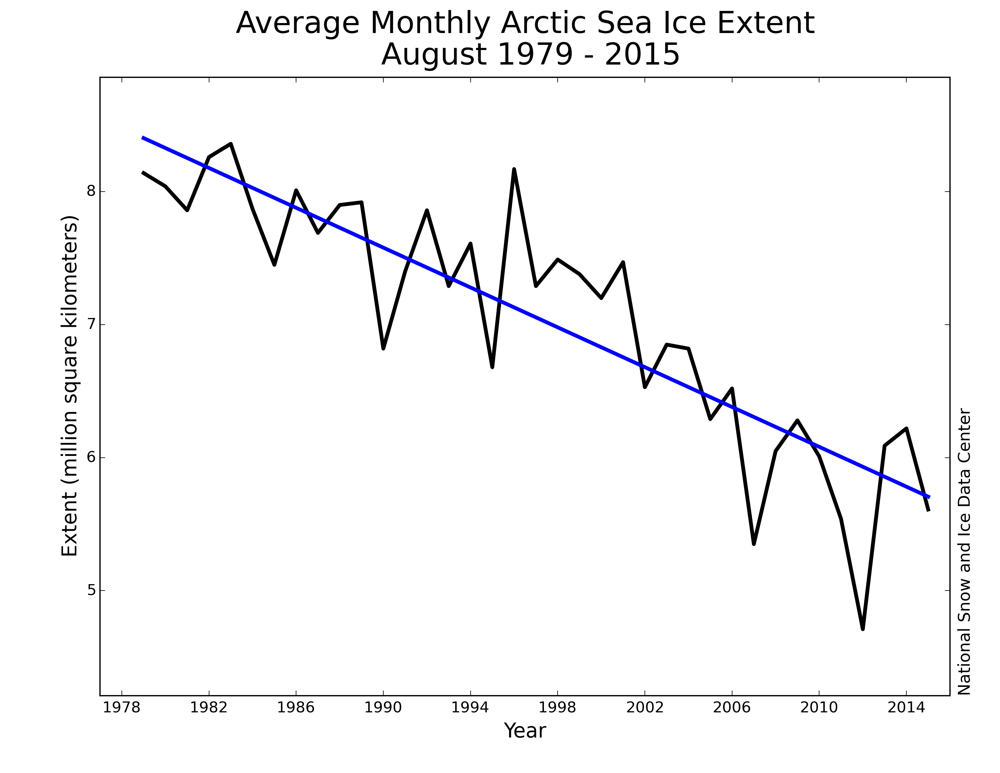
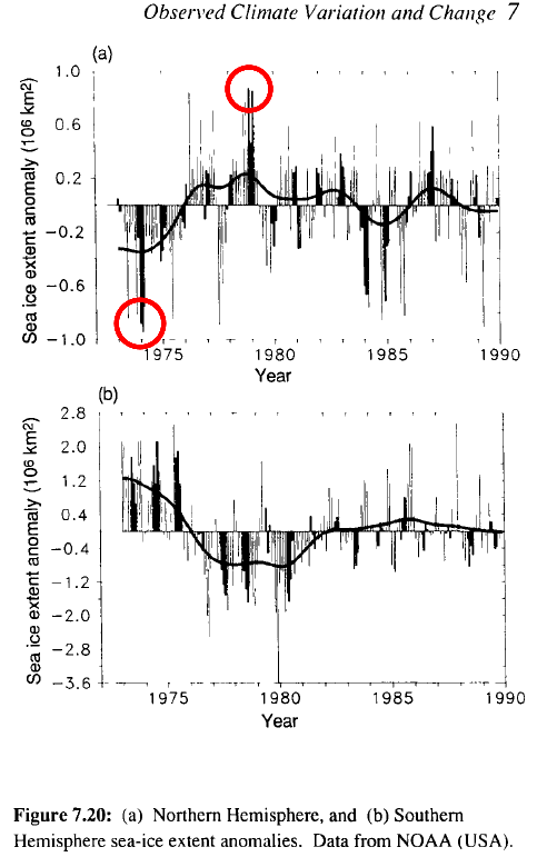
By starting their graphs in 1979, NSIDC is cleverly hiding the two million km² ice gain which occurred prior to 1979. The graph below is from the 1990 IPCC report, and shows the years NSIDC is hiding.
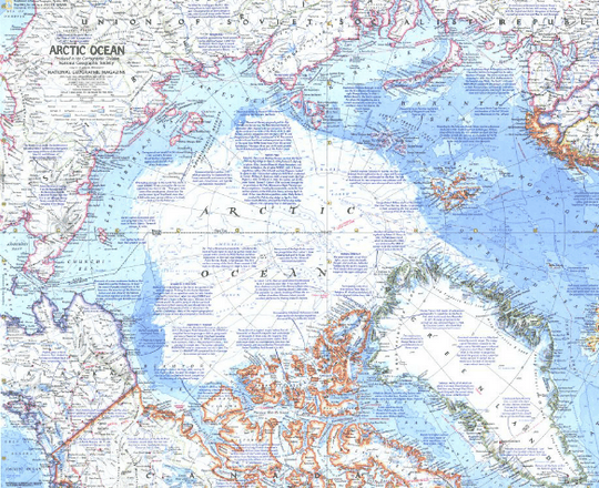
National Geographic published this map in 1971, showing ice extent at the time.
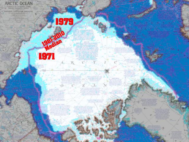
White below shows 1971 extent. Turquoise shows 1979 extent. The purple line is the 1981-2010 median. As you can see, there was a lot less ice in the early 1970’s than at NSIDC’s cherry picked start date of 1979.
Had NSIDC begun their graph in 1971, it would be clear that Arctic sea ice is cyclical, not the fake linear trend they are scamming people with.
But it is worse than it seems – 1971 ice was 1.5 million km² larger than the year before, and there are satellite images.
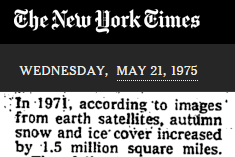
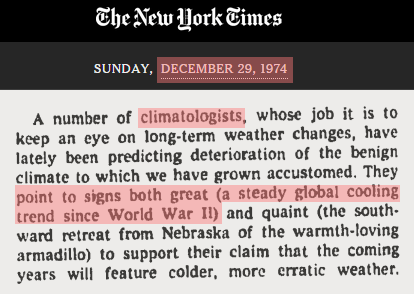
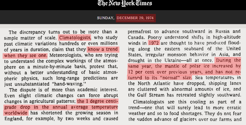
Ice cover increased by 12% in 1972, and climatologists reported a global 1°C drop in temperature since WWII.
So why does NSIDC ignore years before 1979? Starting their graphs in 1979 is wildly misleading, and blatant scientific malfeasance. There is plenty of imagery available back to the 1960’s which they could use to extend a monthly ice graph, as the IPCC did in 1990.
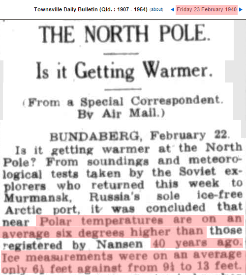
But it is even worse than that. The Arctic was very warm and lost half its ice volume by 1940, prior to the period of 1940-1970 cooling and ice increase.
23 Feb 1940 – THE NORTH POLE. Is it Getting Warmer. | BUNDABER…
Papers Past — Auckland Star — 14 December 1940 — WARMER ARCTIC
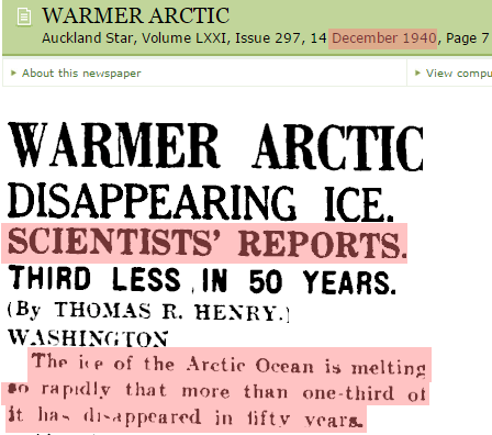
NASA (who funds NSIDC) doesn’t want you to know about the warm Arctic in 1940, so they simply made it disappear. NSIDC graphs start in 1979, which was the coldest year on record in Iceland. Cherry-picking doesn’t get any worse than what they did.
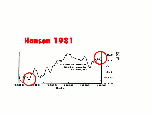
NASA has completely erased the global 1°C drop in temperature from WWII to 1974.
So next time someone tells you that NSIDC graphs show a “long term trend” – tell them to come here and get their facts straight. Vikings farmed Greenland in the 12th century, where it is too cold to farm outdoors now. NSIDC is ignoring key data, and NASA is actually altering data.

Important points to keep in mind.
Real News using Real Science is quite spectacular to see!
I’m certain that the good news will be aired soon on CNN 😉
I think it is only a matter of time, chewer.
When the tide turns, it will be something to see, alright. News people usually love a good scoop, but at this moment in time they are all married to the liberal agenda, and CAGW is part of that agenda.
At some point, it will begin to get colder, and the fiction will be unsustainable.
My feeling is that at some point subsequent to that, this fraud story will be hanging there, giant low hanging fruit for whoever in the MSM covers it first. That is when the dam will break, and we will see several things.
One will be the truth printed for the first time in a very long time. Another will be mass firings, and hearings and indictments. And it is then we will see the biggest run and hide, ” Who me, I was only following orders?”, asscovering parade since the end of WWII.
Psychologists and psychiatrists should pay close attention to the irrational fears climate alarmists repeatedly express about polar ice. Worries about Santa and his workshop seem to play a major role in the phobia. Polar ice data—real or fake—has at most a reinforcing secondary effect.
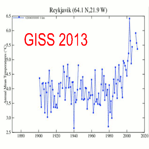
With the unadjusted REAL Reykjavik data you can clearly see the two peaks about 60 years apart
We have probably just passed the next peak in the 60 or so year cycle.
Time will tell.
The melting trend does seem to have levelled out over the last few years.
Unfortunately for people living up there, that means that Arctic sea ice level will probably increase again.
And if the natural cycle does occur, a lot of those northern countries are going to have major issues with their un-reliable energy supply systems.
Biggest fraud since EUGENICS!!
Do you notice the way the southern sea ice extent seems to be the inverse of the northern?
In fact, there seems to be a heavily damped decadal oscillation.
So let’s start them in 1000 AD
doi:10.5194/cpd-11-2341-2015 (Spatial and temporal oxygen isotope variability in northern Greenland – implications for a new climate record over the past millennium) Figure 10
http://snowhare.com/climate/charts/doi-10.5194_cpd-11-2341-2015-figure-10.png
Thank you for exposing the “Modern Little Ice Age”, a period of noticeable cooling between roughly 1940 and 1979. Anyone in the eastern 2/3 of the US who was alive then can very clearly remember the very severe winters between 1977 and 1979.
Talking of more modern times, how is this year compared to 2006 ? 😉
:p
Andy
The graphs I have easy access to go back to 2007.
2015 is above 2007.
And gees, look at Piomas starting to climb !!
http://psc.apl.washington.edu/wordpress/wp-content/uploads/schweiger/ice_volume/BPIOMASIceVolumeAnomalyCurrentV2.1.png
Pity really, the people up there could have done with a break from being permanently frozen in.