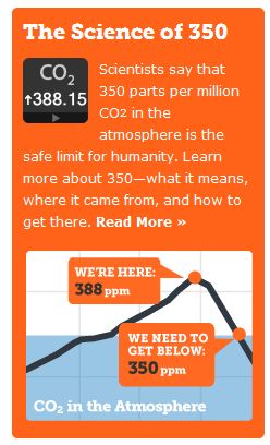
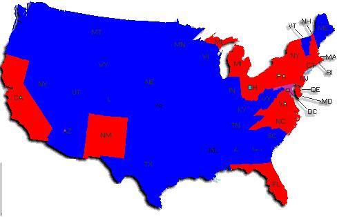
The map above shows in blue, areas of the country which had their hottest year below Hansen’s safe level of 350 ppm. Areas in red had their hottest year above 350 ppm. 79% of the country had their hottest year when CO2 levels were considered safe from global warming.
http://www.ncdc.noaa.gov/oa/climate/research/cag3/state.html
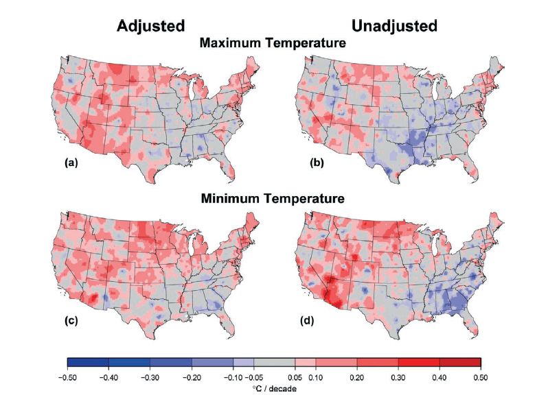
Note that red areas have been upwards adjusted by USHCN and may actually belong as blue. The blink comparators below show how temperatures have been adjusted.
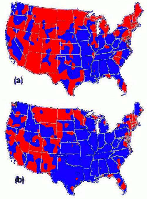
Prior to adjustments, most of the country’s thermometers showed cooling or neutral daytime temperatures (blue.) But USHCN fixed that through the magic of computer wizardry, and now most of the country is warming up.
How cool is that?
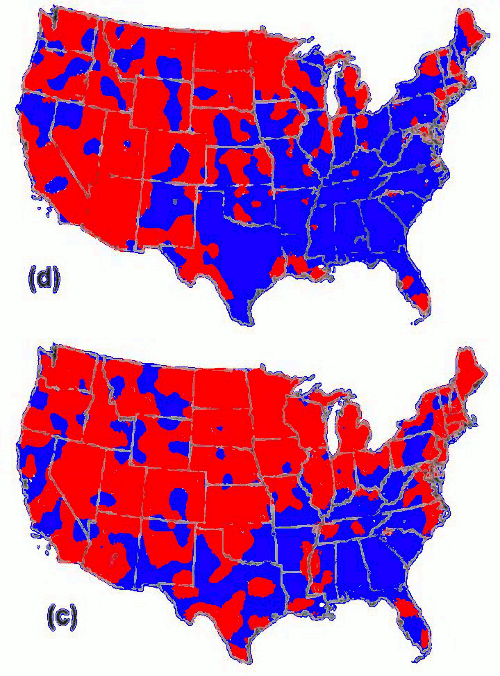
Same story for nighttime temperatures.


I wonder if, in their fevered imaginations, they thought that with the upcoming cooling trend they could manage sufficient carbon sequestration to claim that it was causing the (natural) cooling as well as lowering the [CO2] because of their efforts (and not the cooler oceans absorbing more).
Just thinking out loud.
their hottest year below Hansen’s safe level of 350 ppm
Temperatures do not apply to modern day global warming. Global warming is happening. You ignoramuses.
sarc off
Someone can tell me if I’m wrong, but Death Valley holds the high temperature record in the US, and second warmest in the world. That high temperature record took place around 1911. Death Valley, being in southern California, should be bathed in blue.
These are high annual temperatures for the entire state, not local temperatures for one day.
I guess my point was; if Russia can have an isolated heat wave that gets turned into some horrible form of catastrophic global warming, whats the difference?
That top map looks kinda like the election map……. speaking of the election,
OT, but you might get a laugh, this was done after the election last week
http://www.youtube.com/watch?v=AADeJhGE5ZU