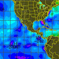
http://weather.unisys.com/surface/sst_anom.gif
Sea Surface Temperatures have gotten very hot around the US, due to greedy SUV drivers. Note all the hot yellow and red in the image above.
This in turn raises the humidity of the atmosphere. Water vapour and clouds are potent contributors to the greenhouse effect, and they travel to Mississippi and make it very cold. The more greenhouse gas you have, the colder it gets in Mississippi. Out of control heating will most likely lead to an ice age.
Extra map for Bob Tisdale.


Buy a wet suit for your favorite Manatee. Looks like the Caribbean side of FL has gotten a bit nippy, and the manatees are turning into ice cubes.
Look at the scale on the map, Steve. Blues and aquas are used to denote SST anomalies as high as +1 deg C.
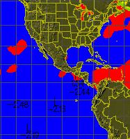
I added in another map showing above/below normal to make it easier for you to see.
Steve replied: “I added in another map showing above/below normal to make it easier for you to see.”
What part of anomaly don’t you understand? The first map you provided were the differences from normal.
What part of blue is below normal and red is above normal is it that you don’t understand?
Pass the popcorn pls
Steve replied, “What part of blue is below normal and red is above normal is it that you don’t understand?”
Since you haven’t supplied a link to the source of your second graph, it’s impossible to say. I don’t see a temperature anomaly scale on graph, Steve. Do you? You may, as always, be misrepresenting the data. You did it with your first graph. It’s likely you’ve done it with the second graph.
It is the same map, with the colours flattened to above and below normal.
That is confusing!
One color for above and one for below is beyond comprehension level for highly trained Climatologists! Is there some way to make it simpler? Maybe fewer choices? You also left out the locations that showed no change, but I guess that would really confuse the issue!