[At reader’s request, I am sticking this to the top of the front page. Look below for new articles.]
[12:54 Mountain Time : NASA has fixed the graph. See update ]
[14:05 Mountain Time : New graph is not the same as the original graph – more soon]
I’ve reported on this before, but here is a more in depth explanation.
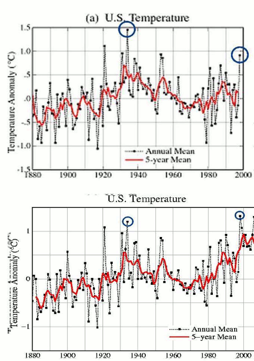
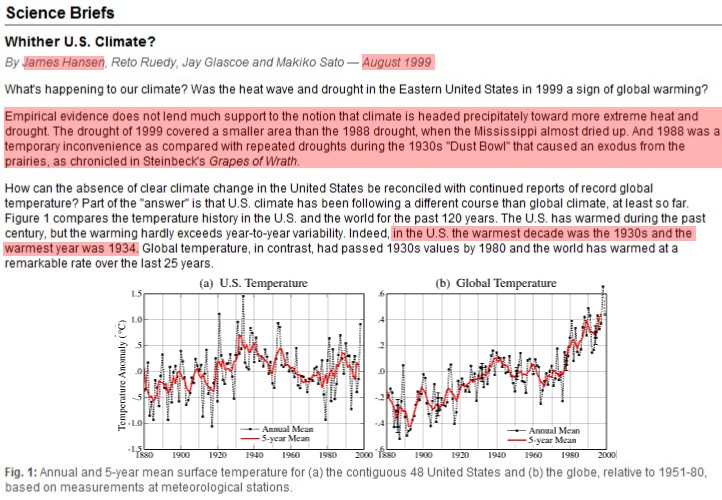
In 1999, Hansen wrote a report which was largely inconsistent with his current claims. Twelve years ago he understood that the US climate was hotter and more extreme in the 1930s. He also knew that 1934 was the hottest year in the US.
http://www.giss.nasa.gov/research/briefs/hansen_07/
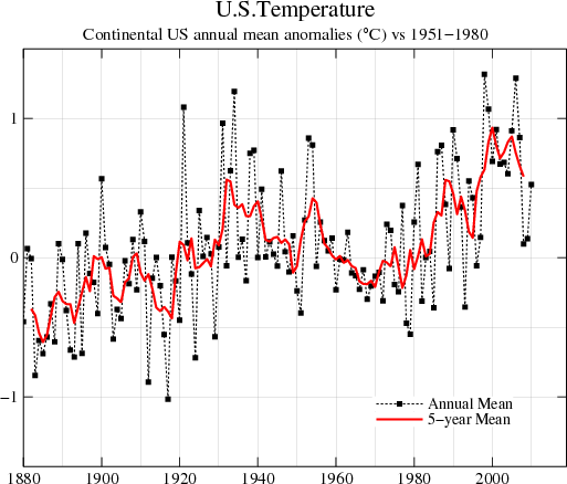
Note the US temperature graph above, and compare that with the current US temperature graph below.
http://data.giss.nasa.gov/gistemp/graphs/Fig.D.gif
In the original version, 1934 was much warmer than 1998. Sometime in the year 2000, the data was “adjusted” to make 1998 warmer. The blink comparator below shows the radical change which occurred.

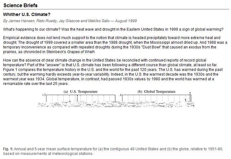
This corruption of the data is bad enough, but it gets worse. On Tuesday, January 18 2011 at 6:33:14 PM, the original graph was corrupted and is no longer visible – as seen below. I do image processing professionally, and I compared the underlying byte data of the image with the original version. I don’t see how this could have happened without someone having touched the file. Files don’t normally change unless someone writes to them.
http://www.giss.nasa.gov/research/briefs/hansen_07/
In industry, people would be prosecuted for this sort of blatant shenanigans.


KRUDD has invested $3.2 million in a house at Perigian Beach on the Sunshine Coast….If the ocean is rising like he would have us believe it is going to get wet….This is why we need a price on Carbon!!!!
http://www.theaustralian.com.au/news/executive-lifestyle/rudd-invests-in-a-family-escape/story-e6frg9zo-1226005969896
Looks like it’s at 16 Tropicana Rise, Castaways Beach. It appears they’re safe from sea level rises of at least 10 metres at that address. I guess given some alarmist projections, he’ll still end up very close to the water.
Such a big house for 2 people, I thought it was the greatest moral challenge?
Interesting that they’ve not tried to fix it yet, considering there must be a number of copies around the world, let alone in their own backups.
Also interesting some of Jim’s comments:
“Empirical evidence does not lend much support to the notion that climate is headed..”
So damn the empirical evidence.. let’s use models.. they give us the answer we want?
“..precipitately toward more extreme heat and drought”
So not bitter cold, snow, floods, then?
“Part of the “answer” is that U.S. climate has been following a different course than global climate, at least so far”
No wonder they changed the data, then.
I have seen a few records in Europe indicating the 30’s were warmer, and there was a story a year or two ago over at Anthony’s about a discussion between Trenbert and Wibjorn Karlen – with Karlen saying he can’t reconstruct the IPCC results because all his results suggest the 30’s were the peak. Here it is…
http://wattsupwiththat.com/2009/11/29/when-results-go-bad/
So, Steve, in all your travels, has this become your suspicion as well? Was the 30’s phenomenon not limited to North America?
We know the Arctic, Greenland, and Canada all peaked then. But I’ve seen a record or two myself in Scandanavia and Russia. …. in the 30s. Keene’s data was inconclusive about this.
This post was dated February 15th – It’s still the 14th here. Did you disappear into the future Mr. Goddard?
Look at the date on your comment. It is not the same date everywhere.
In industry, people would be prosecuted for this sort of blatant shenanigans.
But in government you don’t advance without blatant shenanigans.
Lol, naw Steve, it’s AI!!!! Computers intuitively know now! Mosh says this is all righteous. You see, there’s an algorerythym……….
What once was isn’t any longer and what is, is truth, until tomorrow, in which case, it will no longer be truth. Stupid, stupid people. They’re so smart they can’t see the hand infront of them.
I’ll say this. The properties of mercury in a tube, even all the way back before 1880 were well known. History, math, calculus and physics have stated such and the known properties haven’t changed since then. Anyone artificially adjusting the temp readings back then in an incongruousness manner with today is fraudulent. There is no validity to such nonsense.
UHI existed then but not now???????? BASTARDS. THEY ARE KILLING PEOPLE WITH THIS NONSENSE!!!!
They realize their sham is collapsing around them and they have to resort to these dirty tricks because they don’t have anything else. I SERIOUSLY doubt that world temperature record is completely accurate, considering the NASA/NOAA datasets being corrupted and the extrapolation of stations with missing months by “homogenization” and so forth. I do hope somebody decides to put these crooks behind bars.
Thanks for pointing this out again Steven. James Hansen must think that everything will be ok if he erases the tracks of his ‘adjustments’ in his computer. I can only hope he will be sitting before Congress one day with the two graphs up on display and being asked to account for the changes. No 1988 ‘adjustment’ on the air conditioning this time.
Yes, Jim and company should be dragged in front of congress!!
There must be some kind of committee that is responsible for making sure tax dollars are not used in apparently dishonest ways. NASA is government. They are accountable.
Dear Steven,
Look at all the values changing. This may be caused by a shift in the stations population.
Many stations have been dropped from the record. This video gives some detail.
http://www.youtube.com/watch?v=wvQKxWz3LJc
Not for nothin’ but this born and bred New York City boy was working his tail feathers off in Manhattan during the ’80s and the great drought of 1988-1989 does not ring any buzzers or bells for me. Wiki tells a great story but I have no recollection.
How did I miss that one?
I did a quick google search on the 1988 drought and effects on the Mississippi River, of which I am very familiar. Below the lock and dam system, the river became too shallow for large barges to safely navigate for a short period. It did not come anywhere close to drying up, more melodrama from the drama queen himself.
Would someone post a link to the original file? Not a screen capture, but an unadulterated copy of “Figure 1.gif”?
It is almost impossible for random corruption of a gif file to still produce an image. A byte-by-byte comparison of the corrupted file is in order. If it’s overwritten with a bunch of zeros starting on a 512-byte boundary or something, maybe. Otherwise NFW.
http://stevengoddard.files.wordpress.com/2011/02/fig1x1.gif
Actually, a new file was pushed to the site for fig1x.gif on 19-January-2011, about for sure with a Microsoft web publishing tool. If someone has a copy of the original file, we can about for sure crack this whole thing wide open.
Here is the metadata of the “corrupted” file:
cfood tmp $ telnet http://www.giss.nasa.gov 80
Trying 169.154.204.35…
Connected to web3.giss.nasa.gov.
Escape character is ‘^]’.
HEAD /research/briefs/hansen_07/fig1x.gif HTTP/1.0
HTTP/1.1 200 OK
Date: Tue, 15 Feb 2011 17:13:28 GMT
Server: Apache/2.2.14 (Unix) mod_ssl/2.2.14 OpenSSL/0.9.7l
Last-Modified: Wed, 19 Jan 2011 01:33:14 GMT
ETag: “2547d9-39fa-49a29002b0a80”
Accept-Ranges: bytes
Content-Length: 14842
MS-Author-Via: DAV
Connection: close
Content-Type: image/gif
Thank you, Steven Goddard, for the original file.
There is zero chance that the new figure was accidentally corrupted:
The files have the same size, 500 x 182 pixels.
Both files are well-formed GIF files.
The files have different sizes. The old one is 15,973 bytes. The “corrupted” one is 14,842 bytes.
THE COLOR PALETTES ARE DIFFERENT BETWEEN THE TWO FILES. THE OLD FILE HAS 16 COLORS. THE NEW FILE HAS 29 COLORS.
The files begin to differ at byte 11. This is immediately after the standard GIF header and the width and height.
99% of the bytes are different in the new file from the old file.
IT IS CERTAIN THAT THE NEW FILE WAS CONSTRUCTED, NOT CAUSED BY CORRUPTION.
Post an email address and i’ll contact out of band. i’ll produce logs and simple, reproducible tests for all of my assertions above.
Dr. James E. Hansen
Affiliation: National Aeronautics and Space Administration
NASA Goddard Institute for Space Studies
2880 Broadway
New York, NY 10025 USA
E-mail: [email protected]
Phone: (212) 678-5500
Good luck with that.
I responded to the email address you provided when you posted.
It’s “fixed”, 14.5 KB (14,844 bytes), but different.
Steve, can you spot the differences?
Good catch. I compared the byte data and it is not the original file. But it has a 1999 time stamp.
Do you observe something visibly different?
Steve, my eyes aren’t that good anymore. I’d hope somebody with keener vision would be able to.
The data in the images is identical, but the headers and file size are different.
Is interesting, but I’m not sure as to any significance.
It isn’t the same file
Right, but it appears to be the exact same image. I’m trying to wrap my mind around that one.
I am sure this has been mentioned before, but it is one of my pet peeves. In the original , the scale of the US temperatures goes from -1.5 to 1.5 C, but the world temp graph goes from -0.6 to 0.6 C. It doesn’t really make any difference in what they are trying to say (one would expect larger variations on the regional scale compared to the global average). So why do it?
Steve, this is really ugly on the part of NASA and Hansen. They should be asked to put up the original graphic — which we can helpfully provide to them.
If not, shut the whole thing down.
http://wattsupwiththat.com/2007/08/11/lights-out-guest-post-by-steve-mcintyre/
I agree.
There is a web site curator listed on the bottom of the NASA page. I sent him an e-mail requesting it be fixed. Let’s see if it happens.
lol, I didn’t scroll down far enough to see it, all I got was Hansen’s e-mail addy………stayed up too late last night.
slut
lol, that ain’t right! Was shooting pool!
that’s my story and I’m sticking to it…………..LOL
Pingback: Controversial NASA temperature graphic morphs into garbled mess | Watts Up With That?
I missed this very important post when it was first posted here but just read about it in a comment at Delingpole… so the word is getting out. This really is a “smoking gun” in terms of data manipulation (also known as fraud) that anyone can understand and I just can;t imagine what contorted excuse they will come up with.
Chances are, without a lot of pressure, they will just try to ignore it and stay silent or, perhaps, blame it on Sarah Palin or ‘hackers’ or the heat.
Wow. They did change it already! Guess they’ll have to blame Palin for something else. But what will they blame the 1930s on?
and Anthony has it front and center on WUWT…..
Steve, can you make this a sticky at the top of the blog?
OK
Apparently they have ‘fixed’ the image…
Let’s see. The best modern historical temperature data is for the US. and that data in 1999 showed the 1930’s warmer than today in the US. Then the data is radically adjusted shortly thereafter to promote the present temperatures and demote the 1930’s. Then the former graphic is mysteriously corrupted on the website. The present day hot spots predominately seem to occur where there are no thermometers. Is it any wonder that we are skeptical about the so called climate authorities?
Looks like it, truthsword. ¿Will there be an explanation, I wonder.
The explanation? It erased graphs were pointed out at WUWT. Voilà, not erased anymore.
correction
‘The’ erased graphs…..
I have decided to go back and change the past too. You will all be pleased to note I have now graduated Magna Cum Laude with a PH. D. from MIT. Cool. So listen up, dummies.
Quis custodiet ipsos custodes?
lol, we’re watching the watchers.
O/T but interesting: My heart goes out to the protesters pictured at the below website who have their very existence threatened by global warming.
http://www.consumerenergyreport.com/2009/02/11/hundreds-attend-global-warming-protest/
Before anybody gets too deep into conspiracy theories, I’d just like to point out that if someone was trying to mislead, then they would replace the old graph with one based upon the later revisions of the dataset.
Replacing the graph with garbled mess just calls attention to it. Replacing it with the “adjusted” version would be not nearly as noticeable.
The adjusted graph has been talked about for some time. The garbled may have been a result of the controversy created by the adjustments talked about in the graphs. But we don’t know. Since NASA is funded by taxes taxpayers have the right to have everything at NASA opened to them.
Whoever fakes the data should go to prison. They are trying to control our entire life for a lie they make up.
If criminal changes are brought against an individual in a corporation, for manipulating the corporate accounts (e.g. in committing fraud; in evading income tax; etc.), the impact mainly affects the particular corporation concerned.
But when a person manipulates the temperature data, particularly to show a false exaggerated warming trend, the effect can be significantly far more devastating. It can influence government climate change policy in countries around the globe… billions can be wasted needlessly in trying to combat a “problem” where there really is no problem.
And that is why anyone found deliberately manipulating the official temperature data should not only be instantly dismissed from his position, but also face the full force of the law.
Jo Nova whom you all know with a team of local scientists, volunteers and a Federal Senator have requested the Auditor General to conduct an audit on the Bureau of Meteorology concerning their temperature data and adjustments. So far we suspect they have added some 40% to the raw anomolies. In particular the interest is in remote rural sites which a. need adjusting and b. need homogenising to increase statewide temps. Very shonky. The AG is independant and has been thorough in the past. We suspect the government, which wants to introduce a carbon tax, will resist anything that casts doubt on their settled science.
This just makes me want to throw up.
What can be done about this kind of dishonesty other than keep on “putting it out there”?
Grrrrrrr.