
arctic.atmos.uiuc.edu/cryosphere/timeseries.global.anom.1979-2008
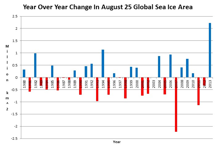
Earth has gained 2.2 million km² of sea ice since this date last year, wiping out the previous record gain of 1.1 million km² in 1994.
According to climate experts, polar ice loss is the canary in the coal mine for global warming, meaning that their junk science theory has flown the coop. All they are left with is newspaper and cable news excrement at the bottom of the cage.

All they are left with is newspaper and cable news excrement at the bottom of the cage.
Which is where the Media belongs. Fit only to be shat on.
I can’t believe all the cherry picking 🙂
Polar ice gain is the 800 pound gorilla, riding the elephant in the room, rescuing the canary in the coal mine.
I like it! A nice picture for a cartoonist.
This is just what the “Experts” at NSIDC “Warned” us would happen if Global Warming Continued! Don’t you remember them making that claim?
Neither do I! 😉
Southern Hemisphere sea ice is 1,000,000 sq km higher today then last year on this date. That = 1 state of Texas and 1 state of Arizona combined.
So many nuclear powered icebreaking ships since the late 70s Have set sale to crush the ice.
http://en.m.wikipedia.org/wiki/Nuclear-powered_icebreaker
People pay $25,000 to take joy ride to north pole.
I wonder how much it would cost to get a seat on a row boat?
It seems all over the Internet people use Manhattan as a form of measurement. I haven’t been able to find an adequate description of what it happens to be. Would that be a liquid measure like a cocktail? Or a dry measure like a borough? I can’t find it listed among the standard SI Units. I wish they would list it.
Manhattan: New York City borough.
Manhattan is one of the five boroughs of New York City, geographically smallest but most densely populated in the city. (Wikipedia)
Area: 33.77 sq miles (87.46 km²)
Population: 1.602 million (2011)
….
Me thinks 1 Manhattan (area unit) = 33.77 sq miles = 87.46 km² …:-)
Thanks!
I notice it lost over 2 million km^2 in 2007, but only regained 0.5 million km^2 the next year, leaving it 1.5 million km^2 less than the year before. Totalled, the gains after 2008, did not even recover the loss from 2007, and all of THOSE gains were lost in the combined losses of 2011 and 2012.
So what it looks like to mem is this year we gained enough ice to get back to the way it was in 2006.
Is that why you’re using the change in extent, rather than the total extent, to make your graph?
Global sea ice area is right at normal and has been above normal most of the year.
Here’s the data on ice extent plotted in a more readily human-readable form. It speaks for itself:
http://www.ijis.iarc.uaf.edu/seaice/extent/Sea_Ice_Extent_L.png
So even with the gain 2013 is still below the 2000 average? It looks like it has bounced back from the lowest on record (2012) but isn’t it alittle to early to break out the bubbly?
Nice alarmist spam, but this discussion is about global sea ice area. Check with the White House about cutting and pasting the right message next time.
Sorry, do you really believe what you are saying?
What about long-term charts?
You have only showed data for August 25th and I exactly know why – because in 2012 it was record breaking small extent of ice on that day. It is logical, that this year it would be greater.
I’ve tried to made a same chart as yours was, but I couldn’t. My result is here: http://s21.postimg.org/guojl7k53/ice.png
Where does this difference come from?
You should show a whole range charts (made from the same data source as yours):
http://i.imgbox.com/aboiHl3M.png
http://i.imgbox.com/adcqq351.png
http://i.imgbox.com/acovhM11.png
Please, do not mislead public.
I hope you aren’t as stupid as you pretend to be
It is not about your hope or my stupidity – facts, please!
What is so stupid in my previous post?
Global sea ice area has been above normal most of 2013
stevengoddard says:
August 30, 2013 at 11:33 am
Global sea ice area has been above normal most of 2013
_______________
AGREE, till August 25th we’ve got data for 237 days in 2013:
59.5% days (141) were above the average
40.5% days (96) were below the average
So in average y. 2013 was till August 25th 0.09 km^3 ABOVE the long term average.
But you have showed us just a comparison 2012/08/25 – 2013/08/25 on a chart in the post – a statistics for that period is (365 days):
38.6% days (141) above the average
61.4% days (224) below the average
So we get an average for this period 0.47 m^3 BELOW the long term average.
The record-breaking positive change in sea ice extent / 365 days was on December 19th 2007: 2,7611599 km^2 (compared to 2,2698612 on August 25th 2013).
Is this fair?
There has been a 72% YOY gain in Arctic sea ice. Does this trouble you?
No, I understand, I’ve just wanted to show what 2.3×10^6 km^2 means in a long term sense.
Quite a big number, but it is anyway dependent on our selection of data range and as such cannot be an strong sign of important change.
It is of course very explicit, but aren’t seasonal averages more appropriate to debate about? Or seasonal maximum and minimum extents regardless the date on which they occur?
Chart http://i.imgbox.com/acovhM11.png shows very straight that in the last 5 years the rapid decrease in maximum seasonal sea ice extent has been slowed or even stopped (max. in 2013 was higher that in 2012).
The same has happened to the secondary minimum of sea ice extent (during the summer on the N hemisphere), which could be this year the highest since 1996.
And of course the primary minimum during summer on the S hemisphere which is increasing in the last 2 years.
It is fair because of the seasonal variations, this year had a different pattern of winds than in 2012 and all this started at the end of last year.
Therefore it’s not fair to include the final months of 2012 to have a 1 year comparison because the entire state of the atmosphere changed, and Steve is showing here how important these changes were.
It’s not simply a comparison of year to year, but to notice that there has been an evolution in the atmospheric state that is now showing a cooling trend much more evident than 12 months ago.
Notice that Antarctic icecap has had positive anomalies for 22 months straight now, and this didn’t happened in 2007.
There is a new trend in climate, generated by the present low level of solar radiations, that is driving this entire situation and has already brought the reversion of the expected El Nino last year, the exceptional recovery of the Arctic icecap this summer, not to mention the record snowfall last winter in the NH, and the continuous above average levels of ice extent in Antarctica.
These are the *facts* that Steve is trying to show here, which are *exactly the opposite* of what the AGW models predicted.
See?
YES, thank you for your explanation.
You’re welcome!:-)