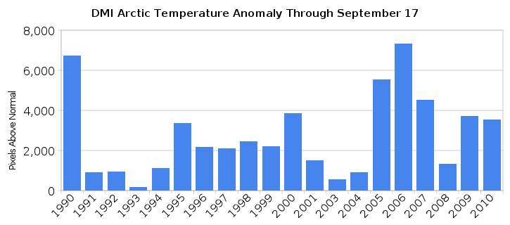
I tried something I had wanted to do for a while. I did a numerical integration of DMI Arctic temperature anomalies (north of 80N) for every year since 1990 (except 2002.) The graph above shows the results.
[youtube=http://www.youtube.com/watch?v=Gm6WgIMFxxc]
Units on the Y-axis are pixels above normal (red) minus pixels below normal (green.) 2002 was excluded because they did something messy with their graphs that year and it was impossible to do a decent count. They shifted everything upwards in 2008, but the scales remained the same.
Results show that 2006 was the warmest year, with an upwards trend starting in 1991, and a downwards trend since 2006. 1990 was also very warm. 2008 was a cold La Niña year.
Based on the trend and the La Niña, I expect 2011 to be a cold year in the high Arctic.


Steve, which software are you using to count the pixels? Which software do you use to make the video?
It is all proprietary software. I founded a startup west of London a few years ago where we wrote this, and it is not yet publicly available. Sorry.
Steve, I question the use of pixel counting in this case as a means of predicting, well, anything.
I immediately thought of this counter-example. Consider a straight line (y = 0) on a graph and a sine wave (y = sin x). The average of the values along each line at each 2pi interval will be 0, but the sine wave will have a great number of “pixels” counted above.
I also wonder why you don’t show the pixels below? They are obviously highlighted on your graph and able to be counted. Following along the lines of the sine wave above, what is below the graph is equally important.
Consider a year where there are 100 pixels above, and 90 below, or [100, -90]; the avg temp, er, pixels would be +5. Another year, has 1100 pixels above and 1090 pixels below, or [1100, -1090]. Again same average, but considering the pixel amounts of both sides of the line would indicate that the first year showed little deviation from the baseline, whereas the second year had large deviations, above and below, in spite of the end result of them ultimately having the same average.
I guess my question is, why are the pixels below not important, but the ones above warrant their own blog post?
This measurement is pixels above minus pixels below. It is a standard numerical integration technique.