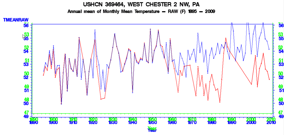
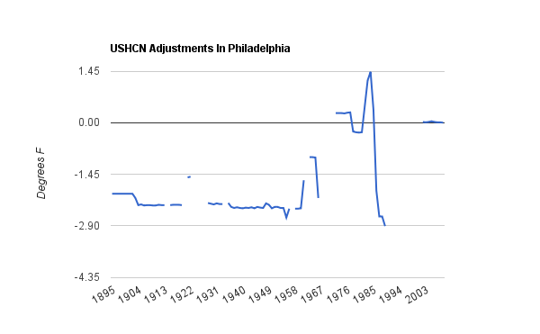
USHCN has done a fine job in Philadelphia, converting a cooling trend (red raw data) into a warming trend (blue adjusted data.) They did this by cooling the past by two degrees.
“If the present refuses to get warmer, the past must become cooler.”
– seen at Climate Audit


“They did this by cooling the past two degrees.”
You’ve got a typo there. “Degrees” should be “decades”
The cooled past temperatures by two degrees.
Steve, whats with the period about 1988 to 2000? On one of your earlier posts, it seems the data is missing………… did they just make stuff up for those years?
I’m missing something here. It looks like they warmed the last fifty years by adjusting the temperatures upward by a total of 2 degrees by 2010. Prior to 1950 the data seems to be the same.
I must be reading the graph wrong or be having a mental fart.
Note the scales on the left side. I normalized the data to 1910 by shifting the y-axis. Most of the adjustments were cooling the past, rather than warming the present.
@Philip Finck
At first i thought the timescale was going from present to past but it isn’t.
You therefore are not having a mental fart but your conclusion is correct;
The heated the temps to a stable increase. ( Sorry Steven )
Ahhh…. I didn’t even notice the green #’s on the y-axix. Now I understand what you did but I’m going to guess that a lot of people will be confused. If I may, I would suggest a graph showing the difference between the yearly values (if you have the numbers handy)…. it would be much simpler and more effective.
Otherwise an additional not to point out the green-blue numbers on the y-axis and corresponding red-blue on the graph.
Actually Steven is correct, it is just confusing.