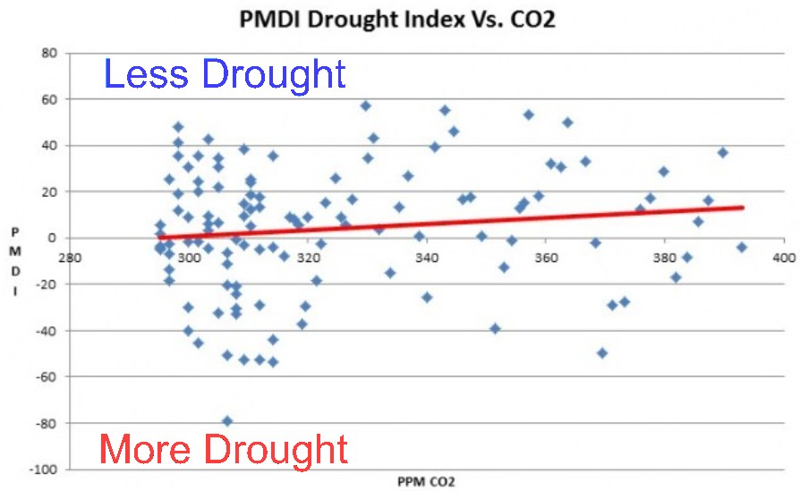
The graph below plots US PMDI (Palmer Modified Drought Index) vs. atmospheric CO2. Lower numbers indicate more severe drought.
As you can see, more CO2 correlates with less drought. The most severe droughts occurred with CO2 at a very safe 310 ppm.
Contiguous U.S., Palmer Modified Drought Index (PMDI), January-December 1895-2011


On a somewhat related topic:
“Africa’s Savannas May Become Forests by 2100, Study Suggests”
http://www.sciencedaily.com/releases/2012/06/120628130643.htm
When did CO2 measurements begin?
For ur info http://en.wikipedia.org/wiki/Keeling_Curve
1958 but there were earlier measurements but not on a daily / weekly etc basis.
Stewart,
Thank you