Since 1997/1998, GISS has been steadily diverging from Had Crut. I have been accused of “cherry picking” this date. In this article I will show that is not the case.
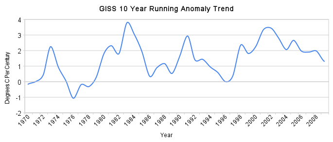
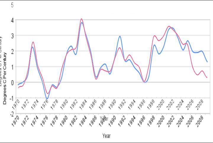
The first plot below shows the ten year running anomaly trend for GISS since 1970. You can think of this as being something like (not exactly) the plot of of the first derivative of the anomaly graph. For example, the 1983 value is almost four. That means that the prior ten year period from 1974-1983 warmed at a rate of almost 4ºC per century. Similarly, the ten year period from 1985-1996 showed no warming trend. The ten year period from 1967-1976 cooled at a rate of about 1ºC per century.
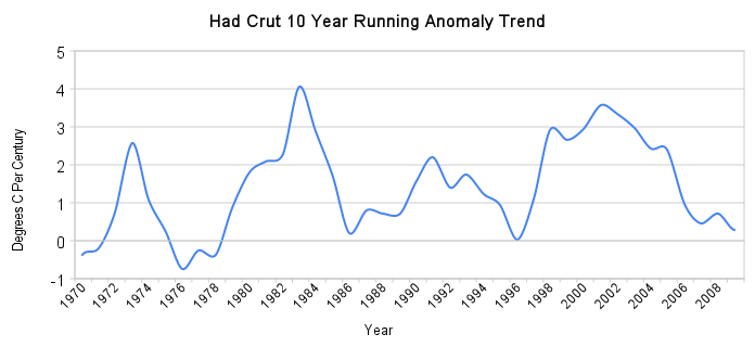
The next graph shows the same thing for Had Crut.
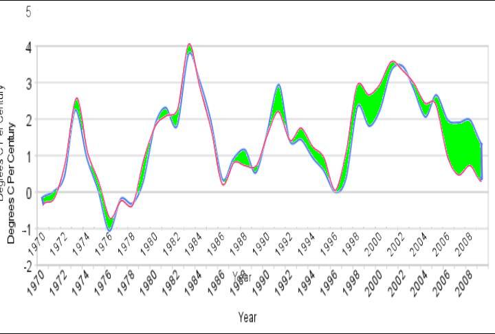
The next graph shows Had Crut (red) overlaid on top of GISS. Note that they were very similar until after 1997.
The next graph shows the same, with areas of divergence colored green. It becomes very clear that there is a change in behaviour after 1997.
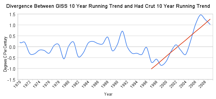
The next graph shows the numerical difference between the GISS and Had Crut graphs. There is a clear break starting in 1997. GISS shows a 1ºC higher rate of warming than Had Crut at present.
Reader “Amino” alerted me to this idea. He generated a video showing the same thing using a different approach with 12 year trends.
[youtube=http://www.youtube.com/watch?v=nMsKy8pW7-k]

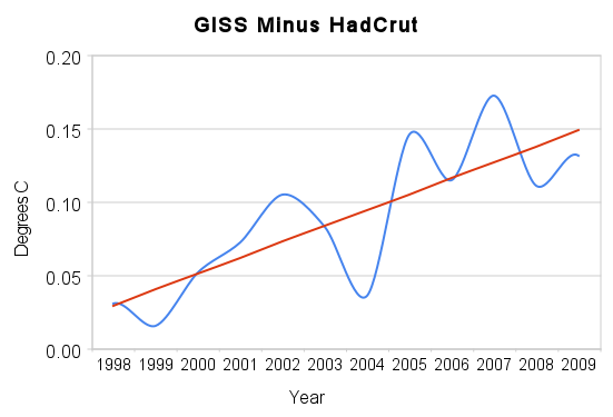
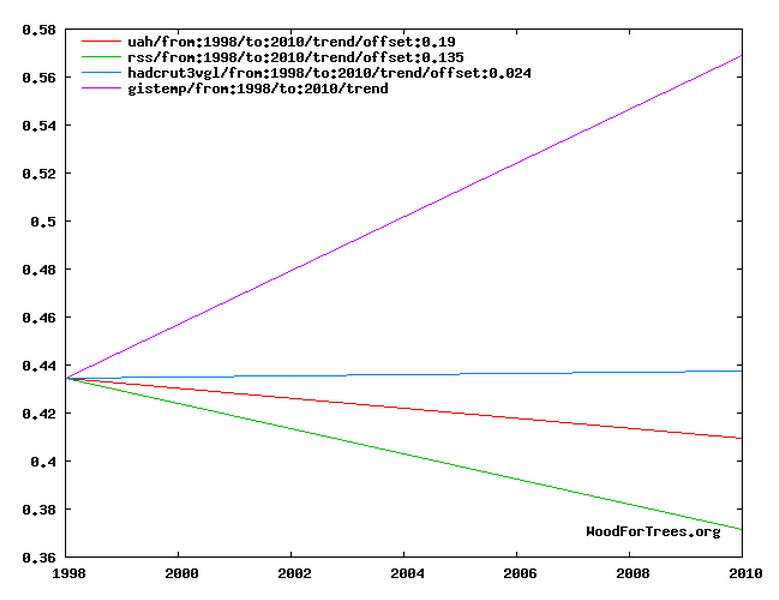

GISS being lower from ~1997 to ~2005 then higher after ~2005 creates a warming trend in GISS over CRU.
http://img163.imageshack.us/img163/7694/paintimage2041.jpg
It looks like there are 3 points at which divergence happens. 1970 to 87/88 the two track close together with little difference. The first divergence is around 87/88 (oddly, James Hansen testified in Washington in 88) to 97/98 where the difference between the two widens slightly. Second, 97/98 to 05/06 where it’s clearly wider. And third, 05/06 onward where difference goes off the charts.
http://img29.imageshack.us/img29/6695/3phases.jpg
Actually, a divergence starts at the 97/98 point where it looks like the two could be data taken from two different worlds, i.e., the real world and James Hansen’s deluded world.
Here is the 1997 to 2009 graph from the video:
http://img832.imageshack.us/img832/3923/133713.png
Since the starting points of the 2 lines at 1997 are so close together I can see that the cause of them being so far apart at the end comes somewhere later in the data set, not at the beginning. The 12 year trend doesn’t show all of the details during the 12 years, just the smoothed average.
This post is important for showing people that James Hansen’s data set is not consistent, though some argued, to the point of distraction, that it is.
That argument, which has caused needless problems, is found in this WUWT post:
http://wattsupwiththat.com/2010/08/16/is-hansens-recent-temperature-data-consistent/