http://psc.apl.washington.edu/northpole/webphotos/noaa2.jpg
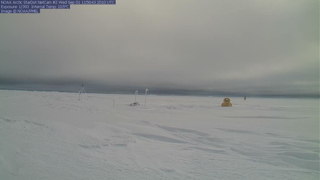
At least there is still sunlight. For a few more days.
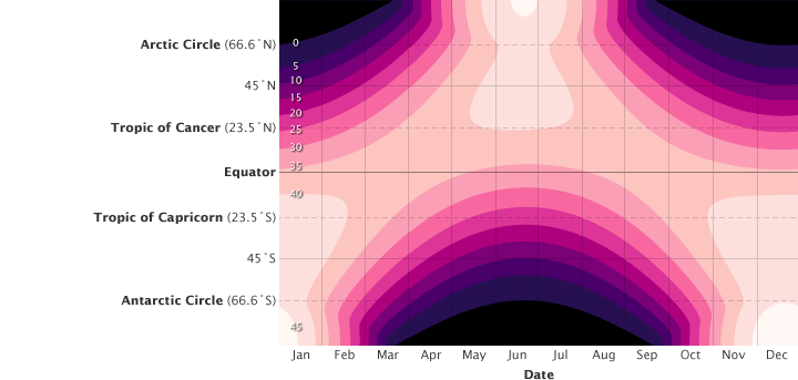
http://earthobservatory.nasa.gov/Features/EnergyBalance/page3.php
Once the sun sets, those nice satellite photos aren’t going to be available any more. So enjoy them while you can.


Hi Steve.
I know this post in on the north pole, but have you notices the southern hemisphere? Today it appears teh NSIDC graph is still well above normal, but the cryosphere anomaly graph shows a negative value. Someone is clearly mistaken…
[CT displays area, and NSIDC displays extent. So they both could be correct. Ice movement has flattened at both poles]
I knew NSIDC was extent, but the cryosphere graph is unlabeled (their fault, not yours of course) so I was unsure what they were measuring exactly.
Thanks for the clarification.
Hi Steve,
A few months ago I asked you a question:
If the ice extent maximum is shifted in time, could the ice minimum extent be also shifted?. As far as I remember you told me that only sun’s high is important and decides on it. Did you see the last AMSR – Sea Ice Extent?
I think you were wrong 😉
[I doubt that we are at the minimum yet, but only time will tell]
You are aware that global warming doesn’t stop the earth revolving around the sun, right?
MattN, you seem to be having some trouble reading graphs, since all the charts you refer to are properly labelled. The dashed line in the NSIDC chart is the record minimum year (2007) not the normal extent. Both area and extent are far, far below normal.
[Reply : No, it is you who are having trouble reading. Matt was talking about the southern hemisphere]
True, that. But since both products show Antarctic ice to be close to the baseline, it pays to look at what that baseline actually is.
NSIDC: 1979-2000 average
UIUC (CT): 1979-2008 average
Different baselines again.