Total ice extent is lower than 2006, due to persistent southerly winds which have been pushing the ice towards the poles and melting out the thinner ice.
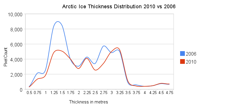
We are told though that the true measure of ice “health” is the thickness of the ice. 2006 had a lot more thin ice (less than 1.5 metres) in September, but the total amount of thicker ice (greater than 2 metres) was similar.
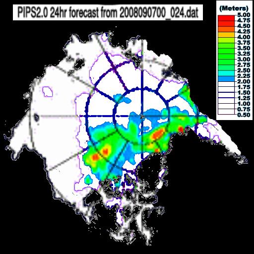
The next maps show only ice greater than two metres thick. As you can see, 2010 is almost back to 2006 levels of thicker ice.
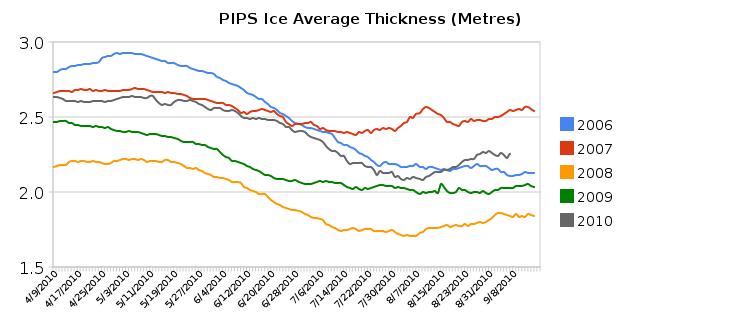
Average ice thickness is higher than 2006, and higher than any time since 2007.
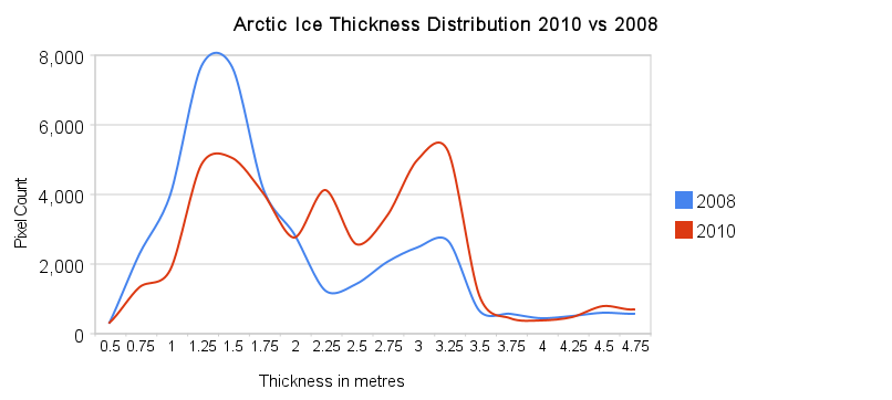
The amount of thick ice has increased substantially since 2008.
Conclusion : The amount of thick Arctic ice (greater than 2.0 metres) has increased substantially since 2008, and is almost back to 2006 levels.

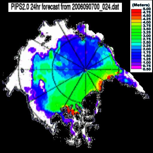
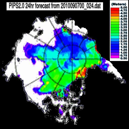
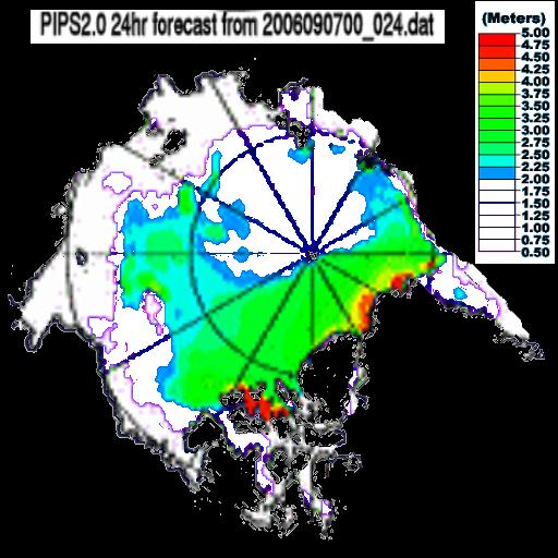
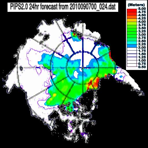

Still working on the PIPS2 model outputs, eh? How interesting that it should show a fringe of 5m thick ice at 100% concentration around the north of Svalbard. And how terribly inconvenient that the microwave data actually shows open water around the Svalbard coast and an extensive field of ~50% concentration ice from there to Franz Josef Land.
PIPS2 was never designed to be an accurate model of thickness or concentration in the middle of the ice field, but to provide useful forecasts of the *edge* of the pack. In that, it’s doing OK, but it doesn’t trump actual observations. So, why not show us some, like the CT or Bremen concentration data, or some MODIS images?
Peter,
Concentration data doesn’t give you any information about thickness, which is the main topic of this article.
The PIPS maps show thick ice to the northeast of Svalbard, which appears to be correct from satellite images.
Satellite images like this one, you mean?
http://rapidfire.sci.gsfc.nasa.gov/subsets/?subset=Arctic_r03c04.2010245.aqua.1km
Svalbard is in the centre at the bottom of the image. The prevailing ice movement is southward, towards the Svalbard coast. PIPS2 has predicted that this will lead to increased concentration and thickness to the north of Svalbard, as ice gets piled up against the coastline.
Unfortunately, this happy picture is contradicted by reality. The entire field of the MODIS image is full of shattered, low concentration ice. PIPS2 is claiming not only that this is 80-100% concentration, but that it has begun to pile up on itself and build thickness to 5 metres plus. It’s not remotely correct. It has the *position* of the ice edge approximately accurate, but is way off beam when it comes to the *condition* of the ice.
I’m not disagreeing about the location of Svalbard, rather the exact location of the red ice on the PIPS map.
BTW – The area near Svalbard you are complaining about is at the edge of the ice pack, which you say is accurate.
The position of the edge is reasonably accurate, but not the condition of the ice at the edge.
Go on, look at http://rapidfire.sci.gsfc.nasa.gov/subsets/?subset=Arctic_r03c04.2010245.aqua.1km and say which bit you think is under sufficient compression to have ridged up to 5m.
Is the PIPS2 model ok to use for comparisons though? Assuming the measurement criteria are the same, even if the conditions may not be precisely the same as actual observations, it may prove useful to show that the ice is thickening on average compared to 2008.
Steven, I have been intrigued by your conclusions based on PIPS ice thickness from the get-go. Do you expect CryoSat-2 data will confirm them?
I don’t think it could do any harm to compare the PIPS images to sea ice concentration maps and MODIS satellite images, just to see how certain areas compare to those in PIPS.
I mean, that whole part of the ice pack that is being pushed towards Fram Strait looks incredible diffuse. There are no ice floes there of any considerable size, just relatively small ones. How can the ice of those ice floes possibly be around 3 metres thick?
Neven,
PIPS will always show more ice than Cryosat, so you can’t do a direct or absolute comparison. I use only PIPS vs PIPS relative comparisons.
Well, perhaps you could add a caveat to your blog posts, saying that you compare year to year, but that it doesn’t say anything about real ice thickness?
It says “something” about real ice thickness, but obviously is not exact. Ice thickness varies greatly over very small distances, well below the resolution of those maps.
How about TOPAZ:
If img src doesn’t work, here’s the link to the image.
Let me try that again: image TOPAZ 9-9-2010.
What do your figures mean without taking sea ice concentration into account.
One pixel at 3m thickness and 100 percent concentration does not equal one pixel at 3m thickness and 75 percent concentration.
The thick ice was more concentrated in 2006, doesn’t that mean there was more thick ice?
The PIPS data does take concentration into account. Areas of lower concentration show up as lower thickness. Look near the North Pole for reference.
So what do you make of these areas by Svalbard (at 50% concentration according to MODIS) and >5m thickness according to PIPS? Are you really claiming that the individual floes are more than ten metres thick?
“The PIPS data does take concentration into account. Areas of lower concentration show up as lower thickness. Look near the North Pole for reference.”
Do you have any evidence for this? I’ve been unable to find anything on the internet.
Also how do you adjust for the variable grid resolution?
Steve,
Look at the areas near the north pole shown as thinner ice.
http://stevengoddard.files.wordpress.com/2010/09/paintimage2110.jpg
The correspond exactly to areas of lower concentration ice.
http://arctic.atmos.uiuc.edu/cryosphere/NEWIMAGES/arctic.seaice.color.000.png
No they don’t. Overlay them and see how bad the overlap is, particularly between Svalbard and the pole.
Peter,
Compare the concentration maps from one day to the next, and see how bad the internal error of those maps is.
Steven,
Compare the concentration maps (and the PIPS2 concentration predictions, and the PIPS2 thickness predictions…) to the MODIS photographs.
The main source of error is cloud cover, which falsely increases the apparent concentration in heavily overcast areas.
There is *no* chance that the PIPS2 model showing high concentrations of thick ice between Svalbard and the pole is accurate – there are actual photographs of the area available, and the ice is not there. Simple as that.
Peter,
You seem to be very focused on one particular point on the map. All Arctic ice maps contain errors of one form or another.
Wouldn’t it make more sense to compare it with the PIPS2 concentration map?
http://www7320.nrlssc.navy.mil/pips2/icon.html
http://www7320.nrlssc.navy.mil/pips2/ithi.html
The differences are quite clear.
Do you have any proof that concentration is taken into account on the thickness maps?
Also how do you adjust for the variable grid resolution?
Look at an area of 0% concentration. You will see it represented as 0 thickness in the thickness map.