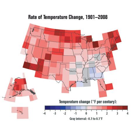
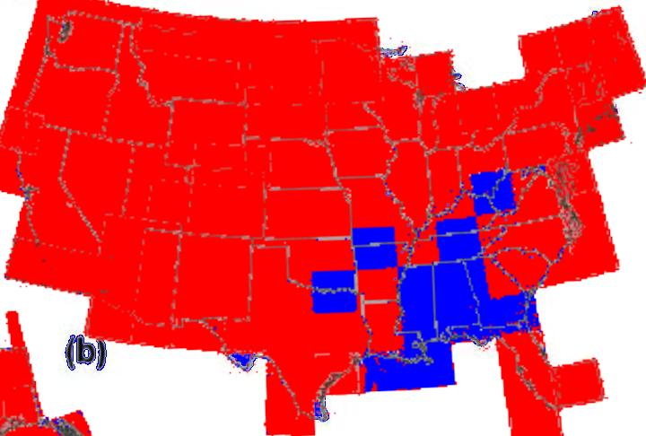
The EPA thinks the US is heating up rapidly. I took their map above, and flattened it to regions of warming (red) and cooling or no change (blue.)
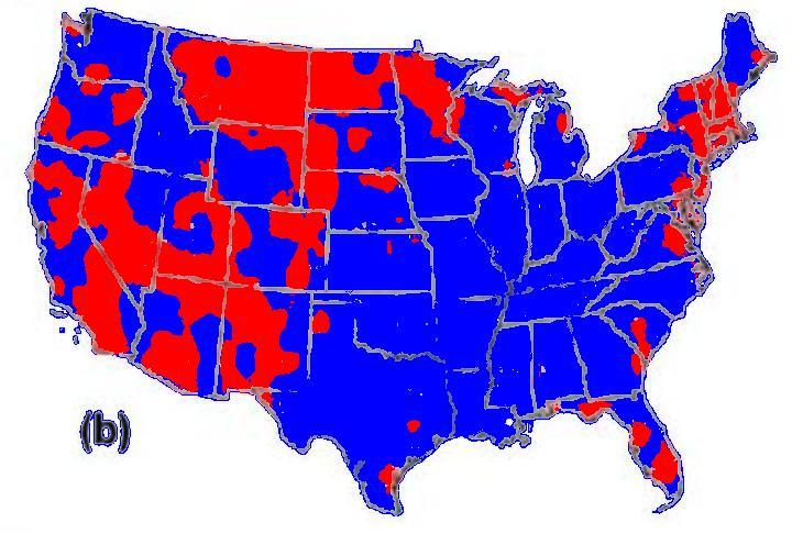
Compare the map above vs. the USHCN unadjusted maximum temperature trends from 1895-2007.
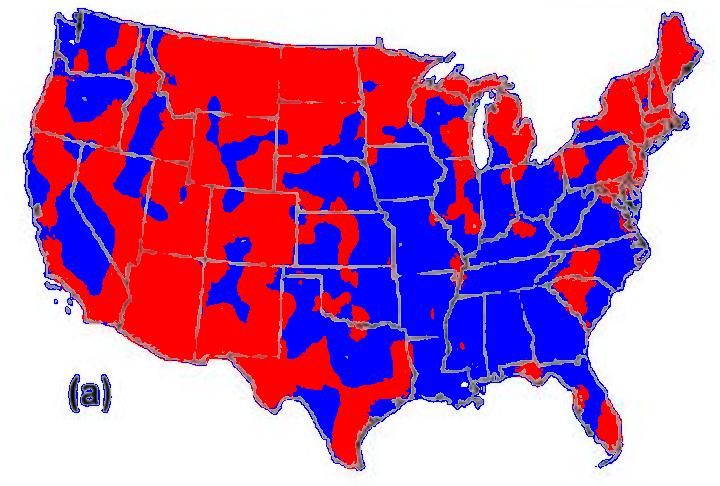
Now compare it to the USHCN unadjusted mimimum temperature trends from 1895-2007.
The EPA map is out of line with actual measured temperature data.
As we have been seeing, the entire US warming story rides on the temperature adjustments made by a handful of people at the Carbon Dioxide Information And Analysis Center.
CDIAC is supported by DOE’s Climate Change Research Division
————————————————————————————-
http://www.freedominion.com.pa/phpBB2/viewtopic.php?p=1441206

