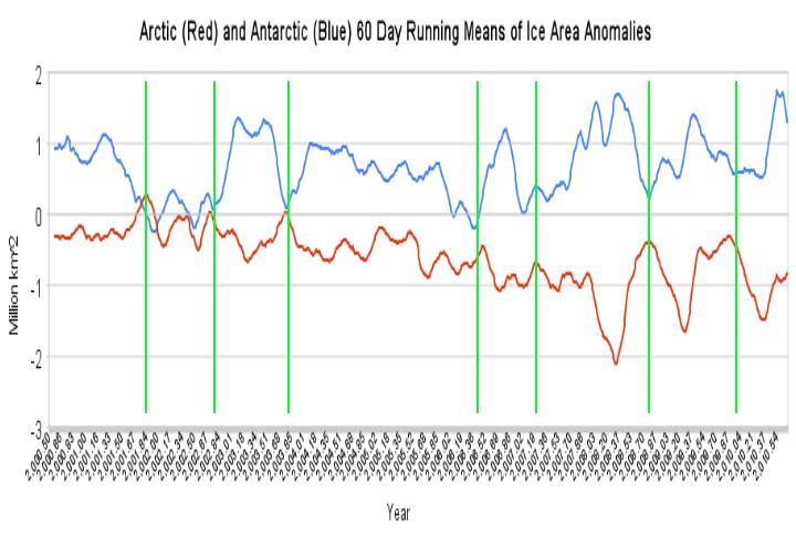
I took the UIUC polar ice area daily data since 2000, and calculated 60 day running means for the anomalies. In the graph above, the Arctic data is shifted horizontally to the right by six months (to normalise seasons) and the Antarctic data is shifted vertically upwards by 0.5 million km² to normalise the baselines.
http://arctic.atmos.uiuc.edu/cryosphere/timeseries.anom.1979-2008
http://arctic.atmos.uiuc.edu/cryosphere/timeseries.south.anom.1979-2008
There appears to be an (imperfect) symmetry. When Arctic ice anomalies decrease, the tendency is for Antarctic ice anomalies to increase. Particularly notable are the opposite record spikes in 2007/2008.
Instead of jumping into the standard ozone explanation, it would be nice to see some studies about what is really going on to cause this relationship.


When it’s summer in the NH, it’s winter in the SH, and vice versa? Or is that too simple an explanation?
BTW, global sea ice area anomaly is going down pretty hard at the moment. It has hardly been positive since last year.
The data is normalised (i.e. anomalies) which takes seasonal effects out. It is also shifted by six months to line the NH/SH seasons up.
When it’s summer in the NH, it’s winter in the SH
Look more closely at the graph. There’s more than that.
What do you get if you add the two data sets algebraically? In a perfect world it would be a flat line through cancellation. In the real world you should see some annual asymmetry owing to the non-circular orbit, axis tilt, and land mass differences between NH and SH, and which changes over time. Track that long enough and you’ll prove Milankovich’s cycles.
Why don’t you actually calculate the correlation rather than waving vaguely at the graph?
the UIUC polar ice area daily data since 2000
Steve, can you do the whole dataset to see if the correlation becomes more pronounced?
I see no correlation in those graphs at all.
Andy