Some confusing communications have been released this week from the Met Office. The reason they are confusing is because we are not educated enough to understand them, but I will attempt to explain them here.
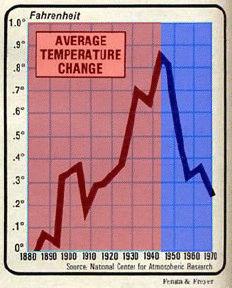
The area in red above is warming caused by burning coal. The area in blue is cooling caused by burning coal. You are also allowed to believe that cooling didn’t happen.
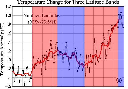
Looking at the longer term picture below, again red regions represent warming caused by burning coal, and blue regions represent cooling caused by burning coal.
The science is actually quite simple. Whatever trend numbers you come up with (after adjustments) you simply declare the slope to be upwards – and then blame it on burning coal.
Hope this helps.


Now I remember!!
http://omniclimate.wordpress.com/2008/10/31/how-to-be-right-about-the-climate-always/
(text continues with example replies in case it’s warm or cold)
The above was written “in jest” by an Italian climatologist in 1982. He is currently an AGWer (by pure chance, no doubt).
Hope this helps.
lol
“The reason they are confusing is because we are not educated enough to understand them, but I will attempt to explain them here.”
Well no one can claim you are crippled with humility.