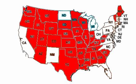
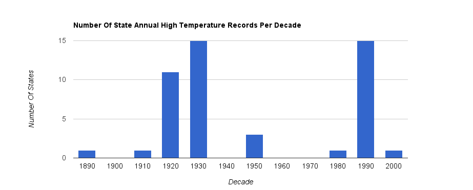
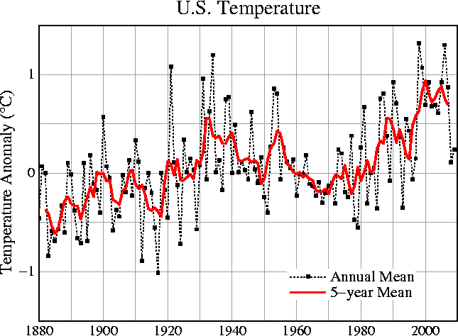
According to NCDC, almost all of the US had their hottest year prior to Hansen’s period of modern global warming. Only one state (New Mexico) had its hottest year during Hansen’s “hottest decade ever.” Most states had their hottest year during the 1920s and 1930s.
Ten states had their hottest year during 1921. Nine states had their hottest year during 1934. (This is even after they adjusted the recent temperatures upwards, and reduced the older temperatures.)
Prior to the year 2000, USHCN/GISS showed 1921 and 1934 as the hottest years. But they “corrected” that messy problem through sophisticated computer analysis. The present became warmer and the past became cooler!
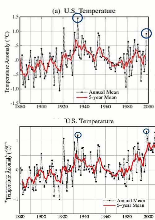
This was done using high tech temperature adjustments, like the one in Lincoln, Virginia – where they determined that a steep cooling trend measured by thermometers was actually a steep warming trend.
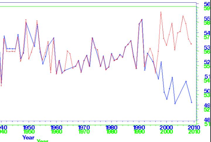
We are lucky to have such clever scientists protecting us from the unimaginable perils of global warming.
The current GISS US graph shows 2006 as the second hottest year in the US, despite the fact that no US states had 2006 as their hottest year – compared to ten states in 1921.
Apparently the system of peer review among our brightest scientists is working very well.
Table of NCDC hottest years below, sorted alphabetically by state.
1927	Alabama	        66
1896	Arizona	        63.9
1921	Arkansas	63.7
1996	California	61.1
1934	Colorado	48.9
1998	Connecticut	51.8
1998	Delaware	57.6
1990	Florida	        72.6
1921	Georgia	        66.3
1934	Idaho	        48.4
1921	Illinois	55.6
1921	Indiana	        55.4
1931	Iowa	        52.1
1934	Kansas	        57.6
1921	Kentucky	59.1
1921	Louisiana	69.1
1913	Maine	        45.7
1998	Maryland	57
1998	Massachusetts	50.6
1998	Michigan	48.4
1931	Minnesota	45.8
1921	Mississippi	66.8
1938	Missouri	57.6
1934	Montana	        45.8
1934	Nebraska	52.4
1934	Nevada	        53.7
1998	New Hampshire	46.6
1998	New Jersey	55.5
2003	New Mexico	55.6
1998	New York	48.8
1990	North Carolina	61.5
1987	North Dakota	45
1998	Ohio	        54.1
1954	Oklahoma	62.8
1934	Oregon	        51.3
1998	Pennsylvania	52
1999	Rhode Island	52.6
1950	South Carolina	59
1931	South Dakota	49
1921	Tennessee	61
1921	Texas	        67.5
1934	Utah	        51.3
1953	Vermont	        46
1990	Virginia	57.6
1934	Washington	50.9
1921	West Virginia	54.7
1931	Wisconsin	47.6
1934	Wyoming	        45


Lucky indeed! Apparently, the properties of Mercury aren’t well known, and but what is well known, is that thermometers are pathological liars! Apparently, they’ve been lying to us for over 80 years!
Isn’t interesting that as our population increases the UHI has a more prominent negative effect? Evidently, UHI lowers the thermometer reading! Someone should alert Dr. Spencer!
You sound just like one of those NASA/JPL scientist who actually looks at data.
Conclusion
Our study explores the changes in Los Angeles temperatures using hourly
and daily records from different weather stations in southern California.
Our analysis of the data revealed the following:
1. The average annual Los Angeles maximum temperature has heated
up by 5.0±0.2 degrees F over the 100-year study period, and the
average annual minimum temperature has increased by 4.2±0.1
degrees F over the same period. We attribute this warming to the
urban heat island effect and, to a smaller degree, atmospheric global
warming.
2. Los Angeles is experiencing more heat waves (periods of three consecutive
days above 90 degrees F) and also more extreme heat days
(days above 90 degrees F). These numbers have increased by 3.09±0.8
and 22.8±4.7 occurrences over the study period, respectively. Both
are a direct consequence of the steady heating of Los Angeles. There
is also some evidence that cold events may be decreasing.
3. The duration of heat wave events is also increasing.
these changes in Los Angeles climate will surely become a problem
for residents of the city. A higher risk of heat-related deaths, an increase in
wildfires, and more strain on water, power, and agriculture may be direct
consequences of the rising Los Angeles temperatures.
http://climate.nasa.gov/files/LAHeatWaves-JournalArticle.pdf
These idiots in California will spend billions on curbing CO2 and then wonder years from now why it is still getting hotter in LA and all theses other urban sprawl areas where they have removed the trees and vegetation and replaced it with strip malls and highways. Doh!
It is all in the Al Gore Rhythms used to create the final product. Giss admits they are based on Estimates / WAGs loosely related to actual temperature records. Historic temperature records are Dynamic in the process being used as each new report provides a minor correction in the historic record. Over time it is obvious and easy to see if you pull up a report from 1988 and one from today you will see considerable changes in historic temperatures. Due to “Improved” analysis methods over time, I am sure!
AGW is happening and the primary cause is the researchers. Eliminate the researchers and you eliminate AGW!
Steven:
Only 50 data points! You will hear about that! 😉
I am suspicious of those states showing warmest temperatures in the 90s.
Maybe there was a massive Blocking High over the North East in the 90s. 😉
Hey Steve, I thought that your map with all the red states was something left over from the election, but this is good too.
But it’s NOAA data. We can’t trust it right?
Oh I understand, it contradicts something we imagine Hansen said even though he didn’t.
So yeah the NOAA data is great this time.
Do you ever actually discuss the data?
Or do you prefer straw man arguments, like pretending that Hansen never talks to Karl.
I am happy to discuss the data. Basically we can’t trust your graph.
You don’t trust my graph? I provided a link to the NCDC data. Please feel free to compare notes and prove me wrong.
but we can’t trust NCDC data. It’s NOAA and they are all American liar scientists. So you can’t base any argument off such data.
You certainly can use it as worst case. My argument is very conservative, because it uses NCDC data which adjusts recent temperatures upwards.
Of course you can’t use it as a worst case. You can’t use it as an argument full stop. Who knows how they adjusted the data in the 70s when the consensus was global cooling. They probably adjusted all the 30s data upward.
USHCN shows exactly how they “adjust” the data. No need to guess.
http://cdiac.ornl.gov/epubs/ndp/ushcn/ts.ushcn_anom25_diffs_urb-raw_pg.gif
But it’s NOAA data. We can’t trust it right?
Thank you for bringing up NOAA! Thank you very much! 🙂
You’re right, we can’t trust NOAA.
Both NOAA and GISS are government data. It is not just GISS that is paid for by the government.
But it looks like the American people are heading a new direction with who they elect. So we should see a change in the official government temperature readings some day too.
NOAA numbers not adding up. Let’s have a look:
1:51 video
http://www.youtube.com/watch?v=FsHOuzwQFmk
NOAA somehow is finding more warming in the ocean that even NASA, though ARGO buoys are showing cooling. They stopped using ARGO—for some reason.
7:37 video
http://www.youtube.com/watch?v=OTxCg6YHOCI
What’s kind of missing from those videos is the herd of elephants in the room.
I see a photo of a station at an airport. But
Where is a graph comparing airport stations to non-airport stations to demonstrate the supposed warming bias?
The same argument stands for countless frames from that video. Eg Darwin Zero. But where’s the graph showing such adjustments are endemic or affect the result? What about, for example, stations that show large and strange cooling adjustments. Those rarely get a look in. All very one sided.
Are you telling me that airport stations have no warming bias?
Is this ChrisD?
It’s not just the US that had hotter temperatures in the 1930’s. Other countries around the world had the same. Since CRU and GISS can’t be trusted I think a work should be done that is independent of those two to find if the whole world was warmer in the 30’s than now.
Why don’t you just take the raw station data and do it yourselves?
If you are “sooo” concerned.
Worried about the result you would find?
(I actually assume skeptics have already “audited” the surface record by producing their own results long ago but chose to cover it up because the results confirmed GISTEMP rather than “blog publish” it)
Most scientists are sensible enough to assume random error distribution across a large sample like this, and just leave it alone. That is what Monte Carlo analysis is all about.
Relax fella.
serioussam says:
November 6, 2010 at 5:09 pm
Why don’t you just take the raw station data and do it yourselves?
If I had access to all the data from around the world back to the 1930’s I would find a way to get it done. And I know of others that I’m pretty sure would do it too.
serioussam says:
November 6, 2010 at 5:09 pm
Worried about the result you would find?
No, I’m not.
Here’s what’s happening with the Russian data,
part 1
http://www.youtube.com/watch?v=_kmp3vUJhzI
If you leave it all alone and assume random error you get more warming than GISTEMP.
So…
I don’t think so…
http://stevengoddard.files.wordpress.com/2010/10/1998changesannotated.gif?w=500&h=355&h=355
the Russian data,
part 2
http://www.youtube.com/watch?v=Dfew9lgzz5o
I actually assume skeptics have already “audited” the surface record by producing their own results long ago
That is incorrect. That has not been done with all data from around the world.
“If I had access to all the data from around the world back to the 1930?s I would find a way to get it done. And I know of others that I’m pretty sure would do it too.”
Well it is out there and people have already done it
I am sure you can therefore find loads of sites where the raw temps are higher than the adjusted ones.
Go on. Don’t keep us on tenterhooks.
eg:
http://rankexploits.com/musings/wp-content/uploads/2010/03/Picture-971.png
Please try to stay on topic. This discussion is about USHCN not GHCN.
and more:
http://rankexploits.com/musings/wp-content/uploads/2010/03/Picture-102.png
http://rankexploits.com/musings/2010/comparing-global-land-temperature-reconstructions/
Wow. All the reconstructions show very little warming over the last 120 years. Thanks for sharing them.
Why should we believe you that GISTEMP shows too much warming when other people are finding the same thing?
Going to accuse JeffId of fraud?
Why do you keep bringing up GHCN? USHCN quite openly acknowledges that their final data shows a steeper slope than the raw data.
Your straw man is not relevant to this discussion.
I don’t get it. All of the data in this article is directly from GISS/USHCN/NCDC.
If you want to prove me wrong, then find the error. Talking about other people’s analysis of a different data set is a pretty useless way to debate.
serioussam
I know the work you are talking about. What JeffId did was look at the GHCN data. It was not all the raw data from around the world.
I have no idea how to get all of the raw data from around the world. But I wish I could.
GISTEMP without contiguous US (therefore no USHCN):
http://clearclimatecode.org/no-us-temperatures/
No visible difference. The world is warming the same amount with or without USHCN. With or without GHCN adjustments. With or without Hansen. With or without Phil Jones. With or without the US. With or without Lincoln, VA.
Yet Mike Davis thinks the global temperature record is all “Al Gore Rhythms” and cannot be trusted. Given the above he couldn’t be any more wrong could he?
I could have worded what I said better.
GHCN compared to GISTemp. So, what was that suppose to be telling me??
serioussam says:
November 6, 2010 at 6:57 pm
No visible difference.
What an attractive way to put it. Is this ChrisD?
The hottest decade ever was measured in 1/1000th’s of a degrees. Without those 1/100th’s the graph would look virtually the same—no visible difference—no hottest decade ever then.
serioussam says:
November 6, 2010 at 5:19 pm
“If I had access to all the data from around the world back to the 1930?s I would find a way to get it done. And I know of others that I’m pretty sure would do it too.”
Well it is out there and people have already done it
No, that is not correct. No one has even taken all the raw data for themselves and found out that the temperature was. What you are talking about is GHCN compared to GISS. Did you know that? You thought you were talking about something other than what was actually being talked in what you linked to?
I don’t even know how one could get all the raw data from around the world going back to the 1930’s.
I think this is getting to the heart of the problem.
All of the surface temp models are essentially based on the same set of numbers. To claim that set A gives the same results as set B is rather stating the obvious.
And also to say that Person A gets virtually the same result as Person B, or Agency C, or Agency D, is also rather stating the obvious.
……………………………………………………………………………………
One thing that does change in recent years is GISTemp. But the change is in 1/10th’s of a degree so it is not detectable in over all temperature, trend, and anomaly. It is easily detectable, though, when you compare the trend of GISTemp in recent years to the other 3 well known data sets:
http://www.youtube.com/watch?v=6ROMzxA4A9c
Hey boys, We got us another ChrisD and Brendon here. Have fun.
Steven:
It is your headed graphic that attracts the Strawmen on there way to Oz looking for a “Brain”:
http://www.youtube.com/watch?v=i1kBiAYQMDg
Yea sorry must have left it in Lincoln VA
You inspired me!
http://stevengoddard.wordpress.com/2010/11/06/keep-aiming-towards-your-big-toe/
Is this ChrisD? Did you leave the name ChrisD in Lincoln VA?
For those who want a check on temperature data (from the real files — occasionally raw, but usually “adjusted”) used by our lying government agencies) check out E.M. Smith’s site chiefio.wordpress.com. He goes through the data from every continent and finds fraud in so many places in many ways. Also he discusses the data from airports, where one technique is always to round up so the temperature is higher (good for planes, not accurate temperature). It takes some time to read through the mass of research, but it is well worth it. Once you do, you will never again vote for anyone who kept any of these government agencies or employees on the taxpayer books. A clean sweep is needed. Tea Partyers and their sympathizers (as long as we do not inlcude equally crooked establishment Republicans) have a task like Hercules at the Augean stables.
Quick question on the airport rounding:
Was this always done, or did it begin sometime after the start of recording airport temperatures?
If it’s always been done, then no big deal.
If it started after that, shouldn’t we expect a next airport warming due to that change of 0.5 degrees?
Also, someone once suggested using the 9/11 incident as a way to estimate the contribution of the planes to UHI warming at airports. Of course it wouldn’t take into account all the asphalt and stuff, but at least it might yield an approximate value of use. Anyone know if that was ever taken up?
-Scott
Scott says:
November 6, 2010 at 9:06 pm
If it’s always been done, then no big deal.
Why is it no big deal? Temperatures have been recorded since the 1800’s. No airports then.
Scott says:
November 6, 2010 at 9:06 pm
Also, someone once suggested using the 9/11 incident as a way to estimate the contribution of the planes to UHI warming at airports.
How could anything be determined from 3 days?
The point is that our esteemed weather monitors dropped MANY other long-term stations for thermometers at airports. In this case the “warming” becomes substantial — espeicially when you take a look at ALL those other stations dropped.
Despite all the impressive graphs Sam has put up, he still totally fails to answer a very simple question – why so many temps have been adjusted upwards – not just in the US either.
To show evidence of some temps being adjusted downwards is disingenuous as this is what you would expect to allow for UHI.
In any event, with so many adjustments up + down, surely the whole database is questionable, certainly when we are prepared to destroy our economies for half a degree.
I don’t know if sam was here to make sense. I think he is ChrisD who only propagandizes.
I like how you confound it by talking about maximum state averages instead of trends in national or global averages, very clever. Nothing quite like making a conclusion based off of statistical outliers in smaller samples and then using it to refute long term trends in larger samples! Have you taken a course in basic statistics? This is complete garbage.
All stations in 10 states for an entire year is a “statistical outlier?”
Yes, especially when considering the precipitous fall over the next two years.
This follows from the ridiculous notion of using extrema to describe the behavior of the population. It’s an intellectually bankrupt exercise from the start.
This is particularly damning of your inability to comprehend statistics: “The current GISS US graph shows 2006 as the second hottest year in the US, despite the fact that no US states had 2006 as their hottest year – compared to ten states in 1921.”
You’re comparing apples and oranges. When did the GISS define “hottest year” as “the year the most states were hottest?” Are you unable to conceive of how those two could be different?
The NCDC data you are linking to does not support your claim. They do not have any numbers for states’ highest temperatures.
Are you daft?
I wouldn’t ask that since you already know the answer. Grenny, daft the only difference is the bucket, and you know what the bucket was full of.
My grandson and I had the best day swimming and jogging in the Washington, DC heat and if Heidi Cullen tries to do anything about it or tries to instigate insurrection I will personally sue her for ruining my summer vacation.