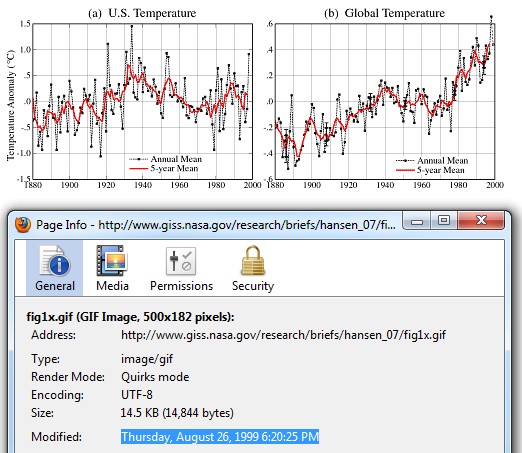
It now has the original file date, too. I’d sure like to know who modified the file on Tuesday, January 18, 2011 at 6:33:14 PM.
Disrupting the Borg is expensive and time consuming!
Google Search
-
Recent Posts
- The Real Hockey Stick Graph
- Analyzing The Western Water Crisis
- Gaslighting 1924
- “Why Do You Resist?”
- Climate Attribution Model
- Fact Checking NASA
- Fact Checking Grok
- Fact Checking The New York Times
- New Visitech Features
- Ice-Free Arctic By 2014
- Debt-Free US Treasury Forecast
- Analyzing Big City Crime (Part 2)
- Analyzing Big City Crime
- UK Migration Caused By Global Warming
- Climate Attribution In Greece
- “Brown: ’50 days to save world'”
- The Catastrophic Influence of Bovine Methane Emissions on Extraterrestrial Climate Patterns
- Posting On X
- Seventeen Years Of Fun
- The Importance Of Good Tools
- Temperature Shifts At Blue Hill, MA
- CO2²
- Time Of Observation Bias
- Climate Scamming For Profit
- Climate Scamming For Profit
Recent Comments
- arn on The Real Hockey Stick Graph
- Bob G on The Real Hockey Stick Graph
- arn on The Real Hockey Stick Graph
- Bob G on The Real Hockey Stick Graph
- Bob G on The Real Hockey Stick Graph
- Gordon Vigurs on The Real Hockey Stick Graph
- arn on The Real Hockey Stick Graph
- arn on The Real Hockey Stick Graph
- Gordon Vigurs on The Real Hockey Stick Graph
- Peter Carroll on The Real Hockey Stick Graph


Wow! That was fast. Congratulations Steven. They are responding to you and to the ‘evil’ blogosphere.
Now, how will they cover their tracks on this coverup?
And, more importantly, how will they explain the 1930s?
Pingback: Controversial NASA temperature graphic morphs into garbled mess | Watts Up With That?
Well, we could file a FOIA but we all know how that will get treated.
But it will provide a great opportunity to set up a new review committee who will work really hard investigating why the FOIA law was not followed and then demonstrate the innocence of those involved. I love reruns.
Hmm…. that was strange.
Storm in a tea cup I suspect. In computing it is quite normal for a ‘Restore’ from a previous ‘Backup’ to revert the file to exactly what it was before any corruption. This looks like the kind of data that you would get if the disk on which the file resides had a low level corruption in it. When it was noticed/pointed out someone did a ‘Restore’ and all is back to where it was.
The file header was modified to a different color depth. The only way that could happen is if someone modified it.
I am just a novice regarding weather analysis so bear with me, but I noticed that the two charts comparing anomalies of U.S. and World Temperatures are at different scales. If you are actually comparing them shouldn’t the scale be the same? If the charts were at the same scale, then wouldn’t the global increase in temperatures look much less significant.
Yes, the slope would have less of an incline in the global graph if the scale were the same as the U.S. graph. But that’s not really the issue. You see the U.S. graph? That was from one of Hansen’s original works. Today, the same graph looks very different. Here’s Steve’s blink comparison to the graph of the U.S. temps then and what Hansen says now.
http://stevengoddard.files.wordpress.com/2010/10/1998changesannotated.gif?w=500&h=355&h=355
Having to restore the old graph must grind on more than a couple of people at GISS.