http://cdiac.ornl.gov/epubs/ndp/ushcn/ts.ushcn_anom25_diffs_urb-raw_pg.gif
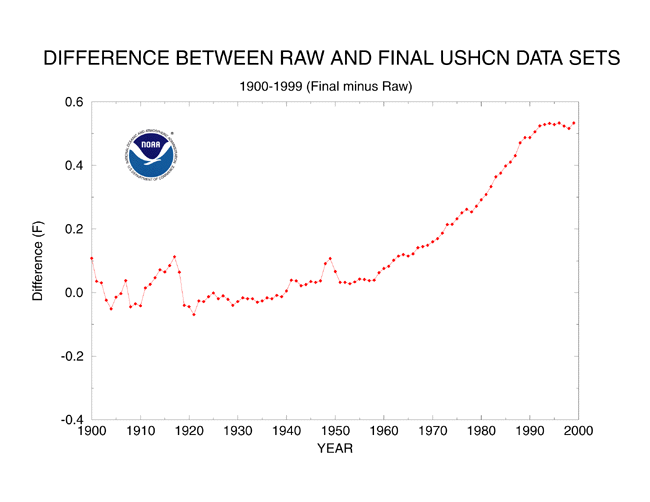
Warmists do have a sense of humor. First they adjust recent temperatures upwards and older temperatures downwards. Then they claim that their baseline is warmer (because they adjusted it upwards) and demand that you subtract even more from the older temperatures (which they already manipulated downwards) – in order to make it look like some feeble warming trend actually exists.
“If the present refuses to get warmer, then the past must become cooler”


..and they infill some areas of no data with data from over 1200km away, despite the fact that temps across that area can vary by several degrees.
C’mon Steve, get with the science. They are only giving more weight to the more accurate data as it should be /sarc.
Degree of “Accuracy” depends on degree of agreement with agenda and preconceived objectives!
What exactly is this graph showing…The delta from raw data to adjusted data?
And is there some way to get to a page where you can generate this graph or where a page is that explains what the graph is? This graph (if it’s what I think it is) is very informative but without a page that describes what it is, I don’t want to use it.
http://www.ncdc.noaa.gov/oa/climate/research/ushcn/ushcn.html#QUAL
Thanks for the link! 🙂
…….and there’s that missing 1/2 degree