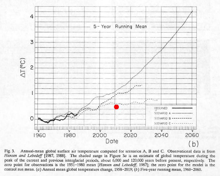
http://pubs.giss.nasa.gov/docs/1988/1988_Hansen_etal.pdf
GISS reports that temperatures warmed in January from a 0.40 anomaly to 0.46 (red dot above) and remain below scenario C. Apparently global warming has been solved!
“scenario C assumes a rapid curtailment of trace gas emissions such that the net climate forcing ceases to increase after the year 2000.”
http://data.giss.nasa.gov/gistemp/tabledata/GLB.Ts+dSST.txt
—————————
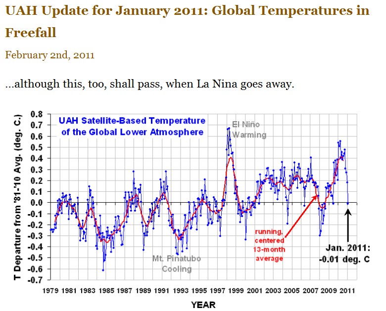
Meanwhile, back in the real world. UAH reports that global temperatures were in freefall in January.


I’ve got to hand it to Dr. Hansen and the team at GISS. They’d find warming if the glaciers returned and their NYC building was knocked off its foundation by a river of ice. Although I’ve got to hand it to them, they are giving new meaning to the motto of the AGW alarmist crowd, “It’s worse than we thought!”
the current La Nina will continue to weaken until July.
The months of January and July are the keys to the ENSO 3.4 index. If the index continues on to positive through July, we’ll have a weak El Nino until January 2012. If it turns back to negative in July, we’ll have a 2 year La Nina right the way through until the middle of 2012.
If that happens, next winter in the northern hemisphere will be worse than the current one.
Is red dot in correct spot on Hansen graph? Shouldn’t it align with year 2010?
It is 2011 where I live.
So the red dot should be just to the right of the vertical line halfway between 2000 and 2020. It is now placed in what seems to be early 2003. Your argument would be enhanced if you moved the dot to the right place. An anomaly of 0.46 Celsius is below what scenario C forecasts for early 2011, which looks to me to be about 0.62 degrees.
Fixed – thanks
You’ll need to shift that red dot Steve else you’re living in 2003 🙂
You can’t get anything past Art Ford. He’s right on the mark as usual.
“It is 2011 where I live.”
But the red dot appears to line up with 2002.
Mind you, Hansen’s chart has a 5-year running mean of the anomaly, which according to his tables stands at about 0.58 degrees. Still below Scanario C.
Fixed – thank you
scenario (oops)
I liked the dot on 2002.
Since there has been no reduction in the growth of greenhouse gas emissions, Scenario A still applies. According to that, the anomaly should be 1.1 degrees by now (as a mean of the past 5 years). Instead we are at almost exactly half of that. 4 degrees by 2060 is extreme even by IPCC standards, and this is a welcome reminder of Hansen’s alarmism, Steve.
I assume that GISS keeps running and tweaking Hansen’s model. Where can we find updated runs?
Question on the UAH graph… Does anybody know if the data for this graph is including UHI? In other words, is it just showing the raw measurements of what it’s looking at?
Since it is something like the temperature of the whole troposphere, it includes places with UHI, but these account for only a small percentage horizontally (on the surface) and even less vertically.
It is looking at lower troposphere temperatures which are above where the “So-Called” Surface temperatures are “Extrapolated”. The anomaly is based on a 30 year mean of 1981 to 2010. (I think the years are right) They recently changed over to 30 year mean rather than 20 year they previously used. Because UHI and other regional human induced micro climates are a small portion of the globe those factors are not taken into account. Also because most Major communities and land use changes that would affect regional temperatures were in existence in 1979 there would not be that much adjustment to be made.
There are so many issues with any “Surface Station” records that I tend to ignore them as they are evidence of the wasteful nature of Climatologists! FUBAR comes to mind as a descriptor!
Steve,
I think the biggest “news” in that paper is revealed in the chart right above the one you posted (fig 3a)
“Fig. 3. Annual-mean global surface air temperature computed for scenarios A, B and C. Observational data is from Hanses and Lebedeff [1987, 1988). The shaded range in Figure 3a is an estimate of global temperature during the peak of the current and previous interglacial periods, about 6,000 and 120,000 years before present respectively.”
It would seem that not only are we below Hanesen’s scenario C, but we’re between 0.1-0.6 cooler than the peaks of the previous two interglacial periods.
Does that make the recent warming not-so-unprecedented?
You should do a post on this.
The Jan11/2011 RealClimate post on checking Hansen’s 1988 projections drew complaints from myself and another commenter, “RC”. GS said that – check the blogs – Scenario C was not to be considered as its assumptions of no emissions were clearly unreal, and that the comparison was therefore not “useful”. He justified Scenario B, although he admitted it was a bit “warm”. Several iterations of complaints received the same answers.
As I suggested earlier, when a nonsense scenario is the closest predicting what happened, it means that the up and down parameters (whatever they are called) mimic (at least for the time being) real-world forces. Rather than say Scenario B is the one to look to, and then try to figure how to push the final result down, I’d suggest looking at C for its up-and-down factors and see if giving them names like CO2 could make sense AND make more accurate predictions.
I don’t understand the logic of dismissing what what doesn’t understand for a selection that is wrong but that you “understand”. Clearly you do not. The solution should be to look at what worked and figure out what it tells you about ultimate relationships.
In the same blog GS showed the 2010 graph of oceanic heat content as predicted, vs the SSTs as measured. Instead of saying the prediction – model, that is – is clearly out, he says that it shows that the missing “heat” is lower than the ARGO floats. This is an argument from ignorance. Scientific? PERHAPS the heat is below, but initially the conclusion must be that the model is wrong considering existing data.
The onus should be to match models to data. It sure seems that the work is to find the data (or modify the data) to match the model.
Is this reversal so hard to see, or am I (and others) missing something big? Over my life I have bumped up against (in business) very strange interpretations that made me think either I was stupid or the others were crazy. Every time it turned out that the others were crazy – they had a huge personal investment, financial or self-image, in maintaining a fiction. And sycophants around them assisted in the ruse.
Denial is an intrinsic aspect of human behaviour. Bizarre as it sounds for a 21st century, well-educated North American, it would appear that such a person can hold the position that night is the brightest time of day if it is important enough for him that it be so.
Yeah, and Greece is solvent again.
The chart appears to have been made in the 1980s. Am I to believe science and medicine today are based on 1980s views? The article is embarrassing.
The anomalies shown on the Hansen map for January 2011 definitely look odd. Taking the UK as an example the map shows an anomaly between +0.5 to +1.0C compared to the 1951-80 mean. Yet the UK Met Office data for would imply a 0.0 to +0.1C anomaly for January.