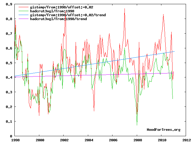
No matter what the climate does, GISS will keep moving up.
Disrupting the Borg is expensive and time consuming!
Google Search
-
Recent Posts
- Analyzing The Western Water Crisis
- Gaslighting 1924
- “Why Do You Resist?”
- Climate Attribution Model
- Fact Checking NASA
- Fact Checking Grok
- Fact Checking The New York Times
- New Visitech Features
- Ice-Free Arctic By 2014
- Debt-Free US Treasury Forecast
- Analyzing Big City Crime (Part 2)
- Analyzing Big City Crime
- UK Migration Caused By Global Warming
- Climate Attribution In Greece
- “Brown: ’50 days to save world'”
- The Catastrophic Influence of Bovine Methane Emissions on Extraterrestrial Climate Patterns
- Posting On X
- Seventeen Years Of Fun
- The Importance Of Good Tools
- Temperature Shifts At Blue Hill, MA
- CO2²
- Time Of Observation Bias
- Climate Scamming For Profit
- Climate Scamming For Profit
- Back To The Future
Recent Comments
- Bob G on Analyzing The Western Water Crisis
- arn on Analyzing The Western Water Crisis
- Bob G on Analyzing The Western Water Crisis
- Bob G on Analyzing The Western Water Crisis
- Bob G on Analyzing The Western Water Crisis
- Hank Phillips on Analyzing The Western Water Crisis
- Hank Phillips on Analyzing The Western Water Crisis
- Hank Phillips on Analyzing The Western Water Crisis
- Hank Phillips on Analyzing The Western Water Crisis
- Bob G on Analyzing The Western Water Crisis


And if you do the same thing with just GISS and UAH starting from 2003 onward, UAH shows at least double the warming trend that GISS does. Is it a sign of a warming conspiracy by Dr. Roy Spencer, or a global cooling conspiracy being started by those who brought us Climategate? We’ll let the reader decide.
It is a sign that temperatures at 14,000 feet exaggerate ENSO events, and that you should do apples to apples comparisons like GISS/HadCRUT instead.
LOL……………………..
It is also a sign that you are making things up, because the UAH trend is much less than then GISS trend.
http://www.woodfortrees.org/plot/gistemp/from:1998/offset:-0.22/plot/uah/from:1998/plot/gistemp/from:1998/offset:-0.22/trend/plot/uah/from:1998/trend
Perhaps take a closer look? I said 2003 onward, not 1998. An for apples to apples, how about UAH and RSS for any year from 1998 to present? UAH shows a significantly larger trend than RSS as well. Or is that still not apples to apples?
Glad you felt I was important enough to make up a separate post dedicated to ridiculing me.
Brilliant. You want to start near a La Nina low and end near an El Nino high, knowing that satellite data amplifies both.
If you want to compare UAH to GISS you have to do peak to peak or trough to trough – otherwise the comparison is meaningless.
And that explains the UAH-RSS comparison…how?
I didn’t make a UAH/RSS comparison
I did.
UAH Update for January 2011: Global Temperatures in Freefall
http://www.drroyspencer.com/2011/02/uah-update-for-january-2011-global-temperatures-in-freefall/
The UAH data on Woodfortrees also seems to end in November 2010, which means that the last 2 months of cooling (+0.18C and -0.01C) are not reflected in any trends.
I wonder what is up with that?
UAH recently changed versions…..again. I don’t think the guy that runs woodfortrees has made the conversion, yet.
The data does not yet reflect HADCRUT for January either (it’s below o.2!). I guess it takes time for the guy running woodfortrees to update his data!
He who controls the data, controls the agenda.
Did you know there has been over two dozen instances of dual record days in the United States. That is, both the warmest and the coldest record broken on the same day. An upturn in atmospheric temperatures don’t mean crap. Warming or cooling has to be quantized in some fashion. I looked at a temperature chart with the little squares above the zero line and the little squares below the same line and bingo, they appeared visually identical in count. This means the amount of cooling was offset by a nearly identical amount of warming. So, no net change either way. Yes, the final temps were higher.