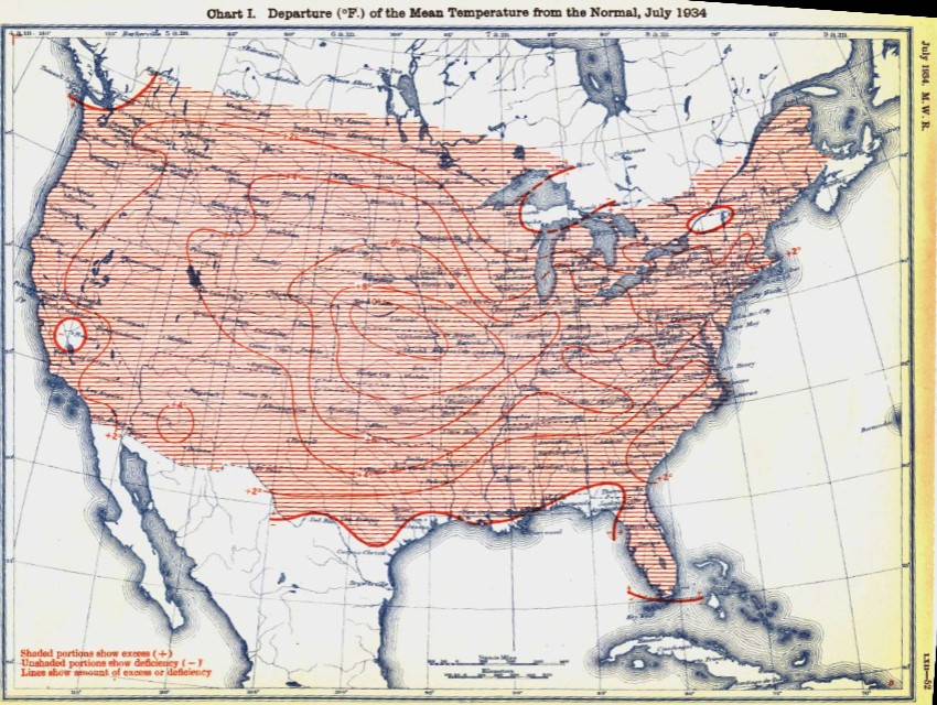
Ten degrees above normal in the midwest.
Disrupting the Borg is expensive and time consuming!
Google Search
-
Recent Posts
- The Real Hockey Stick Graph
- Analyzing The Western Water Crisis
- Gaslighting 1924
- “Why Do You Resist?”
- Climate Attribution Model
- Fact Checking NASA
- Fact Checking Grok
- Fact Checking The New York Times
- New Visitech Features
- Ice-Free Arctic By 2014
- Debt-Free US Treasury Forecast
- Analyzing Big City Crime (Part 2)
- Analyzing Big City Crime
- UK Migration Caused By Global Warming
- Climate Attribution In Greece
- “Brown: ’50 days to save world'”
- The Catastrophic Influence of Bovine Methane Emissions on Extraterrestrial Climate Patterns
- Posting On X
- Seventeen Years Of Fun
- The Importance Of Good Tools
- Temperature Shifts At Blue Hill, MA
- CO2²
- Time Of Observation Bias
- Climate Scamming For Profit
- Climate Scamming For Profit
Recent Comments
- arn on The Real Hockey Stick Graph
- arn on The Real Hockey Stick Graph
- Gordon Vigurs on The Real Hockey Stick Graph
- Peter Carroll on The Real Hockey Stick Graph
- Robertvd on The Real Hockey Stick Graph
- Robertvd on The Real Hockey Stick Graph
- Gordon Vigurs on The Real Hockey Stick Graph
- Jack the Insider on The Real Hockey Stick Graph
- Bob G on The Real Hockey Stick Graph
- conrad ziefle on The Real Hockey Stick Graph


funny how people could feel the heat when it was hot
nowadays it’s cold when it’s warm so only climatologists can understand
so only climatologists can understand
nice!
A mother and baby are shown trying to sleep in the park.
Does any of the following sound familiar?
Co2, the Satanic gas.
Wow, none of you figured out that a map that shows the difference from “normal” is only meaningful when you know what that “normal” is?
Yes, 1934 was 10 deg. F above average, but the average was the PRE-1934 average. If you made the same map for 1934 but compared to the 1971 to 2000 average, you would see a very different map.
It’s amazing how you guys can’t even figure out how to read and display a graph accurately, but dare to suggest the scientists are engaged in fraud!
Unless you DO know the error you’ve made, and it was intentional…. A case of the pot calling the kettle black?
Don’t start spamming the thread.
As I have already explained to you, the discrepancy is at least an order of magnitude larger than any possible differences in the baseline. Given the precision of the color bands (2 degrees) a few tenths of a degree will not have any effect on the maps.
Now take a deep breath and try using your brain.