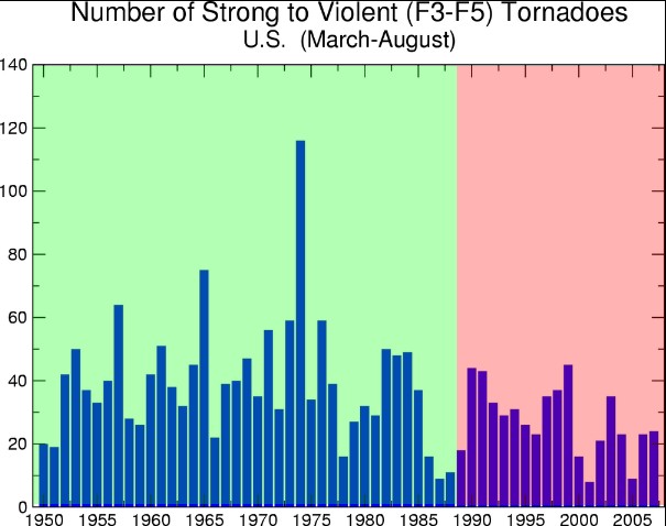
The green area shows unequivocally how safe the climate was below 350 ppm. For example, we only had 119 category F3-F5 tornadoes during 1974, compared to a whopping 9 in 2005. As you can see, tornadoes have become much more dangerous in the red area – above 350 ppm CO2.
http://lwf.ncdc.noaa.gov/img/climate/research/tornado/tornadotrend.jpg


Is this why we are using Biofuels, for the fake hurricanes, so that the 3rd world can starve? They should start building windfarms in India to give the 2billion people power?
http://www.theage.com.au/world/global-poverty-at-dangerous-levels-20110216-1awjr.html
Your smarmy, smug and sarcastic attitude is really showing Steve.
Keep up the good work! 😉
Yep, that CO2 is sure making the climate more volatile. Well, its gonna kick in any day now…….and then it’ll be stormy!! Well, ok, so we’ve been saying that for 30+ years. But just because it hasn’t happened yet doesn’t it mean it won’t!!! And it will be all your CO2’s fault!!! It won’t be mine because what ever CO2 I produce, is offset by the money I sent to algore and the tree I planted! Well, not the tree I planted, but the money I sent to Dell that planted a tree.
Steve,
Could you do the same for hurricane activity?
Here is one place with a bar chart – http://www.friendsofscience.org/index.php?id=456
Thanks!
OK
The calming in tornadoes is caused by manmade global warming. They always knew things like that would happen.