
Hansen says that he was right, your eyes are lying, and the world really is heating out of control. For some reason though, he forgot to include the actual temperature graph.

http://www.columbia.edu/~jeh1/mailings/2011/20110327_Perceptions.pdf
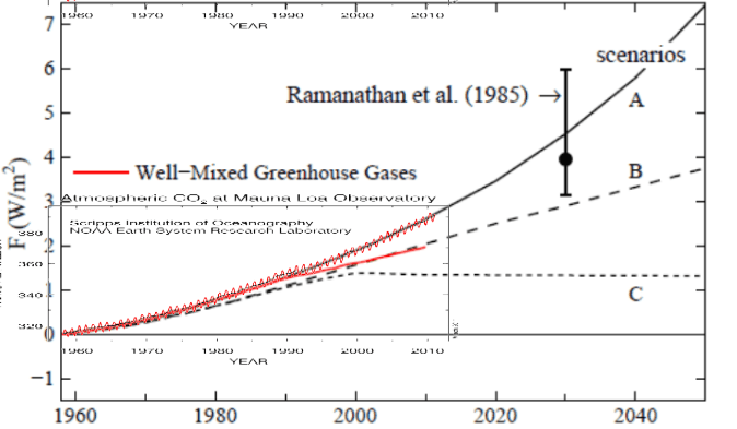
Hansen’s graph above shows what he claims has happened with emissions – a straight line. But the Mauna Loa CO2 graph below shows that CO2 has actually increased exponentially since 1960.

The graph below shows the Mauna Loa data plotted in green on top of Hansen’s graph – exactly following scenario A.

Now lets look at what has actually happened with temperatures since 1960.

The graph below shows Hansen’s 1988 temperature projections vs. the GISS trend since 1960. Well below scenario B and even below scenario C.
")
Conclusion : Hansen is wrong about both greenhouse gas growth and temperature change – even using his own bloated temperature numbers. Climate sensitivity is much lower than he projected. It is time for him to come clean about this.
h/t to Marc Morano and Tom Nelson

A was BAU and Business did not follow his BAU but exceeded it. Claims about CH4 and CFCs are bogus because CH4 has increased due to expanded livestock operations and increased biological activity which leads to increased decay. The CFCs were replaced by a substance that has an even greater GHG effect than CFC according to some reports I have read.
This is one of my major issues with Luke Warmers that want to defend the 1988 graph claiming B is the most likely scenario.
Homer is so convinced by his little theories that he now has to adjust CO2 figures downwards to match his temps which even after upwards adjustment still can’t be made to fit his models.
You would have thought that Homer would have been able to show more warming since he is the god of temperature trend. When will the attacks on credibility be kaunched at the other climate centers who show much less increase than GISS?
Well, in a way, they already have. Note that they called 2010 tied for the “hottest evuh”. But as far as I know, GISS is the only one that made the claim.
And the temps don’t even get to scenario C.
An awful lot of hysteria and money spent for a very small temperature change.
sadly I will go to my grave knowing this charlatan will never be tarred n feathered.
I would give my right arm to see him paraded down the west highway all tarred n feathered.
Anybody know where I can find a site that measures and reports the amount of CFC’s in the atmosphere?
With all the CH4-methane that is being released from the ocean floor, every marsh, every swamp, every rice paddy, every herd of cows, every flock of sheep, most other animals, many forms of bacteria, every human fart, and many unknown sources and yet there is less that 5 parts per billion in the atmosphere- where is it going? The most educated guesses are that it is being oxidized in the atmosphere by O3 (ozone) and interaction of UV with an end product of CO2 and water. Thus there is not enough to cause any “greenhouse gas effect” -the “ghg effect is a hypotheses” that has never been proven. Thus CO2 and CH4 causing Mann-made global warming is a political hoax.
There is only one question that should be asked of James Hansen and Lisa Jackson before they are sent to the mental ward- “Where is the creditable experimental data that proves that the “greenhouse gas effect” exists? They cannot give an answer because it does not exist!
What else would you do if the world stopped warming but you still wanted to cause alarm? Say that forcings are out of control.
Next they’ll rename CAGW to CAGF
But all that heat is still in the pipe line!! We’re all gonna die!! Ya… that’s it, in the pipe line, see. That’s the ticket. Doooooooooooom!!!
D’oh!!
MrC
The climate forcing from atmospheric CO2 is logrithmic. If you take the log of the upwarding curving CO2 levels you will get a straight line in the forcing. Your comparison of CO2 levels to projected forcings is therefore in error.
Don’t you make a mistake here? The first figure shown here has Radiative Forcing on its left axis, not concentrations. Given that RF decreases with linearly increasing GHG concentrations due to saturation effects, getting a linear increase in RF requires an exponentional increase in GHG’s, which is what happened.
(notwithstanding that the temperature predictions did not pan out …)
I see, the upwards curvature is actually a downwards curvature. Thanks for clearing that up.
Jenn and Buckner,
If you look at the original paper that Hansen wrote
http://pubs.giss.nasa.gov/abstracts/1988/Hansen_etal.htm
the plot at the top of this article that shows the y axis in F (W/m2) IS ACTUALLY TEMPERATURE ! It has been changed in Hansen’s latest paper. So that is being very deceitful by Hansen. He is now mixing up temp vs. forcing.
The Baghdad Bob of climate change!
“Just look carefully, I only want you to look carefully. Do not repeat the lies of liars. Do not become like them. Once again, I blame Al-Jazeera, er I mean, El Nina before it ascertains what takes place. Please, make sure of what you say and do not play such a role.”
B Buckner and Jenne are correct. This analysis mixes apples (radiative forcing) with oranges (atmospheric GHG concentration). They measure different things. As the GHG concentration in the atmosphere rises, the radiative forcing of each additional molecule of GHG is progressively less and less. So the straight line measure of radiative forcing is not necessarily inconsistent with the curvilinear measure of GHG concentrations. We all know that actual average surface temperatures are at the low end of or below Hansen’s projections. What this sloppy analysis was supposed to add to that is anyone’s guess.
So, we really are in scenario B?
So the upwards curvature is actually a downwards curvature as Hansen shows. Thanks for the useful information. Exponential == logarithmic
Only in alarmists minds can Hansen be defended by showing how he was more wrong than originally thought.
Saint, look at Hansen’s graph. That triangle thingy on the left-hand side of the graph means “change”. In this particular case, it means “change in temperature”(in degrees Celsius). Hansen tried to cover the table with 3 different predictions tied to GHG emissions. Then, start reading at section 4 of Hansen’s study. The first sentence, “We define three trace gas scenarios to provide an indication of how the predicted climate trends depends upon trace gas growth rates.
Low end, —- my end, Hansen isn’t even in the ballpark. What I take from this is a reinforcement of the lack of credibility of our “climate experts”.
You are missing the point, Saint.
Hansen’s forecasted temperatures are so far out that he is now trying to claim that CO2 increase is less than forecast instead of accepting that his models were just wrong.
This desperate attempt to massage the facts clearly is not borne out by the Mauna Loa data.
I’m not missing the point. I’m only trying to show that the analysis presented here mixes two different concepts—radiative forcing and GHG concentrations—and applies them in ways that are analytically unsound. You can’t overlay a trend line of GHG concentrations on another trend line that shows radiative forcing—they’re not the same thing (though they are related). My point isn’t to defend Hansen, whose work I believe to be deeply flawed. It’s only to say that we shouldn’t accept a faulty approach even if we arrive at an answer we might like. Remember, it was Michael Mann who said that the errors in his Hockey Stick paper didn’t change the results. Should that now be the standard?
The whole global warming story is based on rapidly accelerated warming and tipping points. But when convenient the argument is decelerated warming and flattening of the curve.
So are you saying Hansen is correct in saying we are close to scenario B?
Saint, I see what you’re saying, but if the analysis would only address forcings, then it would ignore the statements of Hansen. Hansen based his forcings on estimates of GHG “growth rates”. So, in order to properly address Hansen’s assertions, it is necessary to conflate the two, because Hansen conflates the two. I already showed you how he was considering GHG in his 1988 paper, here is the quote from his most recent musings, “Temporary aside: there are two main reasons that greenhouse gas growth moved off the track of scenario A onto scenario B in the early 1990s, as shown in Figure 2: (1) the growth of CFCs (chlorofluorocarbons) was greatly diminished by successive tightenings of the Montreal Protocol, (2) the growth of methane slowed sharply.”
And, “Fig.2. Annual growth of (a) CO2 and (b) climate forcing by greenhouse gases.”
How would anyone respond except by addressing these statements made by Hansen? Remember, he states, “The real world (red curve) has closely followed scenario B.”
Recall what he stated in his 1988 paper describing scenario B, “a climate forcing equivalent to doubling CO2 in about 2060.”
How would you respond to these statements?
All these temperature anomalies are inside the bands of error stated for the thermometers used. This is not statistically correct. All anomalies should be followed by the bands of error so that the data quality can be assessed.
There is NO data “Quality” to be assessed! GISS has followed to theory that GIGO Rules!
What I am saying is that superimposing the Muana Loa data (which is parts per million of CO2 only) on a projection of forcing (which is in W/m2), like was done in the third chart above, is an analytical no-no. The two are related, but not the same thing. And no one is flattening the curve. The Muana Loa curve shows an increasing concentration of GHGs in the atmosphere over time. The radiative forcing trend Hansen uses is straighter because each additional molecule of GHG has less of an impact than the one before it, so its slope will never be as steep as the slope for GHG concentrations (and theoretically would flatten out completely as radiative saturation was reached). I repeat—they’re different measures.
Hansen’s was obviously wrong about the amount of CFCs and methane being emitted. It’s not unusual for a projection to be wrong—the decline in the methane concentration, for example, has taken a lot of people by surprise. So now he’s saying, given the new circumstances, that scenario B is the most likely path of climate forcing, not A, and that if maintained, the rate of increase in GHGs will lead to a climate forcing equivalent of a doubling of atmospheric CO2 by 2060. So maybe now Hansen thinks disaster will come a bit later rather than sooner, but in his view, it’s still coming.
Steven’s point about the actual global temperatures being below even the C scenario is more telling. If the forcing is now on path B but the average surface temperature is below path C, that’s a problem—and it would be a problem no matter what forcing path—A, B, or C—was being followed because it means Hansen’s got the climate sensitivity wrong. And he’s got company. Temperature trends also are running below the outputs from the IPCC suite of models, models that supposedly take into account aerosols. The way these models treat feedbacks is the real issue.
“What I am saying is that superimposing the Muana Loa data (which is parts per million of CO2 only) on a projection of forcing (which is in W/m2), like was done in the third chart above, is an analytical no-no. The two are related, but not the same thing.”
===============================================
Saint, agreed, but given that Hansen himself did conflate GHG’s with forcings, how else would one address his errors? Look at his forcing graph and then read his reasoning behind it. He, himself is inferring exponential forcing rather than logarithmic. The methane decrease seems disputable, but his articulation of CO2 increases is totally erroneous. It has actually increased more than what he stated. (instead of linear, exponential)
I guess I’m asking, how else would one refute on the points he made without addressing the issues as he did? Yes, it is a no-no. But Hansen did it himself. He was wrong on the GHG increases, he was wrong on the forcing, and he was wrong on the sensitivity.
And, yes, in spite of our quibbles, the fact that the temps hasn’t even reached scenario C should not be lost, in fact, it should be highlighted.
A little math. If you plot y=ln (e^ax) the graph will be linear. This is because ln(e^ax) = ax. Try it on a graphing calculator or with plotting software.
A little math for you. You are arguing that scenario A was always impossible. Not all upwards curves are exactly the same.
Now go back to your freshman math class and try again.
Armchair climate scientists continue to run Steven Goddard down, but it’s easy to understand why, they hate the truth.