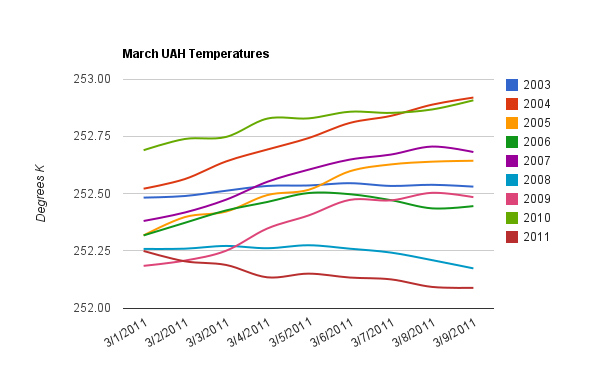
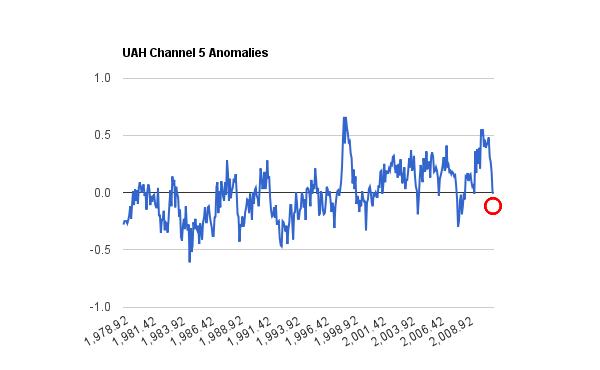
Red circle shows where March is currently sitting.
Disrupting the Borg is expensive and time consuming!
Google Search
-
Recent Posts
- Analyzing The Western Water Crisis
- Gaslighting 1924
- “Why Do You Resist?”
- Climate Attribution Model
- Fact Checking NASA
- Fact Checking Grok
- Fact Checking The New York Times
- New Visitech Features
- Ice-Free Arctic By 2014
- Debt-Free US Treasury Forecast
- Analyzing Big City Crime (Part 2)
- Analyzing Big City Crime
- UK Migration Caused By Global Warming
- Climate Attribution In Greece
- “Brown: ’50 days to save world'”
- The Catastrophic Influence of Bovine Methane Emissions on Extraterrestrial Climate Patterns
- Posting On X
- Seventeen Years Of Fun
- The Importance Of Good Tools
- Temperature Shifts At Blue Hill, MA
- CO2²
- Time Of Observation Bias
- Climate Scamming For Profit
- Climate Scamming For Profit
- Back To The Future
Recent Comments
- Bob G on Analyzing The Western Water Crisis
- arn on Analyzing The Western Water Crisis
- Bob G on Analyzing The Western Water Crisis
- Bob G on Analyzing The Western Water Crisis
- Bob G on Analyzing The Western Water Crisis
- Hank Phillips on Analyzing The Western Water Crisis
- Hank Phillips on Analyzing The Western Water Crisis
- Hank Phillips on Analyzing The Western Water Crisis
- Hank Phillips on Analyzing The Western Water Crisis
- Bob G on Analyzing The Western Water Crisis


This is quite a remarkable free fall, but not unlike the one we saw a couple of years ago………..I haven’t seen the health of La Nina lately.
La Nina is fading fast.
Following the end of La Nina, atmospheric temps will fall another 9 months or so?
I too do not understand your point. It is not even as cold as it was two years ago. Your top plot only compares temps to the last 8 years, not 30.
March temperatures are colder than two years ago, and UAH only provides daily data for the last eight years.
0.4C colder than 2 years ago and going down. Global temps normally start rising in March as the Northern Hemisphere with its greater land mass has a bigger seasonal temperature variation than the Southern.
If you check out the UAH data below you will see there has been a sharp drop since the start of the month.
http://discover.itsc.uah.edu/amsutemps/execute.csh?amsutemps
The page at that link is b0rken:
Error!
Error return (1) from MCU_GetPost
30 years is such a short time for determining any trend. If not for the super El Nino spike of 1998 there would be cooling in the last 30 years. But that wouldn’t mean much either since it’s only measured in 1/100ths of a degree.
I don’t mean to be difficult but that certainly isn’t `visually’ intuitive but yes to over the last say 12 years. It will be interesting to see the temperature trends over say the next 10 years,or 20, 0r 30 …… after which I won’t give a #@*&. 🙂
Amino – Indeed. 30 years on an ice core graph barely registers.
Still, it is starting to look like we’ve wasted a lot of CO2 on this warming project.
Check out the SOI index.
http://ioc3.unesco.org/oopc/state_of_the_ocean/atm/soi.php
Mclean etal estimate a 7 month lag between the SOI and global temps. SOI is at a record high. From here I estimate we will drop another 1 degree C. The next panic over global cooling will start and be blamed on gobal warming. Who would guess that this much heat could be lost so fast. If .1 degrees per decade warming translates into 1 watt/meter of radiative imbalance at the top of the atmosphere then 1 degree cooling over six months must be something like 200 watts per meter of cooling.