http://www.columbia.edu/~mhs119/Temperature/T_moreFigs/
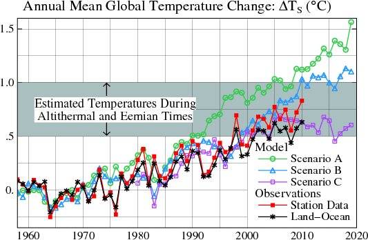
Dr. Jim’s 1988 projections weren’t looking so good, so he dropped an apple in the middle of his oranges. The red line is land only temperatures, but his projections were for global temperatures.
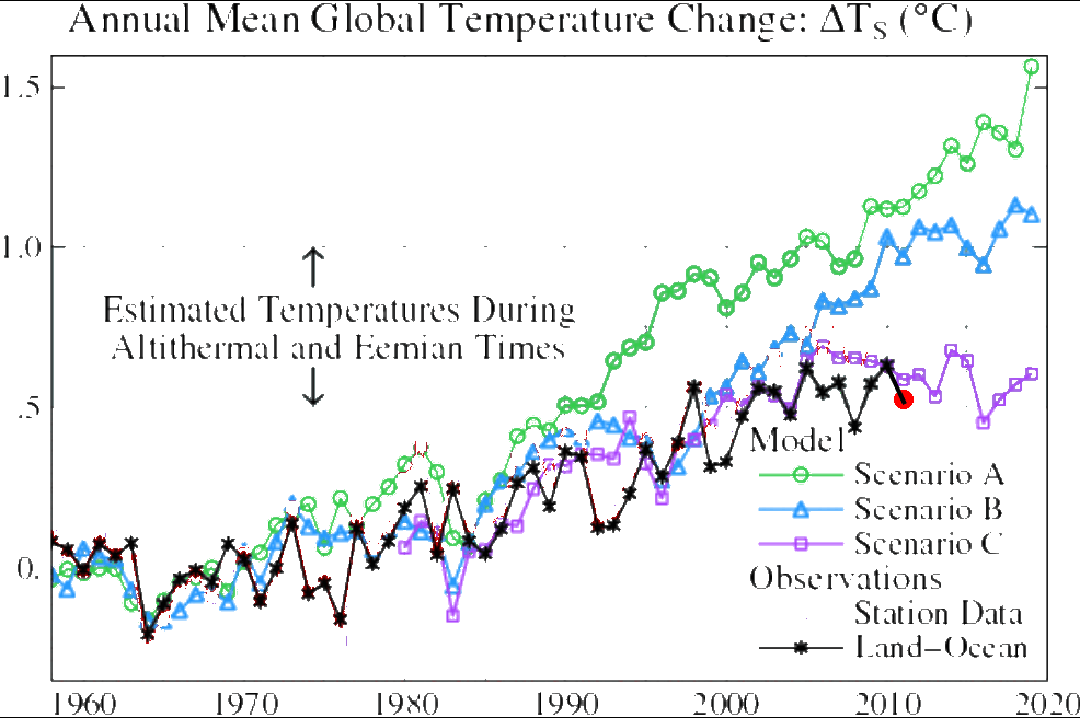
Let’s remove the inappropriate data and update it for 2011 so far.
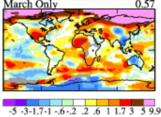
Not looking too good, even with their frantic pink crayon.
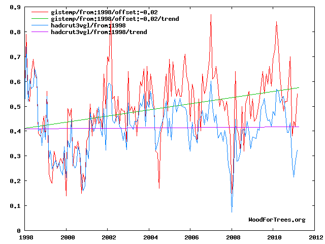
Remarkable how Dr. Jim has managed to keep declining temperatures moving up through this millennium.
In climate science if you don’t like the data, you simply switch to a different type of data.
h/t to Pavel Panenka

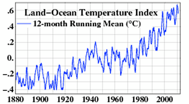

Jim has not proved anything about global warming, but he has taken angel counting on the head of a pin to a new level. And the unquestioning media just assumes that warming continues without abatement.
Could this be the same Jim Hansen who received an award of $250,000 from the Heinz Foundation for services rendered and then proceeded a few months later to publically endorse John “Heinz 57” Kerry for the presidency?
No, I am sure public employees would not act like that.
http://www.giss.nasa.gov/research/news/20010305/
You know what’s next right? The good doctor will use a new trick to get rid of the black and red lines in the graph and replace them with a single pink line based on 100% weighting from his thermometerically challenged Arctic temperatures.
Maybe its just my eyes playing tricks… But is the “Station Data” and “Land-Ocean” data showing an increased difference at later times?