Joe D’Aleo sent this over. Someone at NOAA is pulling facts out from where the sun never shines.
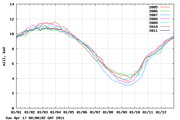
The Arctic actually had record low ice loss in March – i.e. zero.
http://ocean.dmi.dk/arctic/icecover.uk.php
Klaus Wolter at NOAA said last week :
Stay tuned for the next update (by May 7th, or earlier) to see where the MEI will be heading next. While La Niña conditions are guaranteed for at least a few months more, it remains to be seen whether it will indeed last into 2012, as discussed eight months ago on this page. I believe the odds for a two-year event remain well above 50%, notwithstanding the possibility of temporary weakening during boreal summer.
http://www.esrl.noaa.gov/psd/people/klaus.wolter/MEI/
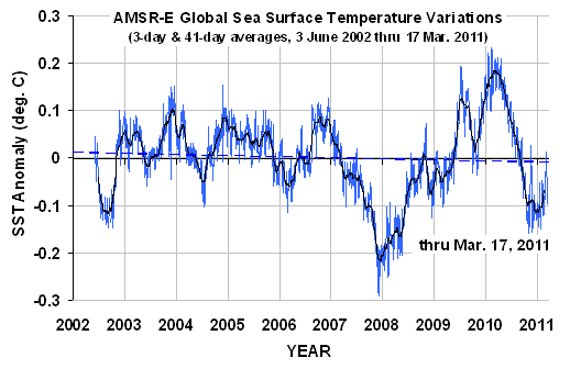
UAH reports that sea surface temperatures were 0.12C below normal.


Just when I thought NOAA were actually coming back to reality…
Almost no ice loss in April either!
There is another pole you know. If you’d read the report you’d have seen the following:
“The average Arctic sea ice extent during March was much-below average, ranking as the second smallest March on record, behind March 2006. On March 7, Arctic sea ice reached its annual maximum extent at 5.65 million square miles (14.64 million square kilometers), tying with 2006 as the smallest annual maximum extent in the satellite record.
The March 2011 Antarctic sea ice extent was 16.2 percent below average and was third lowest for March since records began in 1979.”
That’s rich Phil. Antarctica gained ice in March and has been above normal all but a few weeks of the last two years.
http://arctic.atmos.uiuc.edu/cryosphere/IMAGES/seaice.recent.antarctic.png
According to the graph you showed it’s been below normal all of 2011!
Phil, lets put our thinking caps on. The seasons are reversed in the southern hemisphere. Its suppose to be lower from Jan1- to the present than the mean. Presently, as the sine-wave indicates, antarctic ice is starting to grow.
Look at the sine-wave. Now let’s all run around and scream “the sky is falling”.
According to the graph you showed it’s been below normal all of 2011!
=======================================
Phil, I have a vested interest in this…
…I bought stock in Depends
That said, I hate to burst your bubble, but it will go above and below that line, every year, it’s called summer and winter.
…and no two years will ever be the same
Phil:
You seem to be a follower of the MSU Crowd. You know the ones that Make Sh## Up to support their agenda. Thirty years of satellite records do not even represent long term weather in those regions and the “Upgrades” to the equipment and methods makes the reports even more meaningless. Anecdotal records from sailing ships in the 1800s are more reliable!
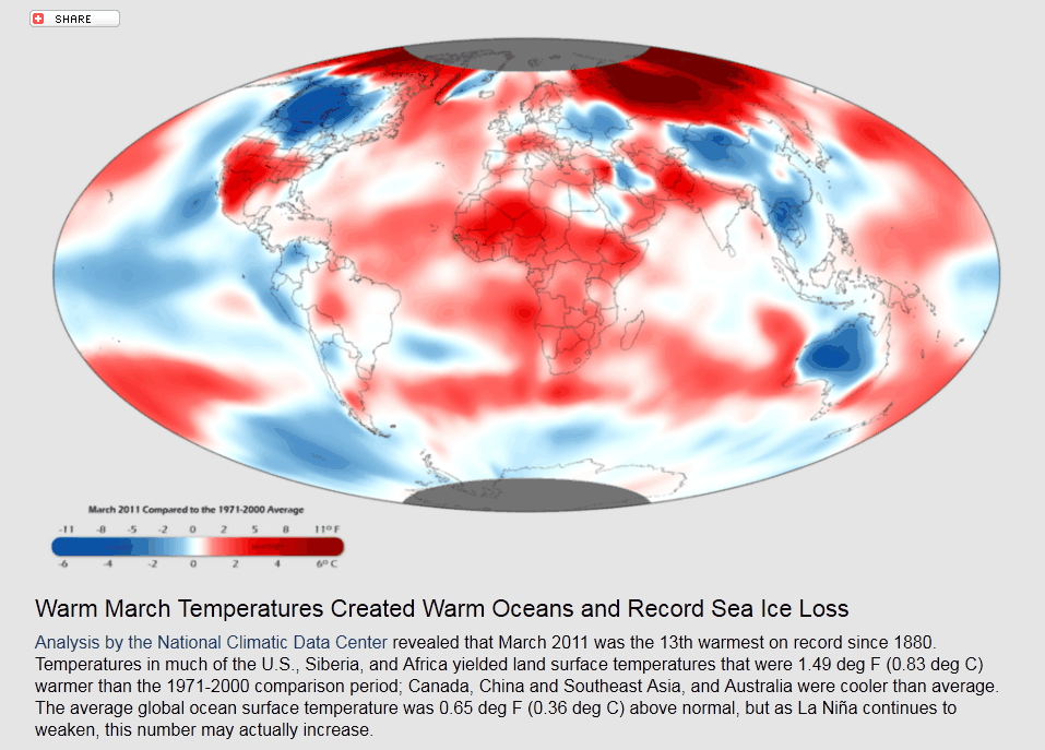
The intersting thing about your comment, Phil is that according to the NOAA map shown above, the Antarctic is largely colder than normal.
Funny how Phil is not talking about rotted ice in the Arctic. He’ll probably wait until August and September to bring it up as he links to a picture of low concentrated ice—leaving the impression that it had never happened until manmade global warming came along.
So since Arctic ice isn’t currently doing what he’d like it to do he talks about Antarctic ice. Pathetic huh, just like everything else in ‘global warming’.
Phil
Heyy! You finally bring up the South Pole. And what a perfectly cherry picked time to do it!
No, Steve brought it up it’s in the article that he wrote the post about, hint they referred to sea ice, not Arctic sea ice which is what Steve focussed on!
sure Phil
Re Phil “There is another pole you know. If you’d read the report you’d have seen the following: . . . .” The Antarctic sea ice loss is so scary! Or not so much.
If you’d looked-up these authoritative sources . . .
http://www.iup.uni-bremen.de:8084/amsr/ice_ext_s.png
and
http://arctic.atmos.uiuc.edu/cryosphere/NEWIMAGES/antarctic.seaice.color.000.png
and judged for yourself – instead of just accepting some alarmist bozo’s words on the subject – you would see that the Antarctic is really not too bad.
Bear in mind too that that Sea Ice EXTENT is a ppoor indicator. Most sea ice extent graphs include sea with only 15% coverage. So a year with a lot of very poor ice floating over a large extent of sea (i.e. ice breaking-up); could look better (on paper) than a year (such as 2011 in the Arctic) when the sea ice is strongly coherent.
Phil, I’m skeptical of anything that starts measuring in 1979…
…reasons being, these guys can’t predict the future and can only extend trends,
and 1979 starts when they were predicting an ice age…
….because the trend was more ice and colder
“third lowest for March since records began in 1979”
Which means that two times it was lower….
…which means that while CO2 levels have risen, it has not gotten warmer, ice has not melted more….
…
Globel warming is a joke to say the Least. 3,500 Scieniest say globel warming is a bunch of bull and 500 say it is good to say. The 500 get money grants to study the made up problem !
If the planet went up 1 degree all the deserts would staret to turn into rain forest ! Also the ability to grow crops would tripple. that means there would 3 times the food on the planet for people to eat. we could never have that.
Phil, if you would care to look at the most recent sea ice extent for the artic, you would see the sea ice extent is rapidly gaining relative to previous years. It is now only 5.5% below the 1979-2000 average. If the current trend continues, the arctic ice extent will make it all the way back to the 1979-2000 average by end 2011. I see you plan on going down with the rapidly sinking AGW ship rather than head for the nearest lifeboat.
Which current trend had you in mind, care to provide a graph?
CT’s most recent update has it at 4.2% below the average. However, unlike you I’m expecting that number to get much further below average within a few weeks and stay there until at least November. More older ice will need to be present to see it stay this close to the baseline throughout the warmer months.
-Scott
Has Hansen had a chance to take his “interpret” the SST chart? After he is thru with his coloring book, the water will be broiling!
Wow that weird, the cycle for alarmism and disinformation over the antarctic should have started weeks ago.
I was wondering too why South Pole ice alarmist weren’t jumping all over the graphs starting in January.
Maybe they’re finally realizing that people are catching it when they switch their statements. In the past, they’ve said the Antarctic didn’t matter (because it was increasing and/or higher than “normal”). So now that it’s finally fitting into the CAGW paradigm, they can’t use it to their advantage because they’ve already said it’s unimportant.
-Scott
It seems they move in packs. They don’t seem to point out anything independent of the groupspeak. If one of the big names in alarmism was to drop a hint about an Antarctic graph they would rush in. Then that’s all we’d hear about for a couple weeks.
suyts says:
April 17, 2011 at 5:27 pm
Phil, lets put our thinking caps on. The seasons are reversed in the southern hemisphere. Its suppose to be lower from Jan1- to the present than the mean.
No it isn’t, the red line shows the deviation from the mean, contrary to Steve’s assertion: ” Antarctica ………. has been above normal all but a few weeks of the last two years.” the graph which he cited shows that Antarctic sea ice extent has been below normal for all of 2011.
Latitude says:
April 17, 2011 at 5:43 pm
According to the graph you showed it’s been below normal all of 2011!
=======================================
Phil, I have a vested interest in this…
…I bought stock in Depends
That said, I hate to burst your bubble, but it will go above and below that line, every year, it’s called summer and winter.
Ask explained above no it won’t, that mean curve accounts for seasons.
…and no two years will ever be the same
That’s true and this year has so far been consistently below average.
2011, yes. Last 365.25 days, not even close. Of course, it’s been below average a lot more than a “few weeks” too…unless we’re talking average as the norm +/- a SD or two or something.
-Scott
Who knows what the average really is? If we make an average of the satellite years it only goes back to the 70’s. There was less ice in the Arctic for most of the last 9000 years than the satellite years.
Arctic sea ice extent at the end of the 20th century was more extensive than most of the past 9000 years.
http://wattsupwiththat.com/2010/09/23/surprise-peer-reviewed-study-says-current-arctic-sea-ice-is-more-extensive-than-most-of-the-past-9000-years/
So the average for the space age satellite era is useless for determining what is normal and average. In comparison to the big picture of the last 9000 years the average for the years since the 70’s would be higher.
Phil,
You didn’t look at the link Steve posted, did you?
http://arctic.atmos.uiuc.edu/cryosphere/IMAGES/seaice.recent.antarctic.png
Coldest March on record in Australia
http://www.bom.gov.au/climate/current/month/aus/summary.shtml
Why is the satellite not showing this for whole country
All of these arguments aside, we were not supposed to have Ice Caps at all since 2002, the warmers just keep changing their dates when things don’t work out for them.
http://news.google.com/newspapers?id=CZJVAAAAIBAJ&sjid=9z8NAAAAIBAJ&pg=1156%2C1812228&dq=james-hansen&hl=en
Here’s some date moving.
http://www.facebook.com/l.php?u=http%3A%2F%2Fblogs.news.com.au%2Fheraldsun%2Fandrewbolt%2Findex.php%2Fheraldsun%2Fcomments%2Fgore_and_his_fellow_alarmists_are_on_thin_ice%2F&h=ad997
At least they cut their funding to spread their lies on that planned website.
I say this decade puts an end once and for all ,about the global man made warming, co2 nonsense.
I am monitoring the following which I conclude control earth’s climate,and if certain parameters are attained or exceeded with these items ,and duration is long enough ,and magnitude strong enough ,then this will be the decade of global temperature’s trending down.
PARAMETERS VALUES
solar flux mostly 100 or lower(85% of time) with
spurts to 160 or higher at times.
ao/nao mostly negative (60% or more of time)
values -1.0 or greater
soi oscillation mostly La Nina state,sea surface -1.0c
or more.( 65% of the time or more)
pdo/amo cold phase avg -1.0c or greater
volcanic activity above normal ,especially high lat.
volcanic activity. one or two
with an explosive index of 5 this decade.
The above will then lead to more snow cover,cloud cover,precip. which will serve to increase earth’s albedo ,this especially applies to the N.H. (due to geographical considerations) which in turn will reinforce a more -AO ,a positive feedback for cooling, while the earth’s overall albedo increase, will further the temp decline.
I challenge anyone to prove me wrong.
I’ve pointed out before that insofar as the 2001 to 2010 period is reported to have been warmer that the use of these data for calculating the commonly used 30 year “normals” would be inconvenient. Now in 2011 these years (2001 through 2010) should be tacked on and the 1971 to 1980 years removed. That’s how things were done prior to this irritable climate syndrome.
Note that the pretty map at the beginning uses a “comparison period” of 1971-2000. Do they do this because their computers are so slow they have yet to produce the new “normals”? Or are they wanting to hide the truth?