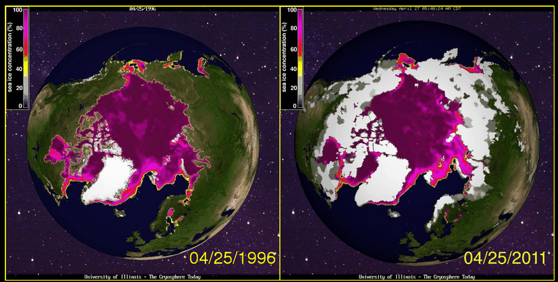
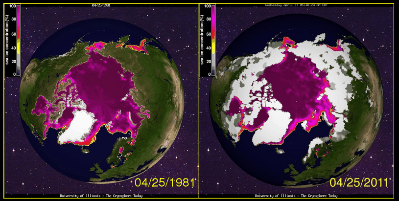
Arctic ice extent almost exactly the same as 15 years ago. And 30 years ago.
Disrupting the Borg is expensive and time consuming!
Google Search
-
Recent Posts
- Analyzing The Western Water Crisis
- Gaslighting 1924
- “Why Do You Resist?”
- Climate Attribution Model
- Fact Checking NASA
- Fact Checking Grok
- Fact Checking The New York Times
- New Visitech Features
- Ice-Free Arctic By 2014
- Debt-Free US Treasury Forecast
- Analyzing Big City Crime (Part 2)
- Analyzing Big City Crime
- UK Migration Caused By Global Warming
- Climate Attribution In Greece
- “Brown: ’50 days to save world'”
- The Catastrophic Influence of Bovine Methane Emissions on Extraterrestrial Climate Patterns
- Posting On X
- Seventeen Years Of Fun
- The Importance Of Good Tools
- Temperature Shifts At Blue Hill, MA
- CO2²
- Time Of Observation Bias
- Climate Scamming For Profit
- Climate Scamming For Profit
- Back To The Future
Recent Comments
- Bob G on Analyzing The Western Water Crisis
- arn on Analyzing The Western Water Crisis
- Bob G on Analyzing The Western Water Crisis
- Bob G on Analyzing The Western Water Crisis
- Bob G on Analyzing The Western Water Crisis
- Hank Phillips on Analyzing The Western Water Crisis
- Hank Phillips on Analyzing The Western Water Crisis
- Hank Phillips on Analyzing The Western Water Crisis
- Hank Phillips on Analyzing The Western Water Crisis
- Bob G on Analyzing The Western Water Crisis


If you close your eyes and imagine you can see a death spiral.
Try other months.
Try 1995! http://igloo.atmos.uiuc.edu/cgi-bin/test/print.sh?fm=04&fd=22&fy=1995&sm=04&sd=22&sy=2011
Exactly. April is not the month of interest. Late sumer is.
http://igloo.atmos.uiuc.edu/cgi-bin/test/print.sh?fm=09&fd=22&fy=1980&sm=09&sd=22&sy=2010
Daniel Packman says:
May 1, 2011 at 4:51 pm
Try other months.
You mean keep trying and trying every possible combination until it finally has a resemblance to what you wish it would show then call it ‘global warming’?
No, focus on summer ice extent since that is what is relevant.
I’m having a hard time finding any maps of summer 2011 ice extent. Maybe you can help me out?
Daniel Packman says:
May 1, 2011 at 7:31 pm
No, focus on summer ice
Bang up idea. Do you have data for summers during the Medieval Warm Period?
I bet you don’t. Coz I bet I know what you are going to talk about, just a wild, uneducated guess: You want to talk about the last 30 years, the satellite data, and exclude EVERYTHING ELSE.
Am I in the ballpark? You’re not cherry picking, right?
Daniel Packman
You must be very new to all this. The summer ice thing you are bringing up has been covered over and over. There has even been people from the NSIDC exchanging comments both here and at WUWT about it.
MWP saw much more ice melt.
“The degree of summer melt was significantly larger during the period 1130–1300 than in the 1990s. “
http://www.agu.org/pubs/crossref/2006/2005JD006494.shtml
If you are interested in AGW, then you don’t cherry pick a single decade, you look at 150 years or so. You also don’t isolate yourself to a single location.
Would you like to talk about the Medieval Warm Period Daniel? Or do you just want to parrot your propaganda?
BTW Daniel, which “decade” are you talking about?
The “medieval warm period” is difficult to quantify in size and locality. In addition, it is a different time scale than that of interest in AGW. There are lots of arm chair scientists who like to do their entire “research” by looking at graphs and making unwarranted conclusions. Here is a compendium of different temperature measures over the last 2000 years. Using just this plot, an entire book of unsupportable conclusions can be drawn.
http://en.wikipedia.org/wiki/File:2000_Year_Temperature_Comparison.png
You are just a font of propaganda aren’t you Daniel.
Where do they get close to 1 million Sq Km below normal from?
http://arctic.atmos.uiuc.edu/cryosphere/IMAGES/seaice.anomaly.arctic.png
The ‘normal’ for the day is the average from 1979-2008:
which for the most recent day on their website is 12.73 whereas today it is 11.75 which means that today’s sea ice area is 0.977 million sq km below the average for the day. 30 years ago today it was 13.17, 15 years ago it was 12.41.
@ D Packman re “Here is a compendium of different temperature measures over the last 2000 years. Using just this plot, an entire book of unsupportable conclusions can be drawn. http://en.wikipedia.org/wiki/File:2000_Year_Temperature_Comparison.png”
Haven’t I seen this before somewhere? Something to do with “hide the decline”?
Six of the 11 referenced temperature plots are by The Hockey Team namely Jones, Briffa, Mann and Hadley-CRU. (Academic in-breeding!)