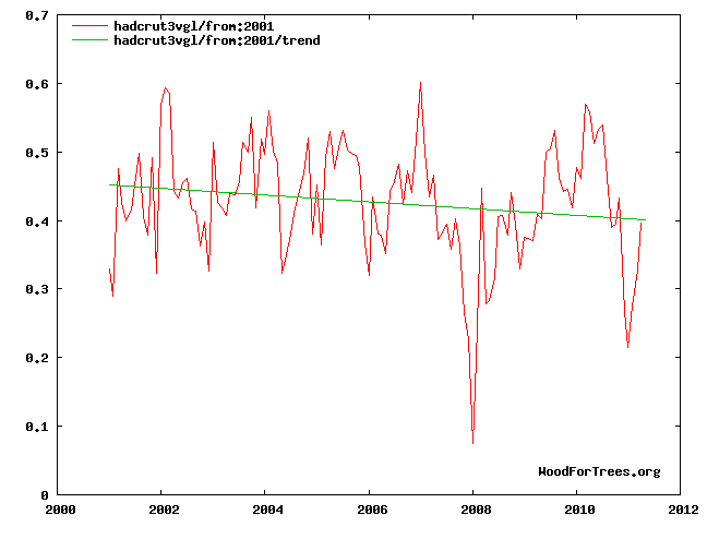
There is no mystery or guesswork about the cause of recent global warming – it can be directly measured. Satellites observe less radiation escaping to space at those exact wavelengths that carbon dioxide absorbs radiation. Less heat escaping to space means more heat returning to Earth and this is confirmed by surface measurements.
Currently, Greenland is losing 300 billion tonnes of ice a year. Over the same period, Arctic sea ice has been thinning and melting, glaciers have been shrinking at an accelerating rate and seasons are shifting due to warming temperatures.
There is no mystery or guesswork that Cook is clueless. There hasn’t been any recent warming, despite Romm’s “super-exponential” growth in CO2 over the last decade.
Temperatures have been rising more slowly than Hansen’s low-emissions scenario C. Can these clowns please give it a rest?
http://pubs.giss.nasa.gov/docs/1988/1988_Hansen_etal.pdf
http://data.giss.nasa.gov/gistemp/tabledata/GLB.Ts+dSST.txt


“Currently, Greenland is losing 300 billion tonnes of ice a year.”
Someone needs a computer.
Not really – he calculated that based upon the temperature of the interior of the earth (being millions of degrees).
I think the caption for scenario C is not correct. It should have read-
“Scenario C assumes that human civilization never industrialized, and CO2 levels remain at 300 ppm.”
Or the caption for Scenario C could even have said:
“Scenario C shows we had no idea what we were talking about and around 2011-2012 we will need a new crisis. Ice age anyone?”
Dr. Makiko Sato did it for you: http://www.columbia.edu/~mhs119/Temperature/T_moreFigs/PNAS_GTCh_Fig2.pdf
Regards
Pavel
Data after 1999 have already be adjusted, per Hansen’s red/pink crayons. 97% of climate scientists plus the Washington Post agree that ten of the last eleven years have been the warmest ever. So it must be so.
Also data before 1979 is not reliable and has been appropriately adjusted. The Dust Bowl, the Medieval Warm Period, the Roman Warm Period are all based on fables from primative savages and can’t compare with the Super-Exponential man made warming that is now taking place.
“Satellites observe less radiation escaping to space at those exact wavelengths that carbon dioxide absorbs radiation.” Johnny Cook
Is this true because I heard that this is not the case?
Also where is it that seasons are supposedly shifting?
IR emission spectra show dips when measured above the equator, but they show peaks when measured above the Antarctic. So, CO2 optically active bands lead to a net decrease of IR emissions near the equator, and a net increase of IR emissions near the poles. This, of course, says nothing about total absolute IR emissions, since we still do not have sufficiently accurate measurements to detect tiny trends in massively variable signals.
Check near the bottom of Hans Erren’s post here-
http://members.casema.nl/errenwijlens/co2/howmuch.htm
@ Andy Weiss
I think they said eleven of the last ten years were the hottest ever.
Your obsessions with minor nations digs you out as being a putz.
then why is Mt Shasta’s glaciers growing, it is further south than Greenland? And exactly how many of the more than 130,000 glaciers in the world shrinking?
then why is Mt Shasta’s glaciers growing, it is further south than Greenland? And exactly how many of the more than 130,000 glaciers in the world are shrinking?
I notice the article says
“Rather than use temperature records that cover the entire globe, he opts for datasets that do not include the Arctic region, where warming is the strongest.”
Than, surely, your first graph shouldn’t be using the HadCURT data – which falls fowl of exactly this point. You point would be made much stronger and more damning if the first graph used data that included the arctic region, no?