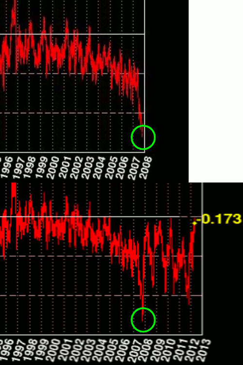
Cryosphere Today has so far managed to show Arctic ice just barely below “normal” this month. But there appears to be something wrong with their graphs. The blink comparator above flashes between their 2007 version of the sea ice area graph and the 2012 version. Note how they have increased the area of all dates to the left of the 2007 minimum, but not the 2007 minimum itself.
Depending on how they are handling the dates after 2007, this could potentially be causing older dates to be shifted upwards relative to recent dates.
If it was simply a baseline shift, the 2007 minimum should have moved upwards too – but it didn’t. Something isn’t right about this.


The first graph shows the anomaly up to the point of the 2007 annual minimum. However, the maximum negative anomaly that year was during the start of the re-freeze, a few weeks after the annual minimum. It’s not surprising therefore that it’s not shown on the first graph.
That isn’t going to fly. Both graphs show the identical maximum negative anomaly in 2007..
No they don’t.
Or rather, only to within the tolerances of an extremely coarse resolution graph.
Try it the other way round. Align the pre-2007 data from the two graphs. You will find that they overlap exactly, allowing for the fact that the later graph, well, continues on later.
And you can scratch the “or rather”. The minima and maxima in both versions of 2007 are clearly different.
(additionally, there was a baseline shift in ~2010 when they extended the period for calculating the average)
The graph indicates anomalies from the 79-08 mean. The lower amount of ice in 08 would have lowered the mean value,thus making all values appear higher compared to the mean in the more current graph. Values relative to each other appear to remain the same.
No. The whole point of this article is that 2007 minimum didn’t shift.
Look closer. Even my eyesight can make out a difference.
In fact, verify it yourself. Here’s the numerical data.
http://arctic.atmos.uiuc.edu/cryosphere/timeseries.anom.1979-2008
1) Make a graph from 1979 through to the 2007 September minimum. This will exactly overly the earlier graph – you may have to shift it up or down a bit as I’m not sure what baseline they used back then.
2) Make a graph of all the data. This will exactly overly the more recent graph.
3) Stop making your commenters do your work for you and look at the actual data before shooting your goddamn mouth off.
Steven – there is a way to stop this cat-and-mouse saga. First of all, whenever there is something strange you should send them an email and give them 2-3 days to respond. Otherwise they will always have their GOOHF card, “It’s those petulant skeptics, they should have asked first”.
Secondly you know, I know, they know and everybody with a minimum of scientific knowledge knows that the current Arctic ice extent IS exactly identical to the 1979-2000 baseline, whatever that is. A few sq km more or less than the published baseline mean nothing at all, since it’s all a matter of averages of estimates of observations from far away.
And as a corollary, the 1979-2008 climatology is far below the current level.
It seems to me that defining temperatures, climate and sea ice by anomaly creates………anomalies!
Defining temperatures, climate and sea ice by raw data creates …… normality!
Creating normality …………….defunds climate change / wierding scientists!
Defunding climate scientists makes……… total fools / charlatans of gullible / disingenuous politicians!
Won’t happen.
If the baseline average has changed, todays average 79/08 should be lower than 79/00 average.
So 2007 min should be closer to the average baseline 0.
Goal posts……
YEP! Goal Posts! Or are those Ghoul posts.
I have been suspicious of Cryosphere’s depictions for a few years. In browsing their history, I found, that 2004 had NH snow intermittently shown, and by 2005, they showed it full time. It seemed to my eye that the arctic basin was smaller with the new snow coverage. Comparing the old snow-less shoreline by overlaying it on the snow image reveals an encroachment on the shoreline, into the sea basin. Coincidentally, this is concurrent with a step function change in NH ice levels, that matches by pixel count the area of lost basin encroached on by the depicted snow. http://i44.tinypic.com/330u63t.jpg
Everywhere you see white, it is lost sea area.
In the last couple of years, the image has changed again, viewing the earth over the pole from a closer perspective, exaggerating the size of the polar ice relative to the diameter of the earth. Steve G., I believe you and I had some disagreement over this last point, it may have been a couple of years ago.
Steve, I went through some old CT files to see if I could find two to compare as you show above. I found this graph, stored 5/2/09, that shows the exact same thing. It appears they rewrote the past by the time I stored this. I would assume I got it from a WUWT posting or commenter. http://i45.tinypic.com/2j15y0n.jpg
In 2008, I had noticed that CT had the policy of changing its baseline each year. I had an emal exchange with William Chapman who managed the site at the University of Illinois. We discussed why a baseline needs to be a BASED line, that is, one that did not change. After reviewing it with the CT staff, the CT staff established the baseline as ending in 2008. They also said that this worked well since a thirty year period has been used in climatology for other baselines. If you notice, NSIDC uses a baseline that ends in 1999, and is only 21 years long.