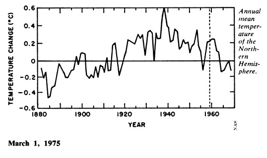
In 1975, the National Academy Of Sciences produced this graph of northern hemisphere temperatures, which had been plummeting since the 1930s.
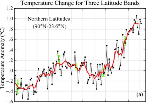
Hansen has since altered the northern hemisphere temperature record to look like this.
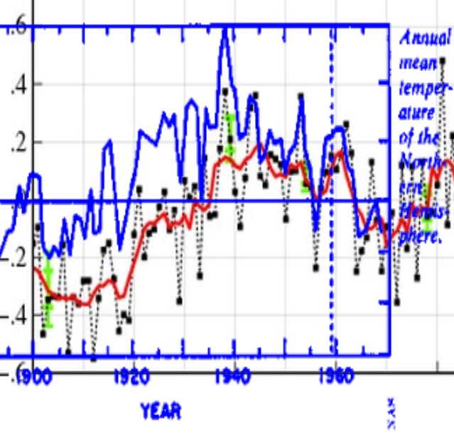
The difference between the original uncorrupted data (blue) and Hansen’s altered data is seen below. Hansen cooled the past in order to hide the warmth of the 1930s, and the cooling from 1940 to 1970.
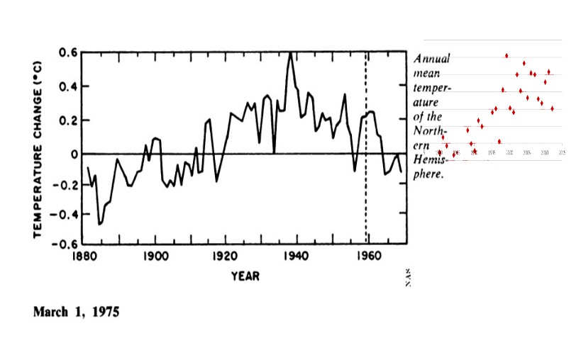
The graph below shows RSS satellite data for the northern hemisphere (red dots) tacked on to the end of the NAS graph – at the same scale on both axes. Before Hansen tampering, there is no warming since the 1930s.


Thanks for pointing out the fraudulent nature of what has been fed to the public. Keep up the good work.