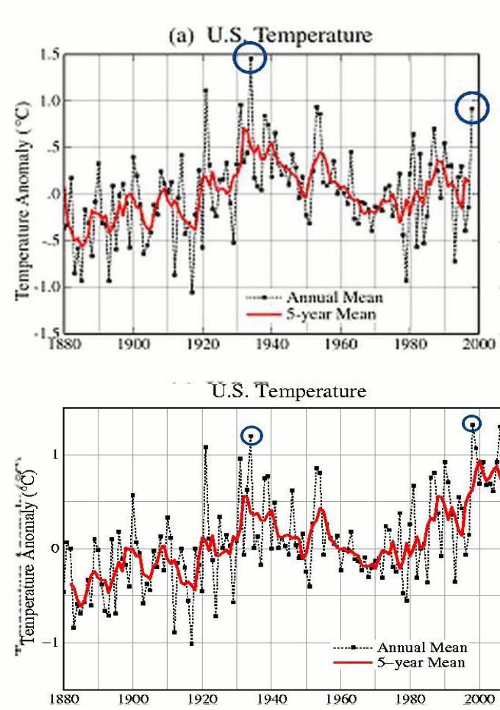
Check out this rant on Deep DoDo Climate
But it turns out that Taylor’s source is none other than hapless climate blogger Steven Goddard, who recently leveled incoherent and unsupported false accusations against James Hansen and NASA’s Gistemp record, as well as NOAA. Goddard also relies on the same reviled NOAA data in his botched attempt to buttress his case that NASA is “hiding” an 80 year cooling trend. Never mind that the U.S. “lower 48? represents less than 2% of the Earth’s surface area in any event, or that past attempts to show U.S. cooling have been proven utterly wrong.
But Tale is a PhD thesis compared to Goddard’s recent outings. The first link above points to a Goddard post exposing some supposed “corruption” of the NASA Gistemp temperature record by “Hansen et al”. Goddard posts a blinking graph purporting to show substantial post-hoc changes in the 20th century U.S. temperature data. But there are no explanations of which data sets are being compared, so there is no way to even tell if they are equivalent, or represent different stages of processing.
A little bit desperate are we? The blink comparator shows Hansen’s 1999 version of US temperatures and his current version of US temperatures. The hydrophobic nitwit who wrote the article is admitting that the warming trend is the result of “processing”- but isn’t bright enough to realize that he just stepped in a big pile.


Say what? You’re using Hansens own graphs. Deep Morons, apparently
LOL….you go!
ddep climate and john mashey,…. gifts to skeptics
…so there is no way to even tell if they are equivalent, or represent different stages of processing.
Wow. Just wow.
Isn’t that the point – that it appears Jim (Madman) Hansen has manipulated temperature data to produce an artificial, imagined warming trend; oh excuse me, the data has been subjected to “different stages of processing” to produce an .artificial, imagined, warming trend.
Hansen is not only manipulating land-based temperature data via continual “adjustments” (dropping many 19th century temperatures and bumping up recent readings), but also failing to adjust for the urban heat island (UHI) effect. If he accounted for urban heating, temperatures in many areas would show a sharp decline.
Isn’t it coincidental that GISS adjustments always result in an upward movement in temperatures, thereby confirming the CO2-is-heating-the-planet hypothesis?
The AGW myth will long be remembered as the greatest scientific fraud ever perpetrated on humanity. It needs to be given a decent burial before more billions of taxpayer dollars are wasted.
The warm period of the 30s wasn’t present only in the lower 48. It was thru-out North America and The Arctic. I’ve also seen records set in Scandanavia and Russia in that period. Dr. Richard Keen had these numbers on Icecap a few years ago. But nitwits don need no steeenkeen data.
And when you have such a large geographical area as I just described all communicating that high, you then must recognize these areas are surrounded by oceans for which we have nearly no information. Given the obvious connection between continental and ocean temps, are we to believe the oceans were exceptionally COOL in that period?
So, in their story, a high pressure cell sat over the lower 48 for A DECADE?
Here’s Keen’s post I was thinking of:
http://icecap.us/index.php/go/new-and-cool/more_critique_of_ncar_cherry_picking_temperature_record_study/
Read it and weep, Oh Climate Komrades.
Look also at this piece of con-artistry from NCAR
http://icecap.us/images/uploads/HIGHLOWNCAR.JPG
Keen notes how they omitted the warmest part of the record to deceive with this chart, making some of these record highs NOT records at all when considered within the context of the entire data set….
But as I recall, they also deceive by showing only a ratio of high to low, when in raw qty of incidents of highs, the trend was declining. Restated, the number of highs that comprise the last few bars is a much smaller number of incidents than the earlier bars. (That’s my recollection of the underlying data) I think WUWT had the whole report from NCAR.
But by expressing this only as a ratio, it deceptively creates the impression of an increasing trend.
Here’s a quote from an oft-cited article by Willett (1950), p. 195:
Also (p. 198):
That “deep” blogger is a bit of a loon.
Steve, Do you think that by ‘different stages of processing’ he means that one is the processing done in 1999, and the other the processing done in 2012?
I gues that because we know what the answer is, we have to keep processing the data to accurately reflect that answer? Post hoc ergo propter hoc indeed.
http://stevengoddard.wordpress.com/2012/06/22/if-the-data-doesnt-match-the-theory-change-the-data/
Shame on you, Steven. Didn’t your mama teach you it’s not nice to pick on mental quadraplegics?