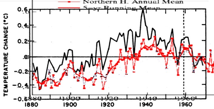
I extracted the GISS Northern Hemisphere graph which wooltwat wanted to see. The graph above overlays GISS NH on the National Academy of Sciences 1975 graph, normalized to zero. (Note that there is some non-linearity in the Y-axes of both graphs. I plotted both of them exactly as they were drawn, with identical scales.)
It is even worse than the original version. Be careful what you ask for.


Excellent work Steven.
Thank you. Alarmists find idiotic details to nitpick about, without even bothering to think through the implications, or lack there of
Also finding that weather is unpredictable and has been within normal bounds recently is not very exciting, well not for Hansen et al.
Yeah but Mosher says Steve doesn’t understand the data 🙂
Which set of data is he talking about? Hansen radically changes the data all the time – but apparently all versions are equally as accurate.
Wooltwat. Eh, hehheehjh, hhehh. I chuckle approvingly. Heh.