Four years after my infamous battle with Walt Meier at The Register, I have found the evidence that I was correct all along. It was right under my nose.
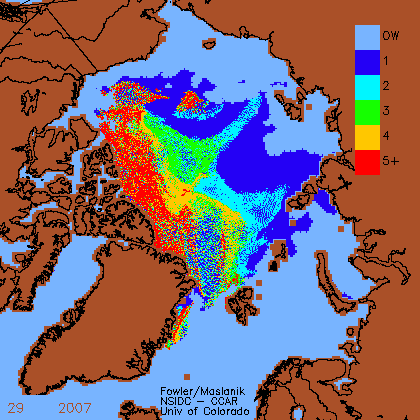
In 2007, NSIDC published this map for week 29 (the current week)
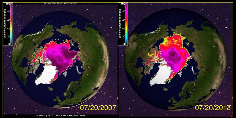
This agrees very closely with the Cryosphere today map for 7/20/ 2007.
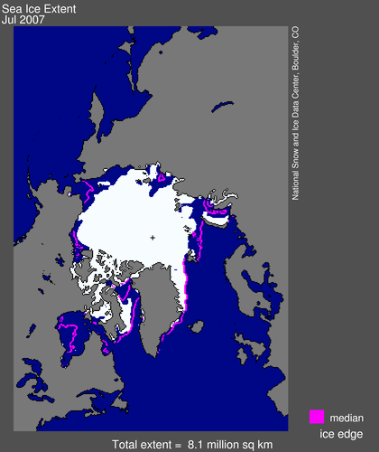
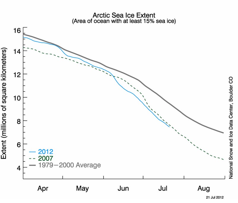
But it doesn’t agree at all with the official NSIDC extent map from July 2007
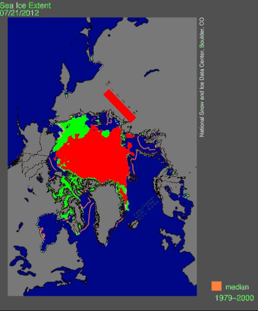
I flattened and overlaid the Fowler week 29 2007 map (red) on the current NSIDC map (green) and guess what – there is a lot more ice in 2012 than there was on the same date in 2007.
Something is wrong with the NSIDC database. They show more ice in 2007, and that is simply not correct. Their own map proves it.
Walt Meier was trying to get me to take the blame or pin the problem on CT, but it looks like NSIDC was at fault. There is a lot more ice in 2012 than there was on this date in 2007.
Here are two satellite images which confirm that the ice edge was several hundred miles further north in 2007

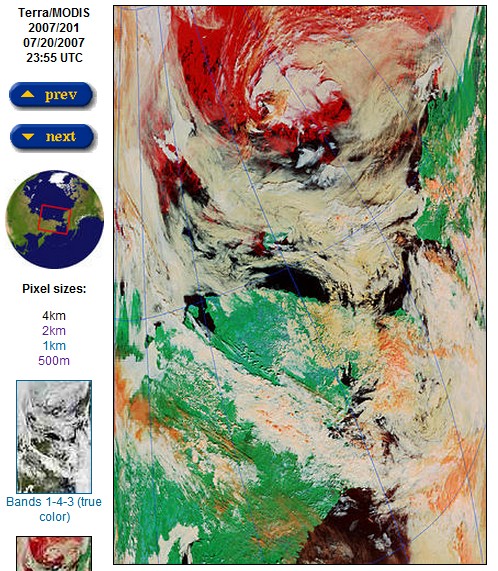
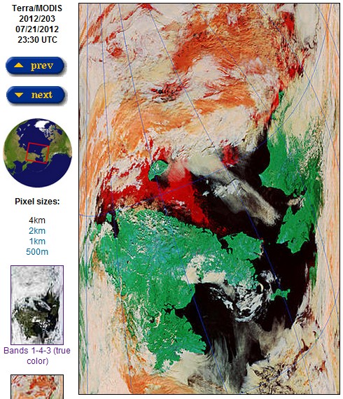

Maybe they work with a higher resolution now and confuse small melt ponds that they couldn’t see before with open sea. Last year the warmists of Bremen proudly announced record low arctic sea ice detected by their new improved algorithm this way, a week before the satellite conveniently failed.
No, that doesn’t have anything to do with it. Something is messed up.
I wonder what the NSDIC see ice extent map looked like back in 2007? I mean have they done a ‘homogenisation’ exercise on it.
The NSIDC map sequence is labeled ‘oldice’.
How is ‘oldice’ defined?
It seems to me that might explain the difference.
No, everything that is not open water is colored in
Thanks Steve for addressing this problem, wondered what was really going on.
Hey , who you gonna believe , the NSIDC or your own eyes ? Thank you Steven , you keep nailing them.
Question. Isn’t the NSIDC map the median for the whole month of July? Comparing a day with the monthly median is kinda apples to oranges isn’t it?
Pleeeeeeeeezzzzzzzzzzzzzzzzzzzzzzz…………………………….
The NIC has a graph for daily extents. It has been showing extent values under 2007 for the last month, but what is interesting is the weekly graph. It shows 2012 above 2007 the whole time this year.
http://www.natice.noaa.gov/products/ice_extent_graphs/arctic_weekly_ice_extent.html
Didn’t realize the perfect overlay of the date on the graph above. Tired eyes.
While it would be improper to attribute any single event to Catastrophic Anthropogenic Global Warming alarmism; frequent fluctuations in past climate data is both consistent and what we have come to expect with regards to Climate Change.
Gold. Pure gold.
The hippies are long-past masters of manipulation and lying.
Consider politics, where memory lasts from days (media for the Dems), to weeks at most (media for the GOP). Periodically they will note that some GOP candidate had a traffic ticket when he was two years old on his tricycle, and ignore the weed-head, serial fornicating, Dem candidate who was a liar and a thief.
In other words, the hippies get people to discount discrete comparisons. It is by playing into THEIR game, this practice of lying, this thing that IS ‘debating’ that the modern churches have become irrelevant, that science has become so corrupt that only a fool will still listen to ANY ‘scientist’ spouting off on any subject. That the world is moments away from sliding fully into dictatorial socialism.
All that is now left is the individual examination of every single claim. I.e. the utter end of the concept of ‘professional opinion’, especially of ‘scientists’. One does have to wonder if civilization will survive this, the greatest and most terrible of the corruptions wrought by the hippies.
The price of freedom (and science, as it turns out!) was vigilance unending. Not necessarily readiness to decapitate hippies (which would have been a thing of great beauty and awesomeness), but to look, to see, to know… TO REJECT where necessary. There is error, and there is lying: unfortunately, nobody (i.e. the public) cares anymore about the DIFFERENCE. Which is simply this: errors are rejected and corrected – whereas liars are rejected, along with EVERYTHING of theirs – while perhaps a cruel and hard thing, this was necessary to maintain the integrity (and the public’s assumption of trustworthiness) of the products that scientists produced.
In this I may be mostly alone here, but all these lessons which (some few of) you are learning in regards to AGW, many others learned a long time ago about Evolution. And I am not talking about ‘alternate’ ‘theories’, I am talking about the blatant filth that is an evolutionary scientist. Their ‘science’ does not exist, except as matters of truth-by-definition, except as conflations (esp. correlation as proof-‘evidence’), except by disregarding the essential philosophy of falsification and the like (i.e. having to actually PROVE anything). This is however important, since a bedrock assumption in those ‘debates’ was that of honesty of the scientists. This will be a point from which Christians will forever break with ‘science’, should enough of them become aware of it. Reason, not science. Truth, not lies. And the rejection of liars.
What has been done cannot be undone, unfortunately. Given that it is now incontrovertible that scientists are, speaking in general, worthless filth, and therefore cannot be entrusted with the task of correction.
And so everything turns to dust: order is a hard thing to tear out of the universe – corruption (decay) is easy, and mostly a harder thing to undo than to simply re-do from scratch.
If there is a thing in this world more corrupt than a hippie-leftist, I am unaware of it (the elites are uber-leftists, example Keynes).
Hey cb , I have to agree with your assessment as I’ve long held that evolution is a theory and not a very good one . Another theory I’ve come to disagree with is the base idea of dateing by gases in rocks and their supposed rate of decay. No , I don’t think the earth was created in 4004 bc or whatever either. I doubt though the wild speculations of millions and more years . It’s just speculation on the part of those making the claim. Carbon dating has been shown to be fairly effective and it goes back something on the order of twenty thousand years or so. Beyond that the dating game is speculation.
Like maggots, the hippies abused the integrity of science: they fed off it, they used it for their social-restructuring purposed. What is now left is a great big pile of hippie-excrement.
Science is not so much dead, as it is shit.
This is what NOAA says it looked like 20/07/2007 and it is clearly starting to break up at the edges.
http://www.natice.noaa.gov/pub/ims/ims_gif/ARCHIVE/AK/2007/ims2007201_alaska.gif
Thanks. That map is almost identical tot he Cryosphere Today map.
No it’s not, it’s much closer to the NSIDC map. Overlay them.
In regard to the body of your post, here are some inconvenient facts:
1) In 2007, the NSIDC ice age product used a threshold of 40% – it was not revised to use a 15% threshold until 2011.
2) Cryosphere Today images use a threshold of 30% – this is sadly not mentioned on the main image pages, but is however highlighted on the bottom of their comparison page.
It’s thus not particularly surprising that these agree well with each other, and disagree with the main NSIDC extent image, which uses a threshold of 15%.
So, the conclusion is that in 2007, in mid-July there was a substantial expanse of ice at concentrations between 15% and 30%, and a core at much higher concentration. In contrast, in 2012, there is a wider expanse of ice at middling concentrations (say 30-70%). This in consistent with the weather and wind patterns: 2007 had those strong southerly winds compacting the ice towards Greenland, leaving a diffuse field of 15-30% ice in the wake of the retreating ice edge. This year has had no such compaction, and in situ melt has left vast areas of fragmented ice at intermediate concentrations.
Peter,
There is a lot more ice in 2012.
So, it appears from what Mr Ellis says that NSDIC are comparing apples (15%) with oranges (40%)on their Arctic Sea Ice Extent graph?
No, the graph compares 15% in 2007 to 15% in 2012. Steve has got hold of some 30% / 40% graphs from 2007 and is trying to use these to prove that the graph is wrong. So it goes.
Look at the satellite images.
Peter, thanks for pointing out the flaws in Steve’s comparison. Indeed, he is mixing different ice edge products based on 15, 30 and 40% thresholds. Steve, if you want to actually compare 2007 to 2012 I suggest you download the original data from NSIDC’s website and do your own extent calculations. I would be happy to share my code that does the extent computations with you so that you can quickly get started. It’s very easy to download the data from our ftp site and process it. I am happy to guide you.
Julienne
Julienne,
I am happy to do that, but the fact remains that the very thin, low concentration ice you are referring to quickly melted during the latter half of July, 2007.
“If I’m wrong, you may call me “Meier”
http://www.natice.noaa.gov/pub/ims/ims_gif/DATA/cursnow_alaska.gif
Sill no sign of the ice breaking up and it is getting colder now.
http://ocean.dmi.dk/arctic/meant80n.uk.php
Steven,
Crosspost this at WUWT for max exposure. If AW pursues this, Walt Meier will probably address the issue.
Steve, have you seen the MODIS image from today or yesterday? You can see how thin the ice is and several new polynyas have formed in the Chukchi. That ice is likely going to melt out, especially since high pressure has returned to the Beaufort. I wouldn’t be surprised to see a large drop in the next few days.
I really would like to get you set up to do your own extent calculations so that you can more easily compare individual years/dates. Also, are you aware that NSIDC is now providing the daily extent #s?
I saw that that there is some indication of melting near Barrow, but there seems to be a fair amount of MYI and Navy PIPS is not forecasting much change in the ice edge.
I also saw that NSIDC has daily data out, but not for 2007?
Daily extent data from the sea ice index are here: ftp://sidads.colorado.edu/DATASETS/NOAA/G02135/north/daily/data/
Oh and look at this image, there’s a lot more melting going on than just near Barrow…
http://lance-modis.eosdis.nasa.gov/imagery/subsets/?mosaic=Arctic.2012206.terra.4km
Additionally, if you go to the University of Bremen site you’ll see the polynyas that have formed
http://www.iup.uni-bremen.de:8084/ssmis/arctic_SSMIS_nic.png
Isn’t that also the same University of Bremen that claimed last year’s ice was below 2007? I consider them to be very unreliable, clearly they’re also deeply involved in the pro-agw side of the debate, like the NCDC. the NCDC also made several changes during the late winter to their moving averages, and the average line because sea ice was actually going above average. Point is we still have more ice than 2007, and even if we didn’t sea level rise attributed to ice which has already displaces its weight on the surface of the arctic ocean, won’t make too much of a change in sea level. Now, if Antarctica was melting then we’d have a problem, but since satellite records began in 1979, Antarctica has seen an INCREASE in sea ice and ice on the continent itself. Antarctica also accounts for greater than 90% of the world’s ice, so if isn’t melting, there really is no need to panic about catastrophic sea level rise from sea ice loss in the Arctic Ocean.
Eric, in NSIDC’s data, 2012 is below 2007 at the moment. The record low in NSIDC’s data for this date actually occurred in 2011, not 2007. The trailing 5-day running mean for today is 7.32 million sq-km, in 2011 it was 7.22.
As for different institutions, they all use slightly different algorithms, different thresholds, different wavelengths, so whether or not one year is below another may be not always be the same between groups.
Remember too that sea ice doesn’t directly affect sea level, so we’re not talking about sea level here, we are only talking about the area of the Arctic ocean covered by sea ice. A more accurate measure is the actual sea ice area (e.g. extent x ice concentration), but the passive microwave data is biased low in terms of ice concentration when there is a lot of surface melting, so extent is a more reliable estimate in summer.
I understand the NSIDC has 2012 below 2007, but it is clear according to JAXA and DMI, we are still above 2007. You do realize that NSIDC uses a “smoothed mean” instead of daily ice, so “AT THE MOMENT” we are above 2007. You also must understand the climate clowns and alarmists use declining sea ice as evidence of climate change and rising level, and that’s why I harped on the fact that sea level rise attribute to loss in ice over the Arctic Ocean will be minimal at best, and is counter-weighted somewhat by the gain in ice over Antarctica. I used to trust the data that came out of the NSIDC, until this past winter when, on multiple occasions, adjusted the running mean of ice to try and stave off the above normal sea ice which did occur late in the winter and into early spring, as was reported by JAXA, NORSEX, and DMI ice sites, but oddly, NSIDC kept sea ice just low enough through tampering of their data to show that ice was still somehow below average. The NSIDC along with the University of Bremen are not trusted sources for reliable and accurate sea ice data, as they’ve been caught tampering the data and using it to portray the AGW hypothesis.
Eric, it seems you don’t understand the data processing. The reason NSIDC provides smoothed ice in the sea ice blog is only because folks don’t understand that weather can cause biases in the ice extent, so if they see sudden drop or rise, they think something is wrong. Smoothing the data removes some of daily changes in sea ice extent that result from weather causing false ice concentrations. Your ideas that NSIDC deliberately changes the data to prove an alarmist point of view is groundless. Because folks such as yourself complained about the centered 5-day running mean, we switched to a trailing 5-day running mean. But this is only for the sea ice news and analysis web site, it doesn’t affect the actual data. You can download the ACTUAL daily sea ice extent fields and do whatever smoothing makes you happy. And you’ll see that in the non-smoothed data, 2012 is still lower than 2007.
I understand why the NSIDC uses a mean over several days, and is honestly not a bad idea. I have a big problem when you say “Your ideas that NSIDC deliberately changes the data to prove an alarmist point of view is groundless.” My claims are in fact true, go and ACTUALLY LOOK, you can do that by looking at past blog posts on this website, Watts up With That or you can go onto Joe Bastardi’s twitter page, and I’m sure you’ll see my point. It is NO COINCIDENCE that the data is suddenly changed, when sea ice was ABOVE NORMAL in February and March, even without any notice in advance of time, until websites like this one and WUWT exposed what was really going on, and requested statements via e-mail to the NSIDC. ” You can download the ACTUAL daily sea ice extent fields and do whatever smoothing makes you happy.” I see that the NSIDC already does that without notice. You obviously didn’t go and look at the JAXA and DMI ice sites which clearly show this year’s ice above 2007’s.
Eric, just because Joe and Steve accuse NSIDC of changing to data to prove an alarmist point of view, doesn’t mean it is true. The timing of when NSIDC moved to a trailing 5-day mean instead of a centered 5-day mean was arbitrary. Steve was helpful though in noting that while the daily plots had been changed to the new 5-day trailing mean, the climatology had not been. Thanks to Steve we were able to quickly fix the problem. While you may want to believe in a conspiracy theory, there is no basis for it. None of the original data that goes into the plots were changed. And as you probably realize now, if the ice cover is near normal in winter, that doesn’t tell you anything about how much ice will melt in summer within the central Arctic since the winter expansion (i.e. in the Bering Sea) melts out every summer anyway.
Finally, it’s important to realize that different groups produce different sea ice concentrations/extent and will have slight differences in whether or not one year is higher than another when the years are so close. The best thing is to stick to one source for your estimates, whether it is NSIDC, Bremen, JAXA, DMI, Cryosphere today. As for what’s happening today with the ice cover, given the uncertainty in the estimate, 2012, 2011 and 2007 are all tied at the moment.
If you are interested in reading more about differences in sea ice algorithms, you can go here:http://www.nersc.no/pub/sea-ice-passive-microwave-algorithms-and-sar-validation