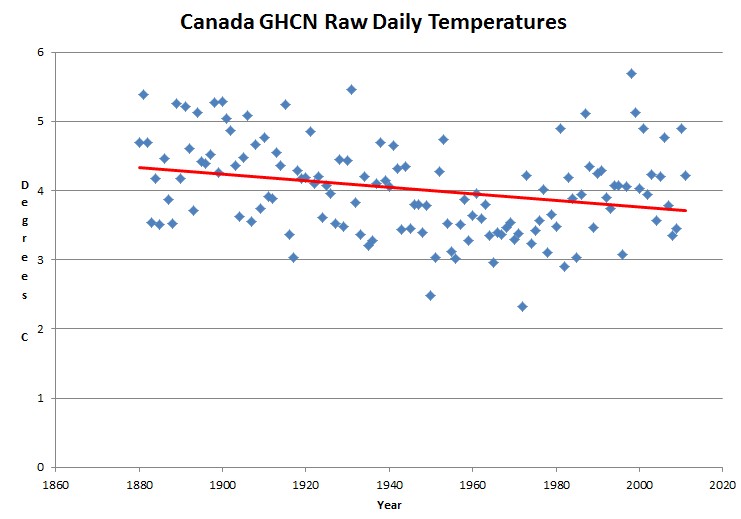
GHCN raw daily data shows a cooling trend in Canada since 1880. Unlike the US, only a small percentage of the GHCN stations are located at airports.
Disrupting the Borg is expensive and time consuming!
Google Search
-
Recent Posts
- Analyzing The Western Water Crisis
- Gaslighting 1924
- “Why Do You Resist?”
- Climate Attribution Model
- Fact Checking NASA
- Fact Checking Grok
- Fact Checking The New York Times
- New Visitech Features
- Ice-Free Arctic By 2014
- Debt-Free US Treasury Forecast
- Analyzing Big City Crime (Part 2)
- Analyzing Big City Crime
- UK Migration Caused By Global Warming
- Climate Attribution In Greece
- “Brown: ’50 days to save world'”
- The Catastrophic Influence of Bovine Methane Emissions on Extraterrestrial Climate Patterns
- Posting On X
- Seventeen Years Of Fun
- The Importance Of Good Tools
- Temperature Shifts At Blue Hill, MA
- CO2²
- Time Of Observation Bias
- Climate Scamming For Profit
- Climate Scamming For Profit
- Back To The Future
Recent Comments
- Bob G on Analyzing The Western Water Crisis
- arn on Analyzing The Western Water Crisis
- Bob G on Analyzing The Western Water Crisis
- Bob G on Analyzing The Western Water Crisis
- Bob G on Analyzing The Western Water Crisis
- Hank Phillips on Analyzing The Western Water Crisis
- Hank Phillips on Analyzing The Western Water Crisis
- Hank Phillips on Analyzing The Western Water Crisis
- Hank Phillips on Analyzing The Western Water Crisis
- Bob G on Analyzing The Western Water Crisis


Remember in school when they would say, “please show your work?” That’s what hyperlinks are for. Or are you afraid someone might check the details?
I`ll give you a link. Good luck dealing with a 2.2 GB file
ftp://ftp.ncdc.noaa.gov/pub/data/ghcn/daily/ghcnd_all.tar.gz
Please do check the details.
I wish you would make up your mind which side of the line you are on. Very Annoying.
Is D Appell still checking the details? Maybe he’s still downloading on hid dial-up.
‘hid’ = his
It’s actually 22,064,751,540 bytes in 81,349 files.
Steve, is there a way to compare airport vs non-airport USA sites (urban vs rural type analysis)?
Good idea. I will do that.
Here’s a couple for you:
The first is Winnipeg where they have a station at the airport, which is colder than a station downtown:
“The average low temperature recorded at the more isolated and exposed Winnipeg airport location was 2.73 degrees cooler than those recorded at the Forks, in downtown Winnipeg.
The average high temperature recorded at the more isolated and exposed Winnipeg airport location was 1.57 degrees cooler than those recorded at the Forks, in downtown Winnipeg.
Closing the airport measurement station would create the illusion of a sudden “warming” by these temperature differences in Winnipeg.”
http://www.fcpp.org/pdf/The_Urban_Heat_Island_Effect_in_WinnipegSept262007final.pdf
Here is a satellite image where downtown Twin Cities are 3 to 5 degrees warmer than airports, which are warmer than outlying areas.
http://minnesota.publicradio.org/collections/special/columns/updraft/archive/2011/01/twin_cities_urban_heat_island_1.shtml
You may wish to look at ChiefIO site where some similar work’s done (different data sets), and give a strong result.
http://chiefio.wordpress.com/2012/07/26/salt-lake-city-airport/
I am downloading the data file above but it is probably too big for me to analyze but I am wondering what the statistical prediction interval of these data would look like if shown on the graph as well…..I realize it is meaningless physically but it might help drive home the point to the unsophiscated viewer the foolishness of using a data set like this to try to predict the future……just a suggestion….
We’ve got the heatwave here, and quite strangely, in an article in a magazine I read, the 1950’s had worse droughts and heatwaves than the one we’ve got now. Amazing, since Greenies still say that this is “Global Warming”.