We are bombarded with statistics comparing the number of record lows to record highs, the number of record highs, etc. So I decided to look at what the actual numbers are in the USHCN database.
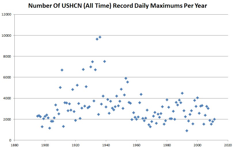
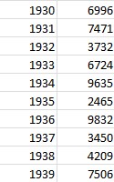
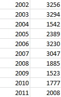
The graph below shows the number of daily record highs set per year for all USHCN stations (through 2011) which have records going back at least to 1930. The results are astonishing. 1934 and 1936 both set nearly five times as many record daily highs as 2011 did. It appears that the entire period from 1910 until 1960 was hotter than recent decades.
There have been 372,989 correctly recorded daily high temperature records in the US since 1895. 84% of them were set when CO2 was below 350ppm.
Compare the number of record highs in the 1930s to the past decade. You can see that the 1930s were consistently much hotter.
My guess is that most of the record highs we keep getting told about are from stations which don’t have records going back to the 1930s. The 1930s were much hotter in the US.
My next addition to this project will be to create the actual annual temperature graph for the US, based on the actual thermometer readings. My guess is that it won’t look anything like Hansen’s graph.


Steve this not my writing. It is so good:
“When a scientist no longer believes in the Scientific Method, he’s no longer a scientist. At the core of Scientific method, we have empirical data, full disclosure, and repeatability.”
Kirk
i work as a writer. It’s good to read this:
“The cherrypicking by alarmists citing the U.S. heat wave as proof of AGW is ridiculous, disingenuous, and purely ideological. True scientist look at the big global picture. Maybe Gore, Hansen, Jones, Romm, Hayhoe, McKibben, Trenberth, Mann, etc. are all vacationing in Chicago and have forgotten about the rest of the planet.”
Not mine. Good thinking.
Kirk
I’m editing this: “People who have been convinced of something by false evidence, [and] if they have held that belief for a long time,[they] rarely become unconvinced of it if the evidence is later shown to be false.
YES! In addition, I recall a study (no link, just a recollection) that suggested that people, when told an untruth about somebody, and then told immediately afterwards that it’s not true, will still often end up believing the untruth, are at least having their opinion of the person being negatively affected by the untruth. Of course, I saw the obvious application (or misapplication) of this to politics. Clearly, with the MSM for years on end talking about AGW like it’s fact, this becomes hard to undue.
Look at Social Psychology and its theories like Cognitive Dissonance and Psychological Reactance. I think Social Psych is important in politic campaigns, and also to the struggle to rectify public misconceptions about AGW.
What happens if CO2 goes on strike. They unionize.
http://www.examiner.com/article/co2-molecule-lobby-plans-to-clear-air-about-global-warming
The only records being broken are the record times hyperbole was used over facts.
What’s going on at the North Pole:
http://psc.apl.washington.edu/northpole/NPEO2012/WEBCAM2/ARCHIVE/npeo_cam2_20120707002846.jpg
The logic here is extremely faulty. Maybe more records were set in the 30s. How many of those records still stand? If you really want to use this stat to prove anything, you need to measure how many EXISTING records were set in each decade.
I am not saying your conclusion is wrong, just that you failed to provide the data to prove it.
-Pie
All of the records plotted here are current and still stand. They are calculated as the first year which achieved the current record maximum.
It appears that it is your logic which is faulty.
Think about it. Using your algorithm, every single station would have set a record in the first year. Obviously that is not the case.
I’m thinking a good project would be to average temps by station for both the raw and the adjusted by year for the monthly data
http://www.ncdc.noaa.gov/ghcnm/v3.php
and then sort by their difference to how the adjustment is distributing the bias is distributed across the stations.
Wait, I’m not sure that works. You’re counting the number of record highs — but the number of years of records before the 30’s were much fewer. For example, if record-keeping started in 1900, every day would be a record high through 1900, every day in 1901 that happened to be warmer than 1900 would be a record, etc.
I don’t think you can conclude the 30’s were hotter.
How are you computing this?
Charlie,
I hope you are joking. Does the graph look like there were 365,000 record highs in 1900?
Since not every temperature in 1895 was a record, they must have been comparing their readings to some previous data. How far back did that previous data go?
I’m pretty sure that’s what we’re all getting at.
Please end the stupidity. The record year is the hottest year of the data set.
If August 13, 1936 is the hottest August 13 on record, it is marked as the record. Where did your little group of geniuses come up with the idea that this chart is plotting successive records?
Use your brain.
Charlie, and Holy….. you guys aren’t recognizing this graph for what it is……. Try this explanation…….Essentially, this is a look back at history. It asks the question what are the current record temps for each day of the year for each site and what year did this happen and how often did this happen per year? The last two questions were plotted.
It is the current records. Not records as they were broke.
Charlie says:
“I don’t think you can conclude the 30?s were hotter.”
Charlie,
The 1930’s just isn’t that long ago. Use your google. The heat was hotter, the highs were higher, and it lasted quite a while, was widespread and is a historical fact.
Steven has spent quite a bit of time and effort establishing this through contemporaneous
news reports.
While I don’t agree w/ Laurence, et al, I would be curious to see what the graph would look like if you didn’t tally the first year only but rather all years where the record temperature was reached. I.e., if 1934 and 2012 both had 103 degrees F at some station on July 8 and that was the record high for July 8, tally a record high for both years (or three or four or however many achieved the high). Does it change the character of the graph?
Never mind my comment. I see that you did that on a more recent post.