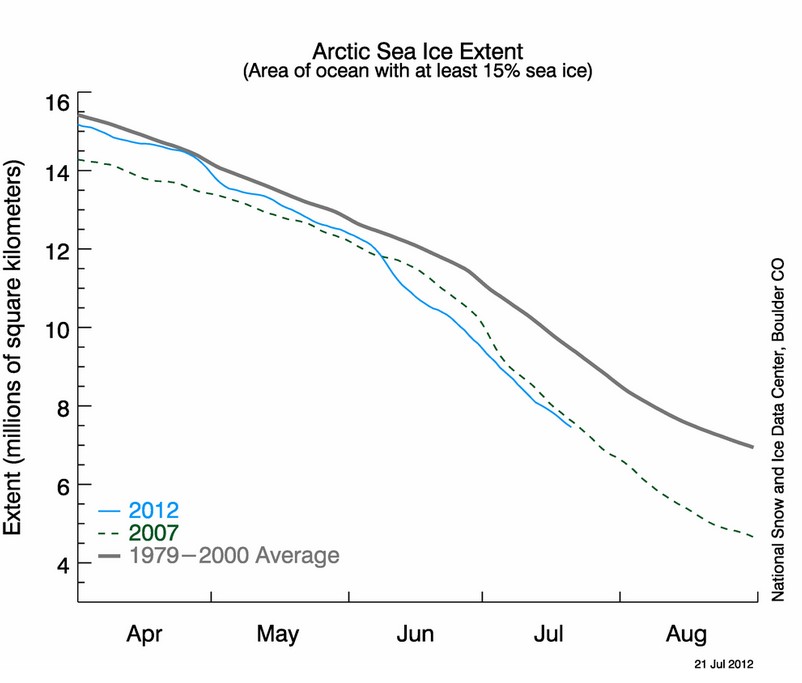
NSIDC shows that 2012 is below 2007
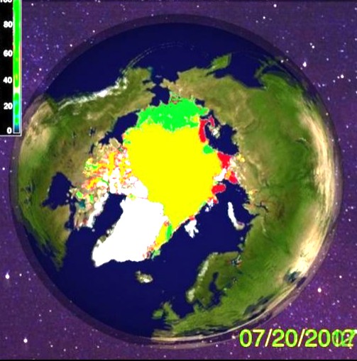
By contrast, Cryosphere Today shows almost 18% more ice in 2012 , than the same date in 2007. Yellow below shows ice which was present in both years. Green is 2012 only, and red is 2007 only.
The science is settled.


Something is wrong somewhere.
Based on the two charts, if both are correct, one explanation could be that some of the green area is less than 15% of see ice.
No, the CT maps have a higher concentration threshold than the NSIDC maps.
Of course, I meant “sea ice”!
Thanks Steven for continualy keeping these issues in the forfront. I am somewhat reassured by the fact that Cryosphere Today seems to be attempting to be accurate in their ice assessments. I am very sceptical of the reports and assessments I hear from any of the government affiliated agencies and suspect some of them of out right misrepresenting the facts. It is a far different government we are dealing with today than it was sixty years ago. I think we really started down hill when they wacked JFK for trying to restore the dollar to congressional control, and return America to the gold standard. I wonder how many people remember that fact ? Do you know he actually ordered the printing of non debt money that did not bear the mark of the federal reserve ?
Steve, great post, and appreciate that you continue to show even the once, reliable agencies under NOAA, are committing fraud, and are deeply entrenched within the pro-AGW side of the debate.
Steve, this does not surprise me at all, especially in the context of your recent exposure of heavy data tampering (sorry… “adjustments”…) within GISS. Something seems to have been up with the NSIDC graph for a good few months now; i.e. I suspect NSIDC/PIOMAS etc may well be involved in the same kind of data manipulation. Would be interesting to know your thoughts on this…
Yeah, I also do wonder how the NSIDC and PIOMAS may be involved in data tampering
DMI is showing a very different story to NSIDC:
http://ocean.dmi.dk/arctic/icecover.uk.php
but that may be because of the lag built in to the NSIDC ‘product’. We will see.
Nope
http://stevengoddard.wordpress.com/2012/07/22/finally-found-my-nsidc-smoking-gun/
And Meier’s response is?
Must be your lying eyes, Steven. R. Gates insists the Arctic ice is in a “death spiral” and we know he is never wrong on things Arctic.
This is what NOAA said it looked like july 23rd 2007
http://www.natice.noaa.gov/pub/ims/ims_gif/ARCHIVE/AK/2007/ims2007204_alaska.gif