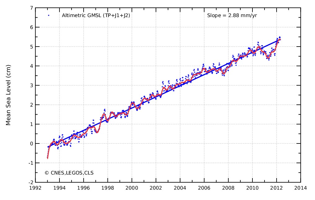
After all of their data tampering of late, and hiding the decline of Envisat, a sudden sharp spike appeared. It looks like sea level has been rising like crazy since early 2011.
MSL_Serie_MERGED_Global_IB_RWT_NoGIA_Adjust.png (1024×680)
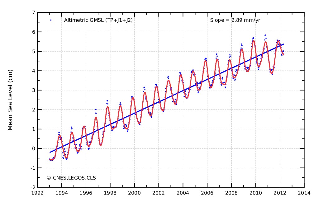
Next, let us look at the same graph, without the seasonal signal adjustment.
MSL_Serie_MERGED_Global_IB_RWT_NoGIA_NoAdjust.png (1024×680)
Instead of a spike, the trend has done the exact opposite. It has actually gone flat over the last three years.
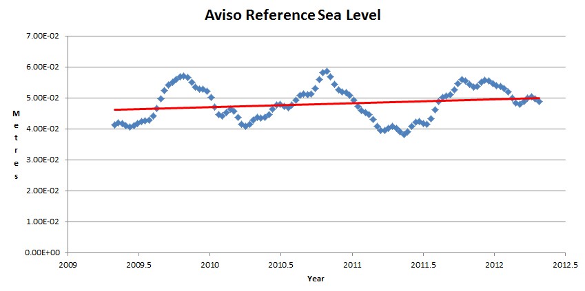
Here is a closeup of the last three years. The trend has dropped by 60% to 1.2 mm per year.
But here is the smoking gun. In the top graph, the most recent measurements are the highest, but in the unadjusted graph, the peaks in 2009 and 2010 were higher than 2011. The adjusted graph is complete BS. It looks like it was colored in by hand by a Hansen protege. All that a seasonal signal adjustment should do is average out twelve month periods. It can’t change the highs and the lows.


From the Deccan
TimesHerald: (from India) Workhorse climate satellite goes silentJeff Tollefson, Apr 24, 2012:
Officials with the European Space Agency (ESA) say that they have lost contact with Envisat, their premier earth-observing satellite.
==================================================================
I never got that memo, Steven. Did you?
The Envisat inner works went dead on April 8th. It’s still up there. Orbit is stable. Just not talking anymore. Not so different from the way the climate alarmists treat us.
It’s like they kept their secret. Hiding it in an Indian paper.
And how about yet another sea ice satellite giving up the ghost in the early spring just in time to not cover the melt season
They tortured it to death.
Basically they either broke it trying to get it to lie , or it developed a conscience and turned itself off .
http://www.space.com/15608-huge-satellite-envisat-dead-space.html
Search for “Envisat satellite lost”
If you just did a search for Envisat satellite lost , without the parentheses, you’d get a hundred thousand hits unrelated to the failure. With the parentheses the field is winnowed down to one, dated a month after the event.
I wonder if Al would say convenient here.
Seems to me this also coincided with our host being put out of action for a period of time by a trusted friend, suddenly acting out of character.
I wonder if money changed hands?
OK, I see it all so clearly now! thanks for your input!
Yeah, well it was that or tell you what I had for breakfast.
Talk too much. Meh
Yeah, and so do you. 😉
😆 Wait, You don’t think I agree with ya here.
Do ya?
Am I agreeing with Me? No actually it should have read, “I talk too much. Meh”
As in me, rather than Me.
One other thing. This report probably puts the finger on where the new crap quality sea level data is coming from.
“Canada’s MacDonald, Dettwiler and Associates Ltd., announced on Friday that it has signed a contract to increase its RADARSAT-2 satellite imagery for Europe’s Global Monitoring for Environment and Security (GMES) program.”
Yep. I’m done.
Yep, that is not what I asked, Thanks for that confirmation again, and your welcome in advance.
Are you and Me going to have a problem? 😉
“Canada’s MacDonald, Dettwiler and Associates Ltd., announced on Friday that it has signed a contract to increase its RADARSAT-2 satellite imagery for Europe’s Global Monitoring for Environment and Security (GMES) program.”
——————
so?
which one of me/ you and you:-) is going to tell us who pays/owns the named crowd above?
or are we gonna have to go work it our ourselves?
http://www.mdafederal.com/press/mda-signs-contract-for-next-phase-of-canadas-radarsat-constellation-mission
80 mil and 42 new?..take govvy money say govvy words,
into allsorts arent they?
drones..snoop sats etc etc.
Phew – that adjustment came just in time for our next grant application.
Even with the sea level BS, the sea level rise isn’t alarming, and has been changing at a fairly constant rate since record keeping began, which is why the trend line is a linear one.
In the top graph, the most recent measurements are the highest, but in the unadjusted graph, the peaks in 2009 and 2010 were higher than 2011
Funnily enough, the most recent measurements are 2012, that being the current year. The yearly peak occurs in ~September, and if you look at the top graph again, you’ll see that September 2011 is indeed substantially below September 2011 or September 2010.
You could also try overlaying a sine wave on your bottom graph by hand: the upward deviation since the start of 2012 will be obvious,
IMO, I believe the sea level “rising” has a lot to do with coastal erosion. Especially along the eastern seaboard. In other words, the sea floor off the coast is RISING causing the same volume of water to travel (displace) farther inland. Thus, creating the appearance of water levels rising. Historical Topographical maps of the sea floor might bear this out. Has anyone document raising levels on the west coast? No real shelves on that side.
Sea level is generally falling on the West Coast. NE US coastline is sinking due to glacial rebound.