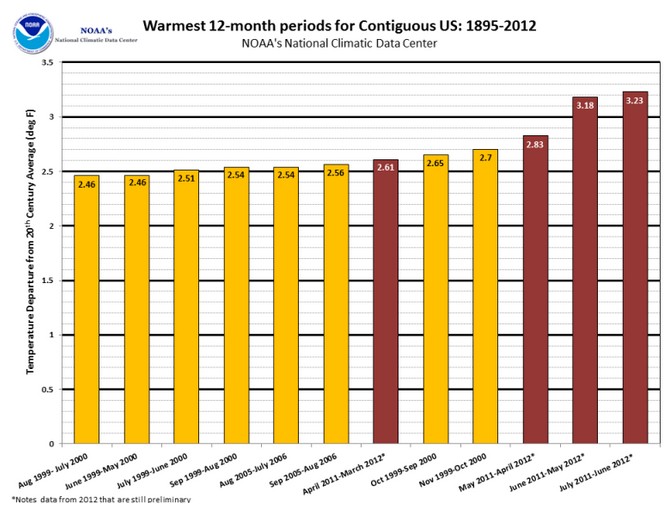
The graph below is the NOAA propaganda version, generated from massively adjusted temperatures.
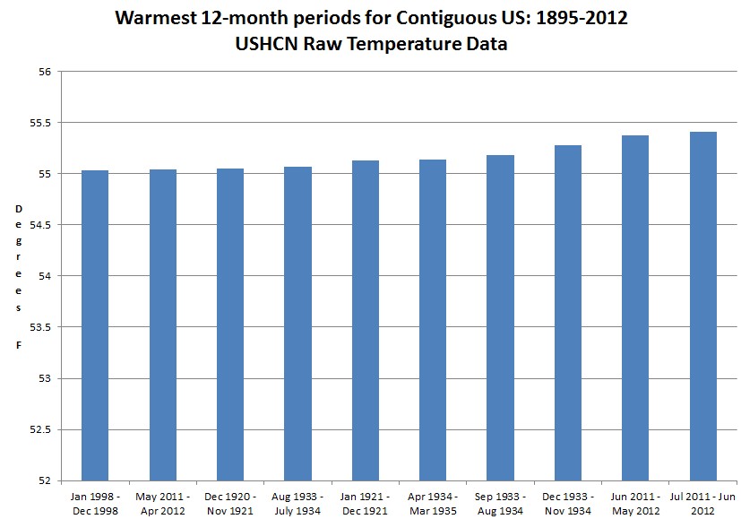
The next graph is what the actual USHCN thermometer data shows – a completely different story.
The recent data is upwards adjusted by 300% of the signal they are claiming to detect, indicating a signal to noise ratio of about 0.3 – i.e completely worthless data which no respectable scientist would use.


Hang onto your seat! This ride will get worse, much worse!
For example, try to digest:
http://journals.ametsoc.org/doi/abs/10.1175/BAMS-D-12-00021.1
Pay special attention to the intro, where you’ll find: “…scientific thinking on this issue has moved on and now it is widely accepted…”
Guess what is now “widely accepted.”
..and their reference? A once respected journal that turned into a tabloid.
how have UHI adjustments played into this? Shouldn’t it be increasing with time?