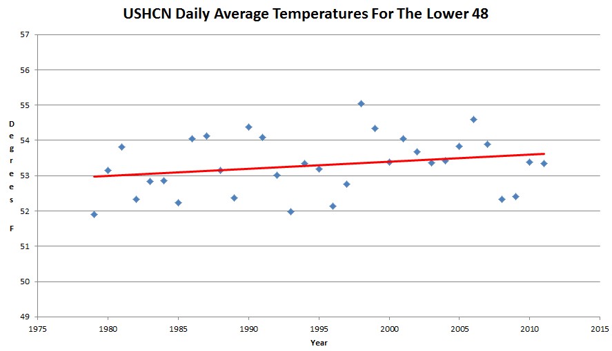
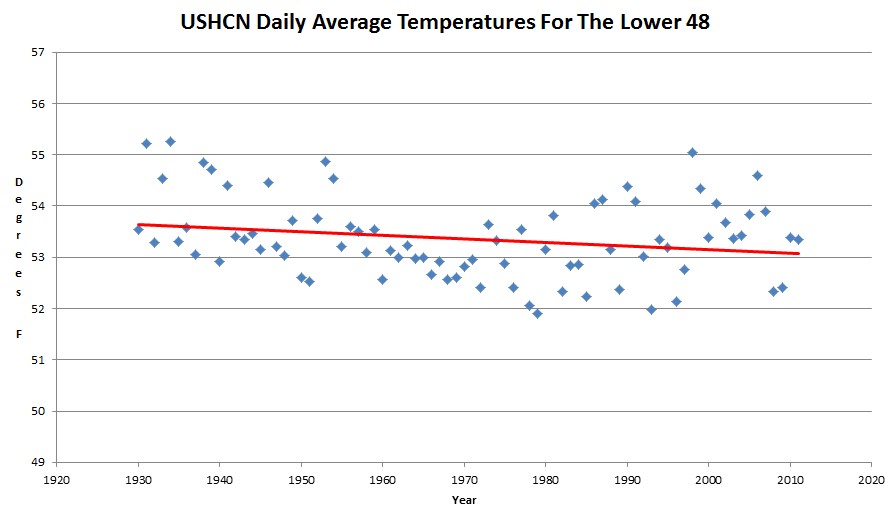
Starting in 1979 make no sense though, because it was the coldest year since 1924. If we start in 1930, the US is cooling.
Disrupting the Borg is expensive and time consuming!
Google Search
-
Recent Posts
- Analyzing The Western Water Crisis
- Gaslighting 1924
- “Why Do You Resist?”
- Climate Attribution Model
- Fact Checking NASA
- Fact Checking Grok
- Fact Checking The New York Times
- New Visitech Features
- Ice-Free Arctic By 2014
- Debt-Free US Treasury Forecast
- Analyzing Big City Crime (Part 2)
- Analyzing Big City Crime
- UK Migration Caused By Global Warming
- Climate Attribution In Greece
- “Brown: ’50 days to save world'”
- The Catastrophic Influence of Bovine Methane Emissions on Extraterrestrial Climate Patterns
- Posting On X
- Seventeen Years Of Fun
- The Importance Of Good Tools
- Temperature Shifts At Blue Hill, MA
- CO2²
- Time Of Observation Bias
- Climate Scamming For Profit
- Climate Scamming For Profit
- Back To The Future
Recent Comments
- Bob G on Analyzing The Western Water Crisis
- arn on Analyzing The Western Water Crisis
- Bob G on Analyzing The Western Water Crisis
- Bob G on Analyzing The Western Water Crisis
- Bob G on Analyzing The Western Water Crisis
- Hank Phillips on Analyzing The Western Water Crisis
- Hank Phillips on Analyzing The Western Water Crisis
- Hank Phillips on Analyzing The Western Water Crisis
- Hank Phillips on Analyzing The Western Water Crisis
- Bob G on Analyzing The Western Water Crisis


I don’t trust any of the temperature data that comes out of NASA, NOAA and their related agencies, because they are going to do whatever they can to keep the lie alive, They knew to cool 1979 because that’s when objective satellite measurements started.
Sorry I dont see any significant trend at all if you know anything about stats should be much much tighter than that. Cheers just for fun hahahaha
No climate scientist would make it in any other field of quantitative science I’ve ever worked in. I know they all do it, but drawing a trend line through such widely dispersed data, without providing an R-square value, is in my opinion fraudulent. The R-square value is a quick way to know how much the trend line is really worth, for example, how much it depends upon the length of the time period, without having to do a whole series of graphs with differing “cherry picked” time periods. With the data shown above, for example, a true scientist would say the temperature has varied widely around a constant value–and one might go farther, and say that constant (not warming, not cooling) value is somewhere between about 53 and 53.5°F (which fairly well encompasses the entire trend lines shown above, note).
Watts says: rural MMTS, no airports: 0.032 C/decade.
What! 1/32 of a degree C per decade! Let me be the first to say it:
We Are Doomed!
/sarc
Al babies beach front resorts are safe….
Go back 1,000 years to start the baseline. The trend is down/cooling. Start the baseline in the middle of the little ice age, and the trend is up/warming. I just love statistics. You don’t have to preprogram a model to achieve the desired results. A basic knowledge of arithmetic is all that is required. Even Joe Biden could understand this.
Reblogged this on Climate Ponderings.
scizzorbill, I think you’re stretching it a bit on the Biden part……….
Just out of curiosity, what is r**2 of the red line?
This is all well within the range of natural variability. The whole AGW matter is a scam of massive proportions.
As well as the estimated amount of CO2 in the atmosphere is well within the historic range of natural variability.
The computer models are broken, the data is a fraud. The ‘science’ is the hook in a ponzi scheme for big government whereby they solicit new taxes by promising to invest funds in evermore expensive CO2 clean-up and research.