Bookmark this – it is important.
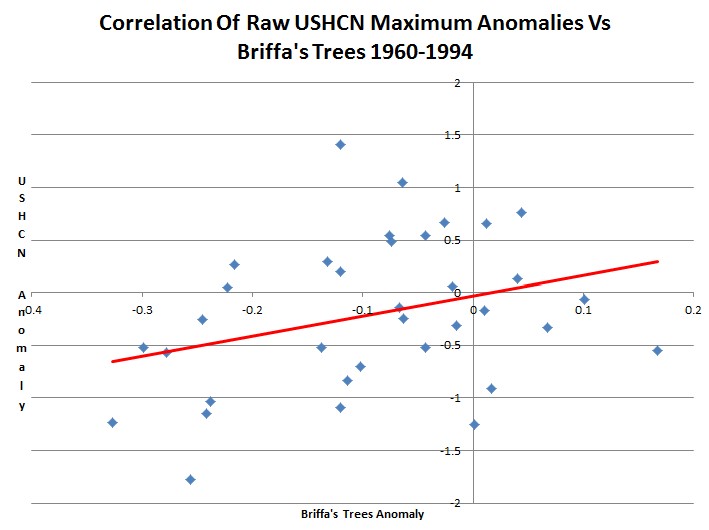
The graph below plots the correlation between raw USHCN maximum temperatures and Briffa’s trees from 1960-1994. Those are the trees which Mann threw out when he did his nature trick. The correlation is pretty decent (rsq=0.103) considering that the USHCN data only covers the US. The USHCN anomalies are calculated vs. the average raw maximum temperature from 1895-2011.
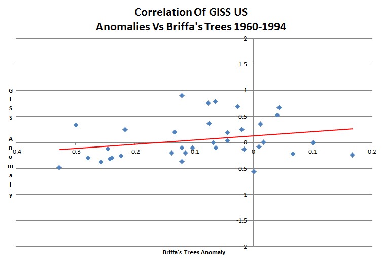
The next graph shows the weaker correlation (rsq=0.066) between GISS US adjusted temperatures and Briffa’s trees from 1960-1994.
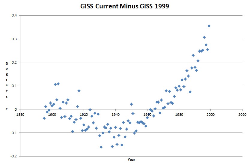
Here are the adjustments which Hansen has made to the US data vs. what he published in 1999. (Note how they look just like a hockey stick.)

This shows us two things.
- The GISS adjustments are garbage
- There was nothing resembling a valid reason for Mann to throw out Briffa’s trees. Mann used Hansen’s garbage adjustments as the justification and the basis of the hockey stick.
This is an amazing story. Hansen made incorrect adjustments to the data. Mann looked at the incorrect adjustments and decided to throw out the tree ring data – because they didn’t match the incorrect adjustments. Then Mann replaced the correct tree ring data with the incorrectly adjusted data – based on the belief that a rise from 318 to 319 PPM CO2 had somehow corrupted the trees’ ability to function properly.


“Then Mann substituted the incorrect adjustments for the correct tree ring data – based on the belief that a rise from 319 to 320 PPM CO2 had somehow corrupted the trees ability to function properly.”
Wow, you have discovered the text book example of a tipping point. 320 ppm was just too much for those trees. Either that or MM is completely FOS.
Don’t trees EAT CO2?
What does throwing a few silly trees under the bus matter when you are trying to get rich feeding at the trough? Compared to raping children, fraudulent science is the least of Penn State’s problems.
If they can throw out Paterno’s wins after the fact, what’s wrong with throwing out temperatures from the 1930’s and 1970’s?
The most offensive thing Paterno ever did was intentionally take an unnecessary safety with two minutes left vs. ASU in the 1977 Fiesta Bowl – which cost me a $50 bet on the spread. I could never forgive him for that.
Very true
Is it true the plants are more efficient at higher carbon dioxide levels, and are more robust and use water more efficiently?
Hey Eric , anyone with a properly managed green house could tell you ,yes that is true. When you see those beautifull plants for sale in the spring in all the stores , know that they came from controled atmosphere green houses.
Yeah, you think they would try to reduce carbon dioxide levels in there? Probably not, because they are smart enough to figure out more carbon dioxide is actually good for plants, and increased carbon dioxide would overall result increase crop yields, and we certainly need that in an ever-increasing global population.
The higher the CO2 level, the less stomata they need; openings through which they get CO2 but also evaporate water. Less stomata means less evaporation.
It is a shame there are not equally-harsh penalties for the crime of ‘raping science’ as there are when done to children. That might slow-down these guys who play so freely with ‘adjusting’ data to fit their liking.
There is the matter of dead people in low income countries due to food price increases and the opposition to new electric plants and the increased cost of oil due to suppression of drilling, and the wasted money on alternative energy that could have gone to saving lives.
What is the total lives lost due to climate fraud? Many thousands?
Thanks
JK
Bravo! I’ve been waiting for this analysis. Nice
That nicely sums up how climate science is done in certain quarters anyway.
Could you redo the top two charts with the same scale on both axes?
What does the last chart look like if you run it through 2011?
Both charts are the same scale and Briffa’s trees end in 1994.
I’ve seen a number of graphs with and end in 2000, like this one. Why don’t we see all the adjustments that Hansen has done up to 2010?
Well, duh, the graph is comparison to 1999 ….
But … does that mean that for the last 13 years Hansen has not changed prior data, that data coming in now is adjusted for various errors/sites, and then never looked at again?\
Has the temperatures stopped rising precipitously since 1999 because Hansen has stopped historical “corrections”?
Can we have the citation for Hansen’s 1999 adjustments? I’d like to read the actual paper and see what the justification for them was.
Good luck with that
Sorry, Steven, I must not have made myself clear.
I’m interested in the title of the paper(s) you used for your post, specifically the last chart. I’d like to see your sources.
Cheers,
Greg
I’ve posted them about 30 times.
http://stevengoddard.wordpress.com/data-tampering-at-ushcngiss/