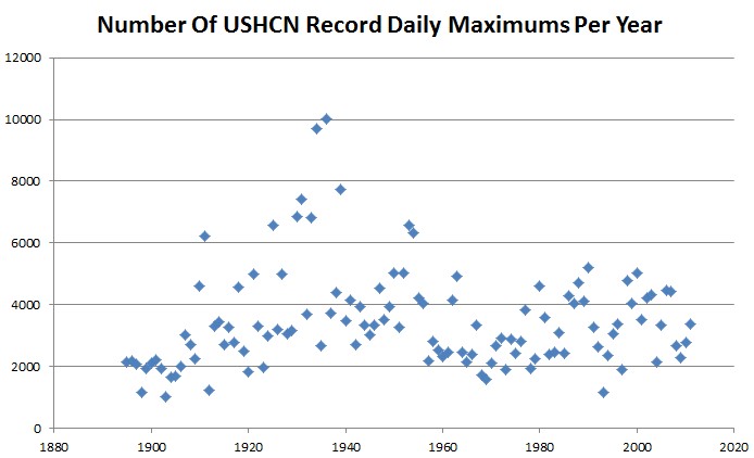
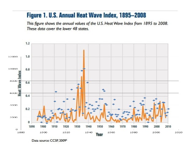
A couple of weeks ago I posted this graph, and word went out over the moron grapevine that I had made a fundamental error. They came to this brilliant conclusion without even asking what the algorithm was that I used.

So I overlaid my graph on the EPA graph, which shows almost perfect correlation.
Someone at Heidi’s Climate Moron Central needs to go straighten out those evil climate deniers at the EPA.


I wonder what an overlaid “annual idiot index” would look like. Hockey stick? Thank you Steven… for being relentless!
It is like shooting fish in a barrel. These folks are as dumb and slow as they get.