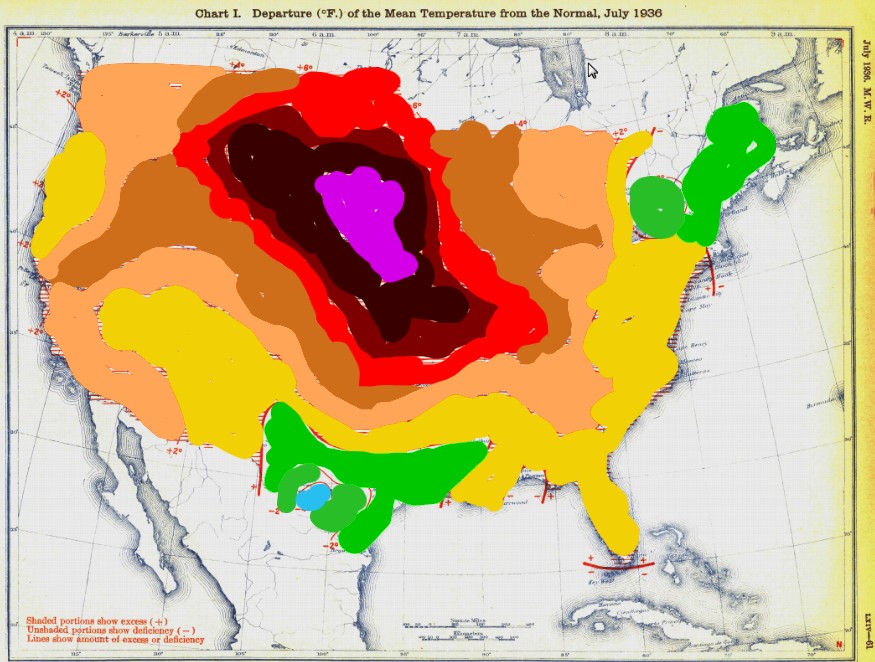
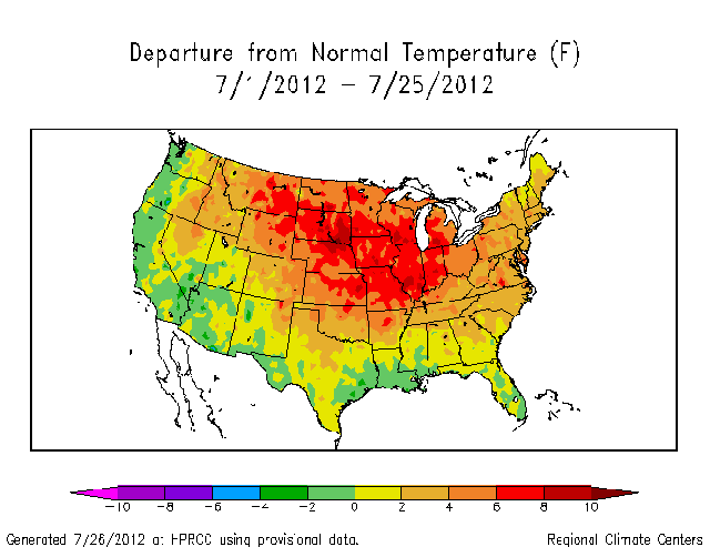
I painted in the July 1936 temperature anomaly map with the same color scale as the July 2012 map, with pink added for +12 anomaly. As you can see, July 1936 was much hotter than July 2012 over 70% of the US – but that isn’t going to stop NOAA from claiming that 2012 was the hottest.
Disrupting the Borg is expensive and time consuming!
Google Search
-
Recent Posts
- Analyzing The Western Water Crisis
- Gaslighting 1924
- “Why Do You Resist?”
- Climate Attribution Model
- Fact Checking NASA
- Fact Checking Grok
- Fact Checking The New York Times
- New Visitech Features
- Ice-Free Arctic By 2014
- Debt-Free US Treasury Forecast
- Analyzing Big City Crime (Part 2)
- Analyzing Big City Crime
- UK Migration Caused By Global Warming
- Climate Attribution In Greece
- “Brown: ’50 days to save world'”
- The Catastrophic Influence of Bovine Methane Emissions on Extraterrestrial Climate Patterns
- Posting On X
- Seventeen Years Of Fun
- The Importance Of Good Tools
- Temperature Shifts At Blue Hill, MA
- CO2²
- Time Of Observation Bias
- Climate Scamming For Profit
- Climate Scamming For Profit
- Back To The Future
Recent Comments
- Bob G on Analyzing The Western Water Crisis
- arn on Analyzing The Western Water Crisis
- Bob G on Analyzing The Western Water Crisis
- Bob G on Analyzing The Western Water Crisis
- Bob G on Analyzing The Western Water Crisis
- Hank Phillips on Analyzing The Western Water Crisis
- Hank Phillips on Analyzing The Western Water Crisis
- Hank Phillips on Analyzing The Western Water Crisis
- Hank Phillips on Analyzing The Western Water Crisis
- Bob G on Analyzing The Western Water Crisis


“NOAA was formed on October 3, 1970, after Richard Nixon proposed creating a new department to serve a national need “… for better protection of life and property from natural hazards … for a better understanding of the total environment … [and] for exploration and development leading to the intelligent use of our marine resources …” NOAA formed a conglomeration of three existing agencies that were among the oldest in the federal government. They were the United States Coast and Geodetic Survey, formed in 1807; the Weather Bureau, formed in 1870; and the Bureau of Commercial Fisheries, formed in 1871. NOAA was established within the Department of Commerce via the Reorganization Plan No. 4 of 1970. With its ties to the United States Coast and Geodetic Survey, NOAA celebrated 200 years of service in 2007.”
http://en.wikipedia.org/wiki/National_Oceanic_and_Atmospheric_Administration#History_and_organizational_structure
Apparently someone at NOAA took Nixon’s idea of a ‘better understanding’, to mean that all data before their formation was sub standard.
What was the “normal” baseline on the 1936 map? It certainly can’t be the same as the one used for the latest map (i.e. anomaly relative to the 1981-2010 average)
No doubt the +/-0.2 or 0.3 possible difference in the baseline would completely alter the +4.0 difference in temperatures.
To petey ellis , The only people knowing what normal is are the ones that keep the old records before hansen and his ilk corrupted them . Put a sock in it petey . By the way , what government agency are you affiliated with ? You really do like to spout the agw line.
Your version of the July 1936 US temperature map has much more visual impact than the monochrome thermocline map. Because there is no need to read numbers or letters on the graphic, it is almost ideal for the viewership of Time, USA Today or CNN. Add a polar bear and its ready for MSNBC.
I am waiting for a response over at Dot Earth where I asked about the total number of cubic km of ice that was lost during the bicentennial melt week in Greenland.
chris y says:
July 27, 2012 at 4:55 pm
Your version of the July 1936 US temperature map has much more visual impact than the monochrome thermocline map.
chris must be one of the majority that can actually see red. I am red/green colorblind and most of the illustrations or graphs that have more than three or four colors are difficult for me to follow. I can usually adjust the chromatic functions of my display so that I can distinguish the differences, but then any picture really looks like hell. The national weather site has a tool which is supposed to help in the interpretation of their maps, but the programmers that developed it did not have the same impairment that I have. To give an example, if the background is full red (255,0,0 in RGB), I will often not notice black (0,0,0) text unless it is very large type. Once I am aware of its presence, I can often make it out well enough to read it.
A tool that would allow me to select a color by placing my cursor over it to highlight that color anywhere on the page would be very helpful. Any suggestions would be appreciated.
Donald Mitchell
[email protected]
Yes, in 2012 we are comparing a new Mann-ufactured normal to newly inflated and adjusted temperatures taken at an asphalt jungle, while in 1936 we are comparing real normals to real temperatures, with no agenda to skew the data. Apples and oranges!!
Apples and Onions are better related than what they are comparing.
Apples and Oranges is not an appropriate comparison because they do have some things in common.