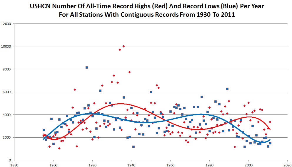
Alarmists like Jeff Masters have been touting the useless statistic of the ratio of record highs to record lows as a sign of global warming. The graph below shows why it is useless.
The graph plots yearly counts of all of the daily all-time record highs and lows in the USHCN database, for all stations which were operating in both 1930 and 2011. A station is marked as having a record if it has the highest temperature reported for any year, or tied for the highest temperature.
The lines are sixth order fits. The first thing that stands out is that the number of record maximums and minimums has tailed off markedly in the last 70 years. Also, the signals are very noisy, and appear to be cyclical and converging.
It is a testament to how poor the science is, that experts would take one small set of data points from one small geographical location, without any historical context, and draw conclusions about “global warming.”
These people are more ignorant and more superstitious than the witch burning crowd in The Holy Grail.


Considering the “adjustment bias” in the dataset, the number of lows should probably be more and the highs less pronounced after 1960? Highs may have to take another hit from UHI.
I am using the raw data. There shouldn’t be any biases in it, as far as I know.
Ok, that should leave it clean apart from UHI then.
I also find it pretty darn funny, from this graph it looks to me like having near equal record highs and near equal record lows are pretty darn rare. Just eye balling it within about 200 difference, I’d say less than 10 times in our history.
Steve,
It reminds me of cholesterol level… Total cholesterol is completely useless without knowing what you are looking at…
A calculated cholesterol test isn’t very accurate when it comes to measuring 2 types of LDL (small and large). That’s what most doctors use. They don’t know any better. They just follow guideline set by someone that is probably linked to pharma-complex industry. This type of test often underestimate small LDL level big time esp on high carbs, low fat diet.
If you were to use NMR test, it will accurately measure both small and large LDL. It’s the small LDL particles that everybody should worry about the most. They speed up plaque build up (often due to high sugar blood level). Check out Wheat Belly Diet by Dr. Davis (a cardiologist). He tried vegan diet and did not find it to work well. Paleo diet type tend to work best if you want to reverse diabetes type two and heart disease.
I’ve read that that people who heavily used coconut milk as part of their diet tend to have very high good HDL due to its high saturated fat amount. It’s kinda funny…
Graphs are useless if you’re clueless about it.
I improved all my cholesterol numbers by greatly decreasing refined carb intake, stop eating junk food, eliminating high fructose corn syrup and took two different supplements. I also greatly increased intake of good water. I did not lower my intake of red meat, but did increase green veggies such as broccoli and asparagus (yum yum).
CholesLo, krill oil, coconut oil, olive oil; worked for me. Lots of almonds too. I have the before and after results if anyone is interested.
Total cholesterol is a meaningless number. They put everyone in box and use the arbitrary number of 200+ as somehow being unhealthy. BS. Doctors are killing the elderly by forcing their total cholesterol down. It is the LDL and Triglycerides that are usually the ones to concentrate on.
Homocysteine and CRP (C-Reactive proteins) are the big heart attack causes.
High-order polynomial fitting is well known to produce artifacts. A better way of smoothing a noisy data set is to average it over periods of time (e.g., 5-year intervals).
But even with your polynomial fitting, one can see that the minimal/maximal records follow the measured temperature averages. A local maximum in global temperatures ca. 1940 coincides with maxima in the records beating the minima in your graph. The global temperatures were somewhat lower in the 1960s through the 1980s, and in your graph the minima catch up with the maxima and even overtake them. In the 1990s and 2000s the world got warmer, and in your graph the maxima beat the minima. That’s precisely what one would expect. The maxima-to-minima ratio behaves in a perfectly sensible way as a function of time.
The ratio of record highs in the 1930s to recent record highs is about 4:1 . That is the interesting statistic in this graph. Now apply the logic you just used to that fact, and see what you come up with.
The tri-lateral commission? Chemtrails? Ron Paul?
Why don’t you average it first? Concentrating all of the attention on a couple of hot years makes little sense.
A “couple of hot years?” Get serious – the top six record years (1936, 1934, 1939, 1931, 1930, 1933) all occurred during the 1930s. No year since 2000 is even in the top ten.
Same goes for the record minima. Of the top 6, five were before 1980.
So how about my offer to look at the smoothed averages for both the maxima and the minima?
Fine. How about looking at the ratio of TMax1930s to TMax2000s?
Let’s look at both the maxima and the minima.