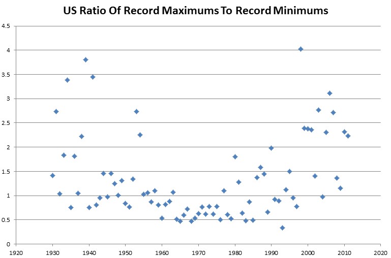
A favorite statistic of alarmists is the ratio of record maximums to record minimums. They create meaningless statistics based on many stations with short records.
The graph below shows an apples to apples comparison of stations with contiguous records going back to 1930. There are symmetrical spikes in the 1930s and 2000s – with a cold period in the 1960s and 1970s
Wouldn’t it be nice if climate scientists did actual science, rather than pushing an agenda?


Your graph still look like alarmist propaganda 😉 – I would suggest using a logarithmic scale (so 0.5 is just as far from 1 as 2 is).
Reblogged this on Climate Ponderings.