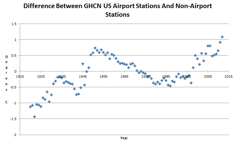
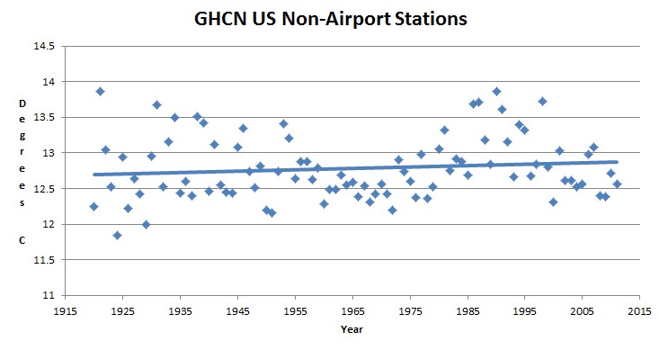
Something is seriously wrong with the GHCN US data. Two-thirds of the stations are at airports and they show regular divergences from the non-airport stations which can only be described as …. bizarre.
The non-airport stations show almost no trend over the last 80 years, with 1921 and 1990 tied for the hottest year, and a steep cooling trend over the last 20 years.


What does the graph of airport stations look like?
Warming trend, of course.
What a pity global trends aren’t pulled from weather stations exclusively from the US.
So, your argument is invalid.
Actually, about half of the GHCN stations are located in the US. But nice try though.
WOT,
Perhaps the divergence between US airport and non airport stations also shows up in the global station records. The US divergence is a big “dig here” indicator for the global record.
Good site for American warming stations
http://www.surfacestations.org/
Yep! The US holds the exclusive patent for both airports and heat islands. Thanks for clearing that one up, WOT! 😉
“Perhaps the divergence between US airport and non airport stations also shows up in the global station records. The US divergence is a big “dig here” indicator for the global record”
It’s possible, but since other countries have different standards for weather station locations, and since the global temperature record is a mix between surface data, ice core data, tree ring data, proxy data, and satellite data, this wouldn’t really change all that much since it’s a drop in the bucket of all the data that is used to determine global temperature averages and trends.
Each drop in the bucket is a loss of accuracy and credibility. And with overall claimed accuracy in 1/10 of a degree this accuracy is obviously nonsense.
The credibility and veracity of those doing the adjustment is called into question.
As the Surface Stations project has demonstrated, the USHCN is riddled with station-siting issues. How can such data be trusted, especially after it’s been adjusted repeatedly by climate magicians, er scientists, to produce a steady increase in warming? The same NCDC and GISS magicians virtually ignore the one local temperature phenomenon that does need to be adjusted for: the urban heat island (UHI) effect.
Can you provide a link to the data source you used to make the charts and how you separated the stations?
I’d like to add this to SustainableOregon.com and throw it in the face of local climate alarmists..
It isn’t trivial extracting the data. The database is 2.2 GB and I have written some substantial software to parse it. I will release it shortly
RealClimate claims that use of raw data is inappropriate because they have adjusted for the errors and biases they contain. If their data-handling were based on site- type and -location to the level we see here, that would be true. But it isn’t. The adjustments I see are done for procedural reasons, i.e. TOBS, instrumentation moves, instrumentation types. The fundamental data corruption by human-moderated very local station position is not taken care of.
Hansen, Schmidt say that they do, actually take care of this, but what they say is that they use satellite data showing night-light to determine urban vs rural, and urban population count. They speak of local effects in the tens of miles, not the fourteen feet to an air conditioner radiator.
There are lumpers and splitters in the scientific world. The lumpers think that if you throw enough into the mix the essence of what is there comes out, while the splitters think that if you don’t know enough about what the pieces are you cannot explain what the “essence” is. The lumpers have the reins right now. (Think how the UK Met Office said their weather predictions were off because they didn’t have a big enough computer. That is the complaint of the quintessential lumper.)
In any normal scientific field, people would assume a Monte Carlo distribution of errors for a massive database like this with so many unknowns.
By tampering with the data, these climate activists (Hansen/Karl/et al) are introducing their own confirmation bias. Anthony’s paper showed that their “corrections” are wrong.
TOBS can go either way, and how do they know that people weren’t resetting their thermometers at night? I did that when I was seven years old to avoid the TOBS problem. Anyone with a min/max thermometer will figure out how to avoid the TOBS issue within a week or two, because it is not a subtle issue.
The fact that they claim to have corrected TOBS tells us nothing. Their adjustments are more likely than not incorrect, and their UHI adjustments are a farce.
Why is the difference negative until 1945; surely there should have been no difference back then?
In which journal will you publish your paper containing these results? Please let us know, I’m interested in reading your complete argument.