I am also interested in the development and application of global numerical models for the purpose of understanding current climate trends and projecting humans’ potential impacts on climate. The scientific excitement in comparing theory with data, and developing some understanding of global changes that are occurring, is what makes all the other stuff worth it.
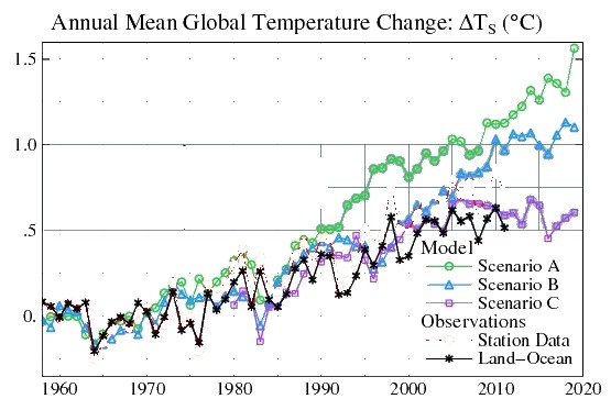
Awesome, let’s compare your data with your theory – Jim.
Massive fail.
”scenario C assumes a rapid curtailment of trace gas emissions such that the net climate forcing ceases to increase after the year 2000.”
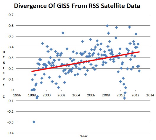
Now, let’s compare your manipulated data with legitimate satellite data. You had to cheat to get even close to Scenario C


I wonder what his projections look like when compared against RSS or UAH…
http://www.drroyspencer.com/wp-content/uploads/Fig2.2-summer-fixed.gif
That remark was meant as a hint hint to post GISS temps and RSS/UAH. 😉
If we pretend we’re Hansen for a moment. Since the difference between scenario C and reality is supposed to be caused by cooling factors, how much media panic would there be if AGW wasn’t artificially bumping temperatures up? A cooling of over 0.5°C in two decades would be extremely alarming especially with a Maunder style minimum on the cards. Shouldn’t the newspapers be putting headlines out like – According to a NASA scientist, without global warming, we’d be plummeting into an ice age? By 2020, if global temps don’t rise much or even fall then the gap would be closer to a degree. That’s… that’s unprecedented!
Shouldn’t someone be warning the public how important it is to emit CO2 to prevent this catastrophic cooling? Clearly Hansen is adjusting GISS temperatures up to prevent us panicking.
Is it possible to plot GISS minus scenario C so that we can see what that underlying cooling looks like?
I like that.
IPCC AR4/AR4/Hansen Scenario B versus reality:
http://s17.postimage.org/jobns27n3/IPCC_Forecasts_Obs_July2012.png
IPCC AR4/AR5/Hansen Scenario B…
This is good to compare UAH/GISS etc
http://www.woodfortrees.org/plot/uah/mean:36/from:1979/plot/gistemp/mean:36/from:1979/plot/rss/mean:36/from:1979
What is important to note is that it is suppose to be the opposite. The warming in the lower atmosphere is suppose to be amplified. Some say by a factor of 1.1 others say 1.25 or so, but the warming of the satellites are suppose to show more, not less than ground temps.