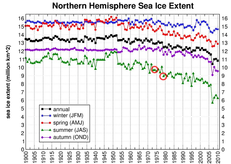
Cryosphere Today has this graph on their website, purporting to show accelerating ice loss since 1900. It appears entertaining, except for the fact that the data is garbage.
http://arctic.atmos.uiuc.edu/cryosphere/IMAGES/seasonal.extent.1900-2010.png
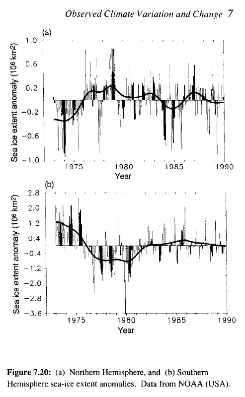
Note the two circles which I drew for 1974 and 1979. It appears there was a lot less ice in 1979 than 1974. Sadly for the data fabricators, we have satellite data from that period (which NSIDC chooses to ignore) that shows that there was a lot more Arctic ice in 1979 than 1974.

www.ipcc.ch/ipccreports/far/wg_I/ipcc_far_wg_I_full_report.pdf
Similarly, the CIA reported in 1974 a 10-15% increase in Arctic ice over the previous few years.
www.climatemonitor.it/wp-content/uploads/2009/12/1974.pdf
The Cryosphere Today graph shows the exact opposite. It is complete garbage, and looks like someone just took a pencil and made up data.


If observations do not match your predictions, change the observations.
“We’ve always been at war with Eastasia”
Note that before 1960 all the curves are almost straight lines. This indicates that they don’t have a clue as to what the actual data was: no good data – lets fabricate a straight line.
Thanks Steve for showing that, now I can see why the NSIDC only goes back to 1979, pure cherry picking for their own agenda
It seemed that cryosphere today was one of the few sites where honesty prevailed. Until now . I guess they decided to be a team player.
johnmcguire:
Sorry to tell you this but I have ignored Cryosphere today after the first Summer I was watching their fairy tales. I agree the others are worse. All of the reported ice conditions are subjective rather than objective, but it is treated as objective. Major Fail!
Which satellite(s) were they measuring from in 1900?
Much of the Arctic wasn’t even mapped until 1907
The bottom figure shows an anomaly of ~-0.2 in summer (July/August/September) 1974, and about the same in J/A/S 1979. Statistically indistinguishable, much like they are shown by CT. The big difference between 1974 and 1979 on the bottom figure occurs in the winter months at the start of each year.
Note also that the NOAA graph at bottom is based on a 10% concentration threshold and is digitised from a 2.5 by 1 degree grid, so is extremely coarse resolution.
The IPCC graph shows 2 million km^2 gain after 1974. That is not present on the CT graph in any season.
Oh, and I hope I shouldn’t have to point out that the CIA report refers to “world snow and ice”, and says nothing specific about northern hemisphere sea ice.
How much would the southern hemisphere ice-cover have to vary exclusively to increase the World coverage by “at least 10-15%”?
Obviously they were talking about the Arctic. Why don’t you read the report?
Not sure about quoting the CIA, anything they say is only to influence things 3 or 4 perturbations after the information has been utilized 🙂
Of course, you could always refer to the NSIDC’s own graph, here:
http://nsidc.org/cryosphere/sotc/images/mean_anomaly_1953-2011-v2.png
It does indeed show a substantial rise between the start of 1974 (anomaly a little above zero) and the start of 1979 (anomaly slightly over 2). It also gives enough context to make clear that this doesn’t affect the conclusion that Arctic ice is being rapidly lost in recent years. Julienne’s already linked you this graph once, it’s a shame you choose not to discuss it.
Peter it is subjective rather than objective and that makes it worthless to support your claims.
And before you complain it’s hidden away somewhere obscure, let me point out that it’s the main graph on the front page of their section on “Sea Ice”.
http://nsidc.org/cryosphere/sotc/sea_ice.html
So, are both graphs correct? Why or why not? Extra points if you can use maths.
Stark:
Both graphs are fairy tales that are loosely based on reality. Very LOOSELY!
Ice Melts?! How long has THIS been going on?
Billions of years… :zzz
Gator:
BUT, BUT BUT, now it melts at -15c!
They used to call that ABLATION and it has been going on forever.
And prostitution is the oldest profession… I get it.