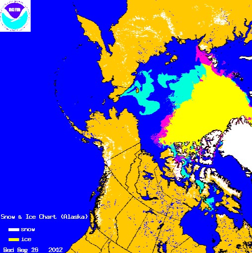
Turquoise represents ice present in 2012 which wasn’t present at the 2007 minimum. Red shows the opposite. There is 28% more ice than there was at the 2007 minimum.
http://www.natice.noaa.gov/pub/ims/ims_gif/DATA/cursnow_alaska.gif
http://www.natice.noaa.gov/pub/ims/ims_gif/ARCHIVE/AK/2007/ims2007265_alaska.gif
Passive microwave measurements are missing vast areas of ice, because an early winter storm broke the ice up into chunks which the satellites are unable to detect. Alarmists are going hysterical, based on garbage data.


The NIC map does seem to be “catching up” with the other maps now that just use passive microwave. Of course JAXA went awol last October so everybody is using less precise data from outher sources now. My bet is NIC will be within 10% come minima.
Does anyone have a map from Cryosat2?
Note that Masie shows more ice than your map and they claim 4.9million extent, so that is 20% more than 2007.
http://nsidc.org/data/masie/index.html
So you need to reduce your percentage difference down.
Andy
Cryosat was supposed to be the final word on Arctic ice information, but it seems there were more important assignments after the first full report.
Quoting Walt Meier of NSIDC:
“..NIC produces operational ice analyses,focused on using many data sources of varying quality and quantity to detect as much ice as possible,even small concentrations. NSIDC’s passive microwave data may miss some low concentrations [it uses a 15% concentration cut-off],particularly during melt. So it’s not unusual for NIC/MASIE to show more ice,though it’s more than in other years because the low concentration ice is scattered over a much larger area.
An important point is that NIC/MASIE,while picking up more ice,is produced by manual analysis and the data quantity and quality varies.So the product is not necessarily consistent,particularly from year to year. NSIDC’s product is all automated and consistently processed throughout the record. So there may be some bias,but the bias is consistent throughout the timeseries. This means that comparison of different years,trend values,and interannual variability are more accurate using NSIDC.”
I am not sure how we can know that an Arctic Storm will have the effects described on the present thin ice,the bringing to the surface of warmer water for instance, if it had no effect on the previous thick ice.I think that some people could be just making this up or using theory.The Arctic ice has lasted to very nearly the end of the melt season which does not allow the sea surface to gain much heat this late in August so I think that the ice should refreeze quickly once it starts to do that.
An “early winter storm” in mid-August? Why are you unable to call it a
“late summer storm”?
Because it was a cyclonic winter storm with very cold temperatures and snow.
Mmm…
Yes, there was a late summer storm with cold temperatures and snow. Taking Summer as June July, August. Autumn as Sept, Oct, Nov, Winter as Dec, Jan ,Feb and Spring as Mar, Apr and May.
NSIDC and JAXA are below the 2007 minimum. A NASA image that depicts the current ice vs. the 1979-2010 mean minimum can be found at: http://www.nasa.gov/images/content/680891main_seaIceArea_08262012-orig_full.jpg
Where is the visible image to verify this?
We never would have known that otherwise. Thanks for the hot tip.
T – 10 and counting …
Up to date image of sea ice at:
http://www.ijis.iarc.uaf.edu/seaice/extent/AMSRE_Sea_Ice_Extent.png
Shows ice area below that of 2007.
There is something seriously messed up about that.