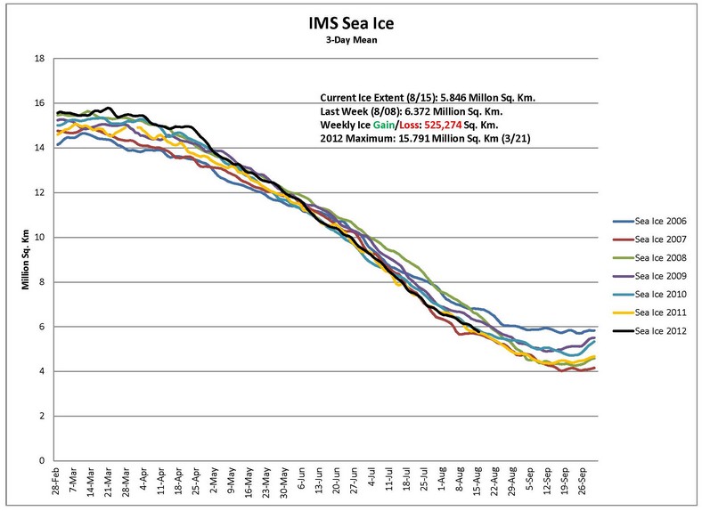
Experts tell us that 100,000 Manhattans of ice will melt this week, and we will have an ice-free Arctic.
Disrupting the Borg is expensive and time consuming!
Google Search
-
Recent Posts
- The Real Hockey Stick Graph
- Analyzing The Western Water Crisis
- Gaslighting 1924
- “Why Do You Resist?”
- Climate Attribution Model
- Fact Checking NASA
- Fact Checking Grok
- Fact Checking The New York Times
- New Visitech Features
- Ice-Free Arctic By 2014
- Debt-Free US Treasury Forecast
- Analyzing Big City Crime (Part 2)
- Analyzing Big City Crime
- UK Migration Caused By Global Warming
- Climate Attribution In Greece
- “Brown: ’50 days to save world'”
- The Catastrophic Influence of Bovine Methane Emissions on Extraterrestrial Climate Patterns
- Posting On X
- Seventeen Years Of Fun
- The Importance Of Good Tools
- Temperature Shifts At Blue Hill, MA
- CO2²
- Time Of Observation Bias
- Climate Scamming For Profit
- Climate Scamming For Profit
Recent Comments
- arn on The Real Hockey Stick Graph
- arn on The Real Hockey Stick Graph
- Gordon Vigurs on The Real Hockey Stick Graph
- Peter Carroll on The Real Hockey Stick Graph
- Robertvd on The Real Hockey Stick Graph
- Robertvd on The Real Hockey Stick Graph
- Gordon Vigurs on The Real Hockey Stick Graph
- Jack the Insider on The Real Hockey Stick Graph
- Bob G on The Real Hockey Stick Graph
- conrad ziefle on The Real Hockey Stick Graph


keep an eye out – maybe??greenpeace is doing a 2 for one deal on blowtorches:-0
Who publishes this graph, Steve?
NOAA’s National Ice Center It is intended for use by people who actually need to know where the ice located, rather than for propaganda purposes.
You mean that is actually a chart out there that hasn’t been torture tested by our alarmist friends?
NIC also provides this interactive tool showing daily ice extent. It shows that ice bottomed out Aug. 17 and has recovered strongly since.
http://www.natice.noaa.gov/products/products_on_demand.html
Paul, more on NIC charts
“Polar orbiting satellites are the only source of a complete look at the polar areas of the earth, since their orbits cross near the poles approximately every two hours with 12 to 13 orbits a day of useful visible data. This visible imagery can then be analyzed to detect the snow and ice fields and the difference in reflectivity of the snow and ice. By analyzing these areas each day, areas of cloud cover over a particular area of snow and ice can be kept to a minimum to allow a cloud free look at these regions. This chart can then be useful as a measure of the extent of snow and ice for any day during the year and it can also be compared to previous years for climatic studies.”
http://www.natice.noaa.gov/ims/snow_ice.html
“NIC charts are produced through the analyses of available in situ, remote sensing, and model data sources. They are generated primarily for mission planning and safety of navigation. NIC charts generally show more ice than do passive microwave derived sea ice concentrations, particularly in the summer when passive microwave algorithms tend to underestimate ice concentration. The record of sea ice concentration from the NIC series is believed to be more accurate than that from passive microwave sensors, especially from the mid-1990s on (see references at the end of this documentation), but it lacks the consistency of some passive microwave time series.”
http://nsidc.org/data/g02172.html
Hope that ice free Arctic holds thru next summer. Been dreaming long time to sail the Northwest Passage.
The difference between your attitude and enlightened self-interest is the degree of enlightenment.