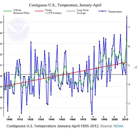
Governor Moonbeam is using taxpayer money to display this NOAA graph on his anti-denier website.
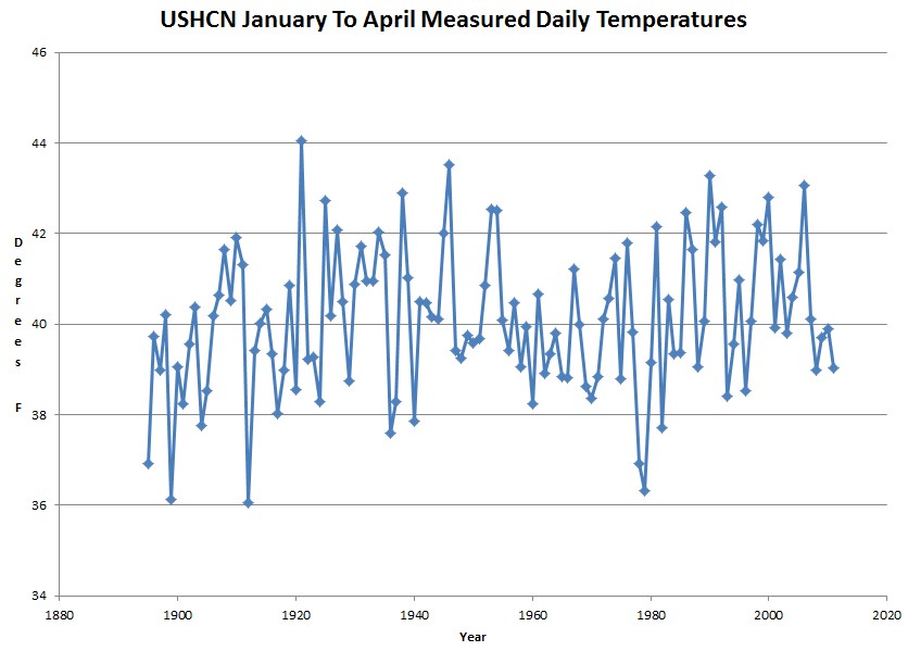
Looks scary – the only problem is that it is complete garbage. The measured data (which the graph above is supposed to be based on) is shown in the graph below through 2011. (The 2012 data has not been released.)
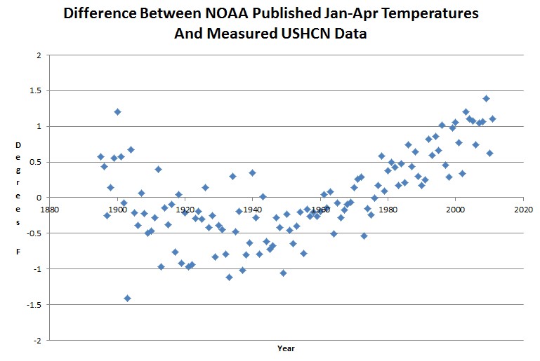
The next graph shows the adjustments tampering which NOAA has done to the data. They have adjusted inflated recent years upwards by almost 2.5 degrees relative to the 1930s, and have made the Dust Bowl completely disappear.
We have passed a tipping point where unabashed NOAA fraud is affecting millions of lives.


NOAA is displaying their own manufactured data as actual fact, attempting to scare tax payers into funding a scam. There should be tribunals, not for deniers but for fraud based alarmism.
Another graph showing a hockey stick. The crooks are in charge of the asylum. The taxpayers are the prisoners.
[youtube http://www.youtube.com/watch?v=PhnTMxHOWlY&w=420&h=315%5D
Eventually the hen comes home to roost (or roast, via public outrage).
Hang in there, the MSM can only hold on for so long, before the threads break.
Tyhe truth has little relevance when the world is neeed of saving.
Did they publish the motivations and calculations for this adjustment/tampering somewhere? I heard about differences between thermometers and “urban heat adjustment” but didn’t see any formulas or data…