NOAA reckons you guys in the US are toast!!!!!!!!
3 – 6 Hurricanes to blow you away this summer!!! Holy Crap Batman!
I wonder what NOAA’s record on hurricane prediction is? Since there hasn’t been a Severe Hurricane hit the US in 7(?) years, their record must be spotty. One day they will be correct, and then they’ll say “We told you so!” But a strike rate of 1 in 8 if it was this year is not exactly confidence building. If this was baseball, NOAA would have been sent down to the minors by now.
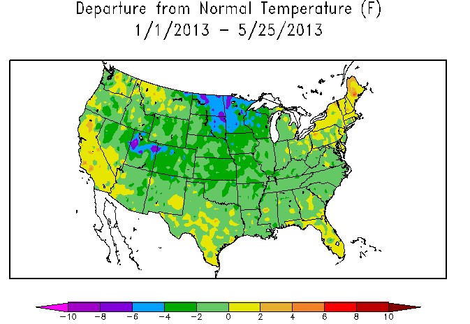
Ever notice how they start out using non-traditionally-associated “cold colors”, such as light green and green to show “below normal” temps (instead of light blue and blue), yet jump directly into traditionally “warm” colors like yellow and orange immediately above the “zero anomaly” point? Subtle bullshit like that betrays their bias in pushing their agenda.
I’ve been seeing a lot of that, where hot colors are obviously hot and cold colors are neutral or ambiguous. It’s the opposite side of Tufte’s famous book “The Visual Display of Quantitative Information” , since the objective of the new graphic paradigm is to impede understanding instead of clearly conveying it, to promote confusion and ignorance.
Thanks, Billy. That puts it in much starker (and more accurate) terms. It would be cool (pun intended) if Steve could put up a flash comparison of those two maps.


Alarmists will focus on Maine and California…
NOAA reckons you guys in the US are toast!!!!!!!!
3 – 6 Hurricanes to blow you away this summer!!! Holy Crap Batman!
I wonder what NOAA’s record on hurricane prediction is? Since there hasn’t been a Severe Hurricane hit the US in 7(?) years, their record must be spotty. One day they will be correct, and then they’ll say “We told you so!” But a strike rate of 1 in 8 if it was this year is not exactly confidence building. If this was baseball, NOAA would have been sent down to the minors by now.
http://www.guardian.co.uk/world/2013/may/23/noaa-forecast-active-hurricane-season
Ever notice how they start out using non-traditionally-associated “cold colors”, such as light green and green to show “below normal” temps (instead of light blue and blue), yet jump directly into traditionally “warm” colors like yellow and orange immediately above the “zero anomaly” point? Subtle bullshit like that betrays their bias in pushing their agenda.
I’ve been seeing a lot of that, where hot colors are obviously hot and cold colors are neutral or ambiguous. It’s the opposite side of Tufte’s famous book “The Visual Display of Quantitative Information” , since the objective of the new graphic paradigm is to impede understanding instead of clearly conveying it, to promote confusion and ignorance.
http://imageshack.us/photo/my-images/23/yeartdeptus.png/
Thanks, Billy. That puts it in much starker (and more accurate) terms. It would be cool (pun intended) if Steve could put up a flash comparison of those two maps.
BC, animated image:
http://img853.imageshack.us/img853/1713/yeartdeptus1.gif
You are da’ MAN! (Not da’ Mann!) 😉
US. Does consistently leaving out Alaska miss about 20% of the Continental US? Perhaps North America would be a better proxy?
Everyone should go wiki the Vostok ice core data. It’s going to be getting pretty cold, soon.
Hard to guesstimate how long the nice weather will last, so enjoy it! The earth has spent most of the last 400,000 years glaciated.